This topic is locked
Hergiswi: Simple. Classic. Unplayable. That's unfortunate. But it was funny, so kudos.
ywkls: my pick for the week. I love the dichotomy of red v. blue / fire v. water. I also think the subscreen is elegant and nice to look at. I imagine that water rushing in and cooling the lava, making the area walkable at some point. Clever!
Dwarlen: I've never been a huge fan of the tileset (the 'vertical' beams throw the perspective out of whack), but you play it out well. The subscreen is also enticing. Re-using the window dressing as overhang is nice, and it works because of the distorted perspective. Well done!
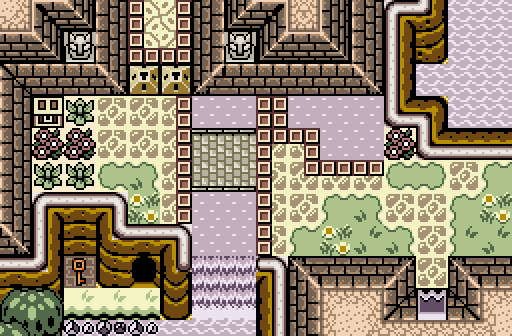
Demonlink: never been a fan of GBZelda-style graphics. The screen is well put-together, offering a wide-variety of visual appeal. The Tetris block borders seem like unwalkable barriers when in the center of the room (to me). The lack of transition between the river(?) and shore screams for attention (next to the flower at the top center, and again at the bendy top of the mountain in the lower section). Not really your fault- it's a design flaw.