Zaxaphone
Which path should link take?
One leads to a fiery mountain, the other a melting Glacier...
Joelmacool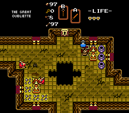
From my latest quest, Chocolate Shadow Temple.
Eggman666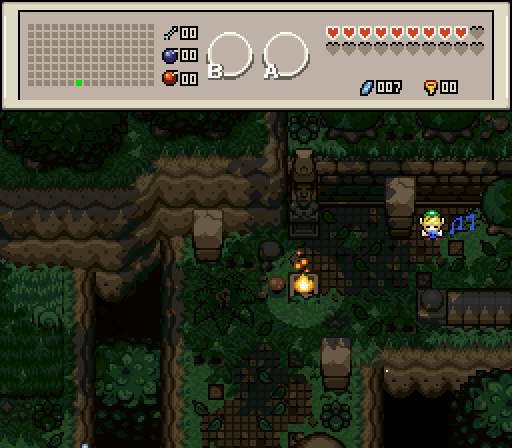
![]()
Jared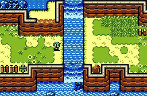

Screenshot of the Week 607
Started by
Neppy
, Apr 16 2017 11:09 PM
Eggman666 Zaxaphone Joelmacool Jared
-
 This topic is locked
15 replies to this topic
#1

Neppy
-

- Members
-

Grand Overlord Empress
- Real Name:It's dangerous to go alone. Take Nep!
- Pronouns:She / Her
- Location:Minnesota
Posted 16 April 2017 - 11:09 PM
- Jenny and Joelmacool like this
#2
Shane
-

- Moderators
-

🩶
- Location:South Australia
Posted 16 April 2017 - 11:17 PM
Voted Jared. It's a pleasant little shot and it feels the most refreshing out of the bunch. ![]()
Edit: Some feedback...
Zaxaphone: Your shot is really interesting. I'd work on the mountains however, they definitely have some perspective issues going on.
Joelmacool: I like it, my second favorite. My only problem is that it feels too monochromatic.
Eggman666: I can tell a lot of effort and heart was put into this shot among your others but I must admit I'm not a fan of the cluttered design.
Jared: It's simple, but most competent screenshot. It uses tiles correctly, has nice colouring and is detailed but spacious too which is why I voted.
- Jenny and Jared like this
#3
CimFighter
-

- Members
-

CimFam/Writer
- Real Name:Michael
- Location:Connecticut
Posted 16 April 2017 - 11:19 PM
Went Zaxaphone. I like the palette here.
- Jenny and Zaxarone like this
#4
Titanium Justice
-

- Members
-

Justice is served!
- Real Name:Jared
- Location:Ontario
Posted 17 April 2017 - 12:15 AM
Eggman666 gets my vote this week. That forest scene has got some really nice detail.
- Jenny likes this
#5
Sparkster
-

- Members
-

The Sparking Spark of ZC
Posted 17 April 2017 - 03:19 AM
Voted for Zaxaphone for this good screenshot.
- Jenny and CimFighter like this
#6
Eddy
-

- Moderators
-
ringle
- Real Name:Edward
- Pronouns:He / Him
- Location:London, United Kingdom
Posted 17 April 2017 - 05:35 AM
Zaxaphone - Nice shot here. I like the divide between the lava and the water, really makes the screen kinda unique seeing both of those in the same place. Got no real issues with it, nice job.
Joelmacool - Pretty nice screen overall. I like the ruined feel of the shot and the screen generally is made well. I dunno what's up with the floor borders on the top-right and the bottom-left of the pit, but other than that, it looks good.
Eggman666 - Another great shot, and I really love how this one looks. Again, the tree top on the bottom left looks a bit weird and there are a few tile errors on the mountains (like the corner near the bottom-right, and how the mountains on the left go into the other mountain). Generally looks good though.
Jared - Beautiful shot, I really like how the grass grows onto the mountains like that and how natural the waterfalls look. Probably my favourite this week.
I voted for Jared this week.
- Jenny and Jared like this
#7
Naru
-

- Members
-

Magus
Posted 17 April 2017 - 05:59 AM
Zexaphone - while I like the general layout and the colors are fitting a cold atmosphere, the lava is too purpelish for me. I also don't like the purple subrosian and while I like the idea with the NPCs the placement doesn't look that great to me.
Joelmacoool - solid screen, the chocolate-theme remains a great idea, but beside that I don't like the colors too much. Also nothing really special.
Eggman666 - again a great screen with a great atmosphere. I still dislike the Link-sprite (and I don't see how it fits into the tileset), the black lines below the notes, while they totally make sense I find them ugly. The whole screen is very harmonic and well designed, it even overshadows the not-too-great-together-fitting-tiles and the weak coloration I typically dislike in DoR. I am not happy though about the two big leaves of grass to overlayer objects/walls and it would be nice if the stone elements had a different color compared to the ground and the tree below - while I really like the idea behind it - looks odd.
Jared - very harmonic screen, great colors, voted here!
- Jenny and Jared like this
#8
Architect Abdiel
-

- Members
-

Kingdom Builder
- Real Name:Michael
- Location:Florida
Posted 17 April 2017 - 07:25 AM
Zaxaphone: I really like this shot with the lava and water on the same screen. I do agree with Naru in that it is a bit too purple though,
Joel: Solid shot, but nothing particularly special on its own,
Eggman: A bit odd in a couple places, particularly with the tree in the gap. But it makes up for it by being visually appealing.
Jared: A really nice shot that I could see being in a GB Zelda title. No complaints.
I'm gonna go with Eggman cause the shot appeals to me the most.
Edited by Maikeru D. Shinigami, 18 April 2017 - 01:38 AM.
- Jenny and Jared like this
#9
strike
-

- Members
-

life is fragile, temporary, and precious
- Real Name:Olórin
Posted 17 April 2017 - 11:59 AM
I voted for Joel. I think the palette really works and the use of negative space is good. The shot just feels like a really solid fundamental shot and makes me wonder about the quest it is from. Zexaphone's shot feels a little choppy to me. The palette is really nice though and it is an interesting concept. Eggman's shot is definitely good too. I like the atmosphere. I do think the tree seems kind of weird though. And overall, this shot just doesn't feel as iconic as the shot from last week, which I voted for. It is still good but not as good as the last shot. And it is really similar so I am inclined not to vote for it. Jared's shot is also definitely good. I feel like it is simple more for the sake of not having any content to display more than for aesthetic reasons though. The aesthetic is nice but not enough to sustain the screen I don't think.
-Strike
- Jenny, Jared and Joelmacool like this

#11
Deedee
-

- Moderators
-
Bug Frog Dragon Girl
- Real Name:Deedee
- Pronouns:She / Her, They / Them
- Location:Canada
Posted 18 April 2017 - 03:01 AM
Close call between Toblerone's (totally his name, yep) and Jared's screen, but I went Jared.
- Zaxarone likes this
#12
FireSeraphim
-

- Members
-

Behold the might of legend!
- Real Name:Patrick Casey Spurlock
Posted 21 April 2017 - 03:01 PM
I voted for Eggman666's screenshot. It's a nice change of pace from the sheer over-saturation of gameboy screenshots that have been winning SOTW as of late.
#13
Haylee
-

- Contributors
-

~ Hope of Energy Nede ~
- Real Name:Haylee
- Pronouns:She / Her
- Location:Italian Restaurant in Koorong
Posted 21 April 2017 - 03:25 PM
The last gb style shot to win was like 4 sotws ago, what're you on about lmao.I voted for Eggman666's screenshot. It's a nice change of pace from the sheer over-saturation of gameboy screenshots that have been winning SOTW as of late.
- Shane, Matthew and Naru like this
#14
Matthew
-

- Administrators
-

- Pronouns:He / Him
- Location:Ohio
Posted 21 April 2017 - 04:28 PM
Who is this Eggman guy and how is he tearing up the competition?! ![]() He's made such great screens, in my opinion.
He's made such great screens, in my opinion.
#15
Lüt
-

- Members
-

Germanize
- Real Name:Steve
- Location:Chicago
Posted 22 April 2017 - 02:34 AM
Though I have to admit I'm often the outlier in that I'm not the biggest fan of GB aesthetic, I think all the GB shots showcase a good degree of the variety and artistry that the set is capable of.
The lava/water contrast in Zax's shot is a personal favorite design choice of mine - I used to do that in the old maps I made for Heretic and Doom, but never thought to try it in ZC. Looks nice. The caves on the sides of the screen are a good finishing touch.
Joel's is a nice display of diagonal symmetry rather than the horizontal or vertical symmetry that 99% of layouts default to when they go for symmetry. Colors are nice, wall/hole border tiles look like part of a natural layout rather than the generic filler detail that floods other screens, and bonus points for accounting for the missing 8 pixels at the bottom of the screen and not having the lowest torches with their flames cut off. Plus, at least this Oubliette isn't as dismal as Quake's.
The grassy growths along the bottom of Jared's cliffs and the ripples at the top of his waterfalls look like he's bringing in the DoR/MC influence. I also like the transition between the cliff-top dirt and regular yellow ground at the top of the screen. There's lots of attention to detail here. The more I analyze it, the more I like it.
Still, Eggy-pie stands out the most here. The blend between cave walls and brick walls is quite seamless, and I especially like the notion of the main ground hanging over a large pit, particularly one that has visible content rather than just some sketchy pixel arrangements to hint that the ground below actually exists and that the pit isn't bottomless.
I also think the shadowy overlay generally works. So often, due to ZC's 8-bit coloring, transparencies like that cause excessive graying-out of the colors below, and sometimes even change colors to something totally different - brown to purple, for example. It's often so bothersome that I disable any transparent overlays that I might attempt, as well as suggest that other people disable them, no matter how artistic and well-done they may be, simply because the discoloration is too overwhelming to account for whatever other aesthetic the overlay offers. Fortunately, yours work quite well with no color loss where it's most important - the greens. And even if a few of the darkest points of the floor tiles are grayed out, it's not as if gray-shaded tiles would be inappropriate in this scene anyway. I don't know if you intentionally built the palette to account for this discoloration issue, or if you got lucky, but either way, the end result is one of the few successful transparency overlays that I've seen. Same goes for last week's shot, obviously.
Two points of suggestion:
First, seeing how you're into fine-detailing - tweaking the cliff tiles, like Eddy mentioned. DoR cliffs are very specific and it definitely takes a while to fully learn how to work them optimally, especially since a lot of the transitional tiles have maybe one column of pixels that are different from the regular tiles - yet, those can make all the difference. I'm looking particularly at the points on the middle-left and bottom right where the main level fades into the pit. If you're still using the default DoR combo setup and haven't added any new combos to your combo list, then you're using combos 3700 and 3702 at those corners. To smooth the transition, use combos 3724 and 3725 instead.
Or, heck, here's a screenshot instead of numbers, just because it's easier to look at:
Spoiler

Second, animation. I like the animations you've been doing, especially in scenes like this where things like those floating embers (?) would go unnoticed in still images. But, sometimes the animation seems a bit jagged, such as the water in the shot a few weeks ago, or the light-circle around the torch in this shot. In case you didn't know, in the game, you can press F4 to advance the gameplay frame-by-frame. So, for example, what I'd do with the water shot is press F3 to pause, press F4 until I get to the next frame of water animation, take a screenshot, press F4 again until I reach the next frame of water animation, take another screenshot, etc. until it comes full cycle. Of course, the catch is that different things animate at different rates, but by picking one of the largest points of focus, it will make the best impression.
And one final note - I like the bottom-of-border grassy overlays, but the one on the torch is so close to the flame that it looks like the ground is going to catch fire in a few seconds. Might be worth finding/making a smaller overlay, or trying the scene without one at all.
Anyway, nice collection of screens from everybody, but went for Eggman in the end.
- Zaxarone and CimFighter like this
Also tagged with one or more of these keywords: Eggman666, Zaxaphone, Joelmacool, Jared


0 user(s) are reading this topic
0 members, 0 guests, 0 anonymous users

