Posted 17 April 2020 - 08:41 PM
These shots are diverse and all very nicely assembled.
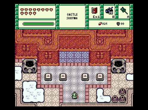
Demonlink
Looks ominous. I like the near-symmetry of the area and the puzzle implied by the switches on the ground. Maybe the colors flashing by are a bit too extreme.
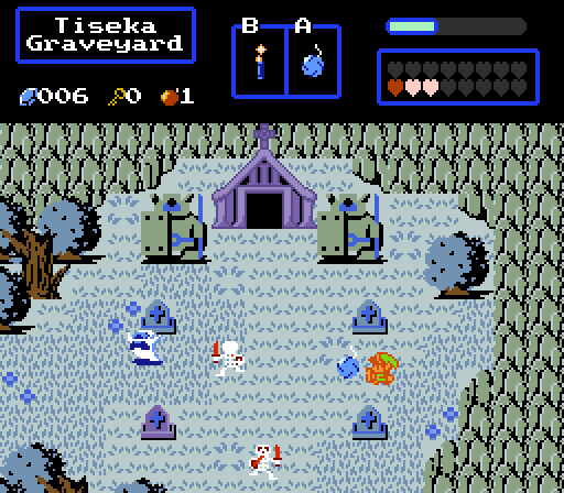
Haritiro
From a playability perspective, I like how open the screen is. The cold, bleak colors fit the graveyard scene nicely. The building at the top doesn't quite fit in with the graphics elsewhere in the shot, which are outlined differently.
Joelmacool
I love the color composition of this screen. The area looks rather labyrinthine from this view alone. This would normally imply a tight, congested, busy screen, but you make great use of walkable regions and include just the right the amount of detail. This is really good.
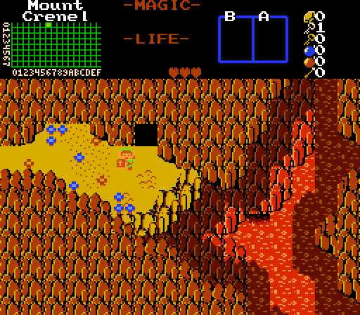
klop422
Looks like a really dangerous area. I bet the player would make sure they buy a potion before entering that cave! (At least, I would.)
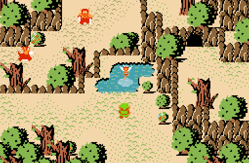
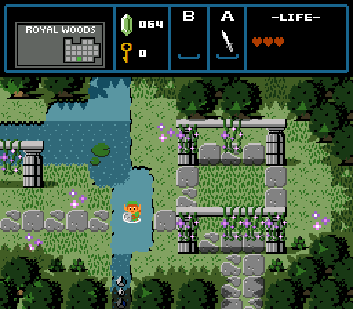
Matthew
There's something magical about this screen. The green, blue, gray palette instills in me a sense of calm, with the fuchsias contributing a nice accent. The shadows are pretty much perfect: they convey the third dimension much better than most classic-style shots do, yet you didn't use so many that they became distracting or gimmicky. Because the dark regions frame a brighter area, I feel like this location acts as a refuge from mysterious, dangerous areas encircling it. The only thing I would change is the horizontal border between marking the shallow-to-deep water transition. It looks too abrupt, especially since your southeast corner of the deep pool has a more gradual, dithered transition.
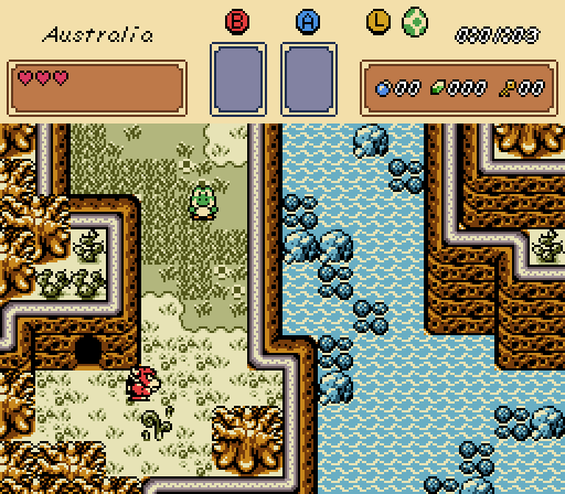
Yoshi
A really pretty shot. I like that the colors are somewhat desaturated compared to the typical bright palettes the Game Boy Color Zelda installments are known for. I feel like this is a frontier and I'm on an adventure, which is exactly what I look for in most quests. That said, Yoshi doesn't really seem to fit in...
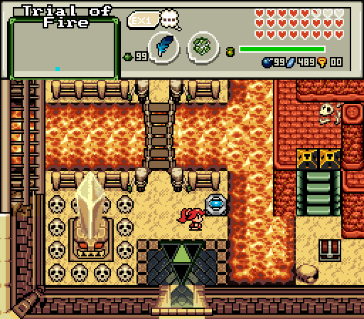
ywkls
That is one heck of a crystal switch! It must do something really significant. The screen uses several different styles, but in my opinion, they don't fit together all that great. I think it's something to do with the inconsistent perspective and use of outlines. (Some tiles rely on black outlines, like the fence; others don't, like the crystal.) Critiques aside, I think you communicated a perilous, fiery area really nicely. Your palette is well-chosen.
I hate to only hand out one vote this week given the high quality of the entries, but I must. It goes to Matthew. I think several of the other shots would win in a typical week, so that's just bad luck.
-
Rambly, Anthus, Hari and 3 others like this

 This topic is locked