We've got five great shots this week. Which one will prevail? Yours could be the decisive vote!
Avaro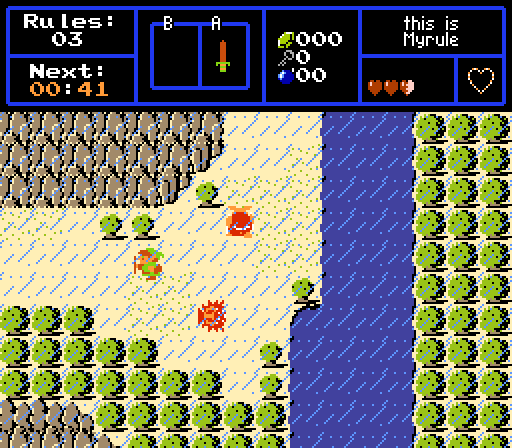
Rainy and sunny, huh. Now where's the rainbow?
Joelmacool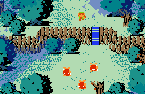
it's like 420 with an extra 300
Russ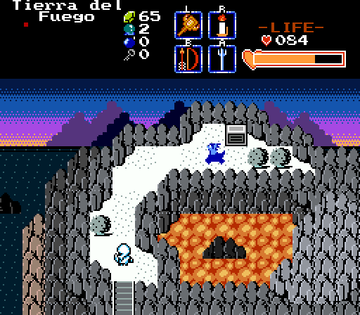
As the sun sets above the Northern Sea, Kell searches for answers. But will he find what he seeks before time runs out...
Shane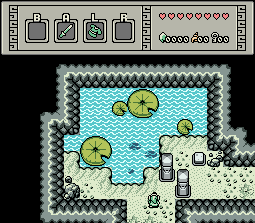
Oh no, they move too!
Yoshot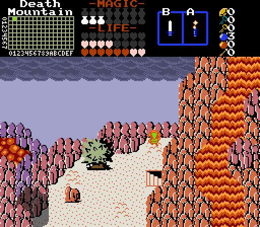
Link looks out over the ledge after exiting the cave passage through the volcano.

Screenshot of the Week 720
Started by
Aevin
, Jan 05 2020 04:08 PM
Russ Avaro Joelmacool Shane Yoshot
-
 This topic is locked
9 replies to this topic
#1

Aevin
-

- Members
-

- Pronouns:He / Him
- Location:Oregon
Posted 05 January 2020 - 04:08 PM
- Hari and Matthew like this
#2
nicklegends
-

- Contributors
-

Trofessional Pransposer
- Real Name:Ed
- Pronouns:He / Him
Posted 05 January 2020 - 04:12 PM
Lots of classic shots this week! I dig it.
Avaro
It's a functional shot, to be sure, but I don't find it inspiring. Respectfully, I find Myrule more fun to play than to look at.
Joelmacool
The shadows, diversity in tree sizes, and multiple levels give this shot depth. (Did I say that last week also? Regardless, I like what you've done.)
Russ
The skillful use of color and dithering make for a pleasant sunset scene.
Shane
I love the construction of the tiles and the visual consistency in the shapes, shading, etc.; however, the difference in saturation between the blue water/green lily pads and everything else is a little jarring. It feels like one of those selective-color photographs. If the sand and rocks were a little less gray, the palette might be a little more pleasant. This is only my personal taste, though. All said, I think the shot is distinctive and memorable. I want to know more about this area!
Yoshot
Looks like a scary place! The spikiness of the lone tree reinforces this dangerous image. Maybe having something in the sky other than the flat gray ash would help the shot out a bit.
I ended up voting for Russ. Joelmacool gets an honorable mention (worth zero votes; sorry).
- Russ, Shane and Hari like this
#3
Matthew
-

- Administrators
-

- Pronouns:He / Him
- Location:Ohio
Posted 05 January 2020 - 06:22 PM
None. [Because I liked them all too much to pick.]
Screen Reviews:
- Avaro: A fairly simple screen, but competently designed. The subscreen and its implications are cool.
- Joelmacool: Super mystifying and cool, this feeling granted by the use of large trees.
- Russ: The sunset really sells the shot. The color choices are the most compelling.
- Shane: Cave screens are hard to make interesting, but the use of Minish Cap tiles really helps make it more appealing. Good job here.
- Hookshot: Very clever use of classic, much like Russ. The shadows of the mountain are what makes this so engaging.
Edited by Matthew, 05 January 2020 - 09:41 PM.
- nicklegends, Shane, Avaro and 1 other like this
#4
Anthus
-

- Members
-

Deified
- Pronouns:He / Him
- Location:Ohio
Posted 08 January 2020 - 10:30 PM
Wow, this one was hard. I ended up voting for Russ, cause... well, come on, just look at it, it's beautiful!
Joel comes in at a really close second for me. Can you tell I like Classic yet?
The other ones are all good shots. I only have two minor critiques. For Shane's I would suggest possibly adding a darker blue shadow on the bottom of the lily pads on the water. It looks good, but it kinda looks like they are hovering over it. At the same time though, another blue might kind of break the GB look, now that I think about it.
For Yoshot's, I'd suggest making the darkest color in the lava fall a bright yellow or orange while replacing one of the other colors with a brighter red. This is all just personal preference of course, but it would make the lava pop a lot more.
Anyway, good shots this week.
- nicklegends, Shane and Hari like this
#5
Hiram Gooch
-

- Members
-

Newbie
- Real Name:Ken
- Location:State of Mind
Posted 09 January 2020 - 12:51 AM
Haven't checked in for a while and lucky me, 4 classic tileset screen, so happy I had to leave my first ever comment
All great,(even the other one) but classics my weakness, Joelmacool edged it out with the caption
Maybe one of these days I'll figure out the submission process
All great,(even the other one) but classics my weakness, Joelmacool edged it out with the caption
Maybe one of these days I'll figure out the submission process
- Avaro likes this
#6
Avaro
-

- Members
-

o_o
- Real Name:Robin
- Location:Germany
Posted 09 January 2020 - 08:09 AM
Joel's shot speaks to me on a deep level. Really like how it looks, the palette is especially nice. The transparent shadow layer kinda looks like mist. I'd have used foggy tiles instead of these I guess, but still neat.
Nice shots everyone else too!
- Shane, Joelmacool and Hari like this
#7
Lüt
-

- Members
-

Germanize
- Real Name:Steve
- Location:Chicago
Posted 09 January 2020 - 09:25 AM
For Yoshot's, I'd suggest making the darkest color in the lava fall a bright yellow or orange while replacing one of the other colors with a brighter red. This is all just personal preference of course, but it would make the lava pop a lot more.
In other words, he wants you to map for 1SM instead of 6th Quest contest.
- Hari likes this
#8
Anthus
-
- Members
-
Deified
- Pronouns:He / Him
- Location:Ohio
Posted 09 January 2020 - 01:42 PM
Correct. 
- Hari likes this
#9
Twilight Knight
-

- Members
-
Tell all with glee, Argon's on PureZC
- Real Name:Sven
- Location:Rotterdam, NL
Posted 10 January 2020 - 04:38 AM
Found it pretty hard to vote this week since all the screens are so good, but ended up voting for Joelmacool.
Some comments on the other screens:
Avaro: I really dig the palette! The screen design is quite simple, but effective. Perhaps what could make it better is putting some large trees between the smaller trees, but that's not true to the classic tileset, so I can understand if you don't want to do that.
Joelmacool: I really like the detailing and the perfect composition! And I'm always a fan of the "transparent forest foliage overlay", it can do so much for a forest screen.
Russ: The "layers" in the mountains are absolutely great. Like mentioned by Nicklegends, the coloring and dithering is brilliant. A truly beautiful scene!
Shane: Damn, those graphics are great. I also really like this idea of the lilypad puzzle. The palette is also very pleasing. All in all a great screenshot.
Yoshot: Very interesting and unusual design, but I like it a lot. It's a bit hard to grasp the perspective though, but it's nothing you should have to fix in my opinion. Also I need to mention that I really like those pink-ish "rocks" you used on the right side of the screen to kinda determine the flow of the lava. That is really clever!
- Shane, Avaro, Joelmacool and 1 other like this
#10
Hari
-

- Members
-

Snivy Gang
- Pronouns:She / Her
Posted 10 January 2020 - 09:53 PM
I actually picked up that trick from a Terraria building tutorial of all things, lol.Yoshot: Very interesting and unusual design, but I like it a lot. It's a bit hard to grasp the perspective though, but it's nothing you should have to fix in my opinion. Also I need to mention that I really like those pink-ish "rocks" you used on the right side of the screen to kinda determine the flow of the lava. That is really clever!
Basically, when you have a waterfall or lavafall, you can make it more visually interesting by putting rocks in it and having the water/lava divert around them. :)
Edited by Yoshot, 10 January 2020 - 09:55 PM.
- Twilight Knight likes this
Also tagged with one or more of these keywords: Russ, Avaro, Joelmacool, Shane, Yoshot
 |
Matthew
PureZC Events →
Screenshot of the Week →
Poll Screenshot of the Month 202Started by Taco Chopper , 05 Aug 2024 |
|

|
|
|
|
Sheik
PureZC Events →
Screenshot of the Week →
Poll Screenshot of the Week 818Started by Taco Chopper , 21 Jul 2024 |
|
|
|
|
|
Shane
PureZC Events →
Screenshot of the Week →
Poll Screenshot of the Week 817Started by Taco Chopper , 04 Jul 2024 |
|
|
|
|
|
Matthew
PureZC Events →
Screenshot of the Week →
Poll Screenshot of the Month 201Started by Taco Chopper , 28 May 2024 |
|
|
|
|
|
Jenny
PureZC Events →
Screenshot of the Week →
Poll Screenshot of the Week 814Started by Taco Chopper , 13 May 2024 |
|
|
1 user(s) are reading this topic
0 members, 1 guests, 0 anonymous users

