Screenshot of the Week 391
#1
Posted 03 December 2012 - 02:00 AM
Dragonsoul subscreens. Work in progress.
Shane
Emerald Garden
Dawnlight
Moblin: I wouldn't climb that wall if I were you.
Jared
Falls Temple.
-DuCkTApE-
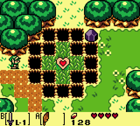
I will give a cookie to anybody who knows this screen!
Dragonite
#2
Posted 03 December 2012 - 02:39 AM
Dawnlight: Sweet, but I think you are using grass borders on the dirt. It'd make more sense if the borders were facing away from the grass, overlapping the dirt (and not the other way 'round).
Jared: Nice, but floor and walls are hard to tell apart in terms of color. Same goes for the water. I also think that tMC torches would fit here better.
Ducktape: Yay, Holodrum! Love it for nostalgia value. The last row of trees on the left is incomplete, though.
Dragonite: Best screen this week. Well done! Would have voted were I not in the competition.
#3
Posted 03 December 2012 - 02:59 AM
#4
Posted 03 December 2012 - 11:08 AM
#5
Posted 03 December 2012 - 11:16 AM
Shane: Nice, simple, and functional. I like it.
Tri: An all around great shot. My vote went here.
Jared: The screen layout itself is really good, but the water blends in with the floor too muchl, and the result is I almost have to struggle to tell where one fades into the next. Try giving the water and the floor a bit more color contrast. The screen layout's great though.
-DuCkTApE-: I wanna say it's a screen from Oracle of Seasons... not bad, but not great either. Just good.
Dragonite: It's pretty good, but those pits... I dunno, something about them just seems weird.
#6
Posted 03 December 2012 - 04:14 PM
Jared: Nice, but floor and walls are hard to tell apart in terms of color. Same goes for the water. I also think that tMC torches would fit here better.
Fixed. I made the lower walls (The water ones) blue, and left the ground underneath green. I think it looks great. Thanks!
And thanks for your kind comments, everyone else.
#7
Posted 03 December 2012 - 04:50 PM
#8
Posted 03 December 2012 - 04:54 PM
#9
Posted 03 December 2012 - 08:15 PM
Edited by Shane, 03 December 2012 - 08:15 PM.
#10
Posted 03 December 2012 - 09:58 PM
I have to say that sub-screen is quite nice. And I love it, And one question aren't those dragon looking emblems from Breath Of fire 2?
If they are you ripped them quite nicely. and they look great.
Shane
Looking a bit plain, But I see that you are going for the official Gameboy look.
With that said I think you pulled it off pretty good.
Dawnlight
My god... There is to much going on in this screen its awful. Sorry, it had to be said.
Maybe if you remove some of the vines it might look better.
Jared
Loving that dungeon shot. It looks very pleasing to the eye. there's not much more to be said. Good job
-DuCkTApE-
Oh boy. Holodrum... Holodrum But where is my Air bear I need to climb that wall .
Anyways good shot
Dragonite
Well well well. It looks very nice. but too me it seems very familial... Where could I seen something like this before??
Could it be here?
Either way looks good
#11
Posted 03 December 2012 - 10:07 PM
Dawnlight
My god... There is to much going on in this screen its awful. Sorry, it had to be said.
Maybe if you remove some of the vines it might look better.
Don't worry, I don't explode when someone gives strong criticism on screens they don't like. (Unlike some other people) It originally had little vines. I just felt it didn't flow properly.
#12
Posted 04 December 2012 - 03:59 AM
Sheik/Supindahood: Voted here
I have to say that sub-screen is quite nice. And I love it, And one question aren't those dragon looking emblems from Breath Of fire 2?
If they are you ripped them quite nicely. and they look great.
I didn't rip them as much as I redrew then. But yes, the original tiles are from BoF. In DS, these are what indicate how many shards of the Dragonsoul you have collected. In this case the player has just gotten the 'Emerald Soul', which means three more are missing.
#13
Posted 04 December 2012 - 04:18 AM
Shane - I like the shape and structure. It just needs something happening within it to make it interesting. Otherwise, good job.
Dawnlight - Easily the best shot this week. You know what vibe I get from this shot? Almost like a section from a 3D Zelda game was successfully and brilliantly converted into 2D. Maybe it's the vine wall with the Skulltulas, but it's really, really nice. Vote went here, really good job, man.
Jared - I'm honestly having a difficult time understanding what's going on. The middle platform seems to be underwater... but a glance at the others shows that it's the same depth as the others. And are those lit torches? And are they underwater? If not underwater, the palette's off. If not lit torches, what are they? The shot's got a good shape and design, but it's also difficult to tell what's happening.
-DuCkTApE- - My problem with this screen is in the top-left. Those trees are overlapping the cliffs in an unnatural way. Those top two trees just need to go, because if that cliff is supposed to be two tiles high... then those trees' roots would actually be in the cliff. Remove those two, and the shot should be fine.
Dragonite - The only problem I see here is that there are far too many holes in the center. It's a bit of an eyesore, really, but other than that, the rest of the shot looks pretty great.
#14
Posted 04 December 2012 - 04:27 AM
Edited by Shane, 04 December 2012 - 04:27 AM.
#15
Posted 04 December 2012 - 05:55 AM
0 user(s) are reading this topic
0 members, 0 guests, 0 anonymous users