Going with Shane this time.
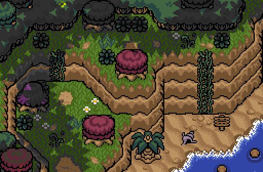
Aslion - the shot is too visually noisy for me I think, too many wall textures / floor textures / color changes.
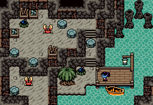
Shane - I like the theme and the details such as the lamp and boat near the dock. I don't like the hard edges between the floor texture and the walls which I think is easier to get away with when your shot resembles GB more than SNES, but I think the colors/details etc put this screen more on the SNES-side of things IMO. Anyway, it's a small nitpick and this one's my favorite.
Phosphor - I love that you're breathing new life into Pure and am excited to see how your project pans out. This shot's nice, though in the context of a contest doesn't especially stand out.
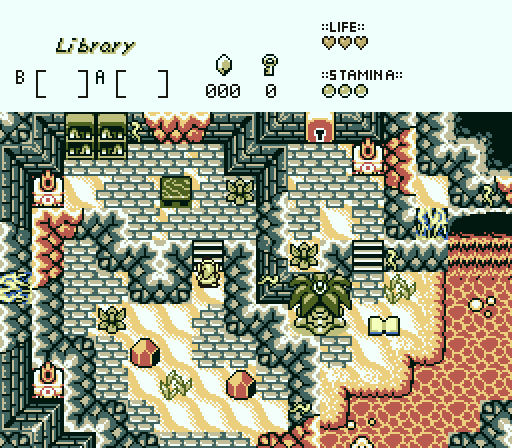
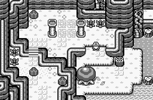
Colin - my only real twist on the source material is that I was trying to make the south-west portion of the screen start out at the highest elevation, lowering down each stairs to the base level. Took me a little while to figure out a way to decrease elevation while also moving north that I liked but I think I got it especially in the constraints of using unedited LA tiles.
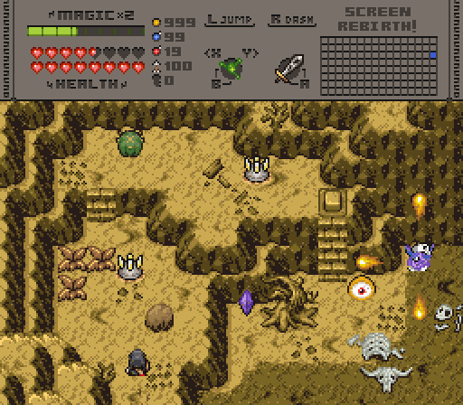
Twilight Knight - the animal bones in the bottom right look really grainy It's nice otherwise though.
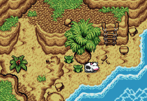
Taco Chopper - the lack of an outline on the north portion of the palm tree while other details have black outlines surrounding the whole thing causes a stylistic clash. Since the elevation in the sand descends at the middle-bottom portion of the screen, a nice detail would've been to add puddles in the depression to suggest tidal pooling. Either that, or flip the direction of the sand elevation change.
Edited by Colin, 19 June 2023 - 06:44 PM.


 This topic is locked

