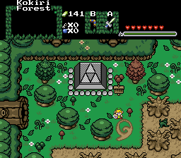
Ta-QS: This is funny that you showed my picture. As people have told me that my problem is that I make my areas too open. But I like open. However, like someone else has mentioned, that picture of mine was from a dungeon. If you look at the screen, there is a lot on the screen because it was an important part of the level. ZC is limited by making screens flow like how aLttP does (the screen follows you). Because of that, secrets weren't able to be carried over to another screen (2.11 it can now). Also, aLttP is just one style of an overworld. In Link's Awaking, most of the screens are crowded. You showed like the one place where it isn't, the town. Look at the other games, like Golden Sun and Secret of Mana. Those are as crowded as others. But, yeah, I do like more open spaces.
If you play my game, you will notice that I love open spaces; (Hyrule Field, level 5, any town). But the reason why people were so mad is the way you were stating this debate. You were basically saying that we all suck. I say, it depends on the style. Gashin's style is like that for example. It isn't too crowded, you would see that by playing his demo. And, I was just shocked that you showed my game for a bad example when my game is one of the most non-crowded quests. I don't think it takes away from the game at all.
By the way, once ZC moves away from screen to screen and goes to screen follows you (aLttP), you will defintely see a shift and have more open places like what you are talking about. ZC is just too limited to have fun in a too open area. Please release a demo of your game to show us what you are talking about. I can guarantee you that it is harder than you think.

Stop overcrowding the screens
Started by
Ta-QS
, Nov 07 2006 12:32 AM
58 replies to this topic
#31

Shoelace
-

- Members
-

The Shaman of Sexy!
- Real Name:Michael
- Pronouns:He / Him
- Location:Arizona
Posted 07 November 2006 - 08:54 PM
#32
/M/
-

- Members
-

6♣7♠8♥9♥10♥
- Location:Gotham City
Posted 07 November 2006 - 09:16 PM
It's a good thing you mention about the GB games Gashin, I forgot about those.
In LA, the forest is completely crowded. All the caves, you can bearly walk through them. Tal-Tal-Mountains, near the last dungeon, is overcrowded. The 4th dungeon, near the water.
In OoA, when you travel to the past, and into where the gorons live, its crowded there also. In OoS, the ruins is crowded.
In Minish Cap, the complete Lake Hylia, Wind Temple,Wind Ruins and swamp, is crowded. Probaly more areas, but I can't remember them now.
If I still had the ROMs, I would show you over 50 screenshots of where it is crowded in every 2d zelda game.
#33
Limzo
-
- Members
-
_
Posted 08 November 2006 - 03:27 PM
Please show us your oh-so-wonderful-better-than-nintendo-spaced-wide-open-quest then, Ta-QS.
I want to see how it looks.
I want to see how it looks.
#34
The Satellite
-

- Members
-

May the way of the Hero lead to the Triforce.
- Real Name:Michael
- Pronouns:He / Him
Posted 08 November 2006 - 03:29 PM
I'm sorry, mommy.
EDIT: Maybe it was substanceless, but it was by far not off-topic. This is really old, but I'm going to make this post count. First of all, no Limzo, I am not Ta-QS, though you probably know that by now. Secondly, this post was more of a harsh, sarcastic feedback to this guy. But I can see where you think it is off-topic.
Anyways, all of you are right, and Ta-QS is wrong. Most of the shots I see nowadays are absolutely perfect, and easy to get around in. Check out my shot, which is in SotW 163:
Except for the mass trees in the bottom right, I wouldn't call that crowded. Though you probably would. But what do you expect? It's a forest. Certain levels are meant to be crowded. Think about this for a sec: exactly how realistic is OoT's Lost Woods? Not very. Exactly how realistic is my shot above? More so. Woody areas have more trees about, though less straight. You need to take these things into consideration.
I also checked your profile; you haven't logged on since Nov. 13, 2006. Probably working on that "quest" that never had any screenshots/demos surfacing. You're probably just jealous that you can't make any good quests yourself. It's like what has been repeated multiple times: you need to show us your own work before you have the justification to just go off and diss everybody's work. And those screenshots look fine to me. Heck, I thought Revfan's was very open. What kind of trick glasses are you wearing?
EDIT: Maybe it was substanceless, but it was by far not off-topic. This is really old, but I'm going to make this post count. First of all, no Limzo, I am not Ta-QS, though you probably know that by now.
Anyways, all of you are right, and Ta-QS is wrong. Most of the shots I see nowadays are absolutely perfect, and easy to get around in. Check out my shot, which is in SotW 163:
Except for the mass trees in the bottom right, I wouldn't call that crowded. Though you probably would. But what do you expect? It's a forest. Certain levels are meant to be crowded. Think about this for a sec: exactly how realistic is OoT's Lost Woods? Not very. Exactly how realistic is my shot above? More so. Woody areas have more trees about, though less straight. You need to take these things into consideration.
I also checked your profile; you haven't logged on since Nov. 13, 2006. Probably working on that "quest" that never had any screenshots/demos surfacing. You're probably just jealous that you can't make any good quests yourself.
Edited by The Satellite, 31 May 2007 - 11:54 AM.
#35
Limzo
-
- Members
-
_
Posted 08 November 2006 - 03:30 PM
QUOTE(The Satellite @ Nov 8 2006, 08:29 PM) 
I'm sorry, mommy.
Wait. You're Ta-QS?
#36
Moonbread
-

- Members
-
Playing With Psychos
- Pronouns:They / Them
Posted 08 November 2006 - 04:10 PM
I also need to add one thing. How can you judge an entire area while you only see one screen? Even the original Zelda had cramped screens. Remember Death Mountain? You could only move left or right, but not up or down on some screens. So if ZC is based on the original...
#37
Sharon Daniel
-
- Banned
-

.
Posted 08 November 2006 - 05:27 PM
The Satellite, please refrain from making off-topic, substanceless posts.
#38
Tatsudoshi
-

- Members
-

Senior
- Location:Where you'd least expect it.
Posted 08 November 2006 - 06:16 PM
I can kind of see where Ta-QS is coming from. Though those screens probably aren't the best examples, I have played quests where one screen is loaded with tons of trees, rocks, and other doo-dads, but less than half of it is walkable. This makes it really cumbersome to move around, to the point where it took me a while to figure out how I'm supposed to get to the other side of the screen. 
I'm looking at some of the example screens, and I can only find 2 that look "crowded":
- Gashin's first screen, assuming that the majority of those rocks are unwalkable. However, if he doesn't overwhelm the screen with enemies and only puts a couple of keese or something in, it'd be fine.
- Revfan9's can be a bit crowded, especially with the darknuts and the lanmola. Maybe less lava would make it better. It could be just the overall "business" of the screen (I.E., the falling snow and lava).
I actually find Noel and Radien's screens to be perfect. Nice detailed graphics, but not too overwhelming or busy-looking.
And would you really want every screen to look like this over and over?
#39
Comix
-

- Members
-

Hello.
- Real Name:Kurt
- Location:Somewhere in Canada
Posted 09 November 2006 - 10:13 PM
I love how you come and tell people who have an eye for design off when you haven't shown us anything you have come up with. Gashin is amazing at what he does and I think a lot of detail makes a quest a whole lot more fun to play then an open screen that makes you want to just stop playing. I don't really ever get into quests very often but when I see screens that have taken hours to create I love seeing how they have done it.
I don't think you should tell off people who have months or years of experience in designing screens when all you want is a simple screen with a few enemies on it. It makes you look like a newbie.
I don't think you should tell off people who have months or years of experience in designing screens when all you want is a simple screen with a few enemies on it. It makes you look like a newbie.
#40
nicklegends
-

- Contributors
-

Trofessional Pransposer
- Real Name:Ed
- Pronouns:He / Him
Posted 10 November 2006 - 01:46 AM
I actually agree to some extent, that a number of quests' screens are overcrowded, but I find the argument neither important nor compelling enough to make a topic about. 
It is good to see people share their opinions, though. This sort of stuff we should have more of.
It is good to see people share their opinions, though. This sort of stuff we should have more of.
#41
Limzo
-
- Members
-
_
Posted 10 November 2006 - 04:18 PM
QUOTE(Comix @ Nov 10 2006, 03:13 AM)
I love how you come and tell people who have an eye for design off when you haven't shown us anything you have come up with. Gashin is amazing at what he does and I think a lot of detail makes a quest a whole lot more fun to play then an open screen that makes you want to just stop playing. I don't really ever get into quests very often but when I see screens that have taken hours to create I love seeing how they have done it.
I don't think you should tell off people who have months or years of experience in designing screens when all you want is a simple screen with a few enemies on it. It makes you look like a newbie.
I don't think you should tell off people who have months or years of experience in designing screens when all you want is a simple screen with a few enemies on it. It makes you look like a newbie.
"Look like" isn't the term...
#42
Mr. Pimpy
-

- Members
-

...
Posted 11 November 2006 - 11:17 PM
QUOTE
Certain "professionals" have a habit of overcrowding each single screen with too much details and objects.
ZC already has such a small game space why do you have to waste it even more by placing 1000 trees and cliffs ?
Each screen being a obstacle run is NO fun.
Link needs alot of space to feel good.
I guess you all havent played the original titles for ages,
LOZ, LTTP, LA, OS, OA and MC don't have even 1 quarter as much objects and obstacles as you place.
If you want detail and good graphics, make each single tile awesome but dont kill the zeldaness by overcrowding everything.
And yes, i mean all of you.
Who gives a s**t?
I seriously doubt you or your blank boards could top any one of the quests you mentioned.
You do things your way and the rest of us will do things ours.
#43
Radien
-

- Members
-
Courage
- Real Name:Steve
- Location:Oregon
Posted 12 November 2006 - 06:49 AM
Hmm... it seems one of my screens was shown when you gave examples. Now, I wanted to say a few things. No, I'm not going to get angry.

Now, two things about this screen:
1. It is in a "town" -- an area with no enemies. Here, traveling from screen to screen is mostly just a matter of sightseeing. Some screens are very "interactive" while others aren't. This one isn't. However, I often save the non-interactive screens for cut scenes (meaning, with dialog). Because of the way ZC works, you can't have too many events on one screen, so screens such as this are a necessity.
2. This screen doesn't have that much walkable area. Is this a flaw? Well... it can be. In my opinion, some of the screens you showed will probably be annoying to the player because there is very little area in which to move. This is also a problem caused by the way ZC works; you do not have larger "screens" in which Link can roam about with the "camera" following him -- in ZC, every area's borders are in exactly the same place and the same size.
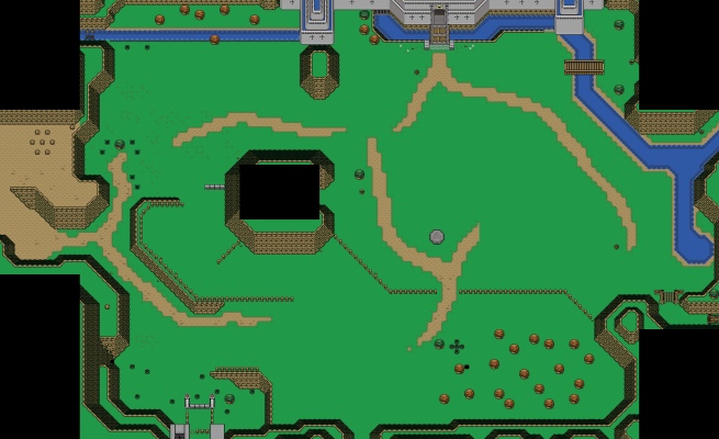
...So, do you think big, open screens are what ZC needs? Well, okay then. Let me show you what it ends up looking like.
This is probably too big to embed, so just click here.
That's one of my teasers for Hyrule Field in my quest. Now, I've filled it out a bit since then, and changed the style of a lot of the graphics for the better, but the layout is still roughly the same. You can see an older version of this in action by trying my 1st demo.
People's reaction?... They didn't like quite that much open space. It bears a lot more resemblance to what you're talking about, but seriously, the LTTP and even the LA way of designing areas does not work as well in ZQuest.
Lastly, I want to point something out: Link to the Past is old. Really old. Relatively speaking, that is. It was one of the early titles of the SNES. Compare it to Seiken Densetsu 3 and you'll see the calibur of change I'm talking about. They didn't necessarily know "Everything There Is To Know" about graphical design back then. Link's Awakening? Not too much different. It was created for a VERY limited platform. The original Gameboy had 3 colors, all told: white, grey, and light grey. It was later upgraded to color, but the graphics were not redrawn. Nor were they redrawn for the Oracles games. So really, Oracles was made using only slightly updated, but still archaic graphics.
Not to mention, if you look at the way they did forests back then, the trees are REALLY, REALLY crammed together. As in, root-to-root, in a pattern that repeats itself exactly. So much for avoiding overcrowding...
Anyway, I think I've made my point. Yes, some people overcrowd, but you can't expect ZC to work the same as official Zelda games. It's different, so the same standards do not necessarily apply. Nor are all of Nintendo's 2D Zelda titles graphically perfect, in the first place. I have real issues with some of their usual methods, and a lot of them have nothing to do with how much "stuff" is on each screen.
Now, two things about this screen:
1. It is in a "town" -- an area with no enemies. Here, traveling from screen to screen is mostly just a matter of sightseeing. Some screens are very "interactive" while others aren't. This one isn't. However, I often save the non-interactive screens for cut scenes (meaning, with dialog). Because of the way ZC works, you can't have too many events on one screen, so screens such as this are a necessity.
2. This screen doesn't have that much walkable area. Is this a flaw? Well... it can be. In my opinion, some of the screens you showed will probably be annoying to the player because there is very little area in which to move. This is also a problem caused by the way ZC works; you do not have larger "screens" in which Link can roam about with the "camera" following him -- in ZC, every area's borders are in exactly the same place and the same size.
...So, do you think big, open screens are what ZC needs? Well, okay then. Let me show you what it ends up looking like.
This is probably too big to embed, so just click here.
That's one of my teasers for Hyrule Field in my quest. Now, I've filled it out a bit since then, and changed the style of a lot of the graphics for the better, but the layout is still roughly the same. You can see an older version of this in action by trying my 1st demo.
People's reaction?... They didn't like quite that much open space. It bears a lot more resemblance to what you're talking about, but seriously, the LTTP and even the LA way of designing areas does not work as well in ZQuest.
Lastly, I want to point something out: Link to the Past is old. Really old. Relatively speaking, that is. It was one of the early titles of the SNES. Compare it to Seiken Densetsu 3 and you'll see the calibur of change I'm talking about. They didn't necessarily know "Everything There Is To Know" about graphical design back then. Link's Awakening? Not too much different. It was created for a VERY limited platform. The original Gameboy had 3 colors, all told: white, grey, and light grey. It was later upgraded to color, but the graphics were not redrawn. Nor were they redrawn for the Oracles games. So really, Oracles was made using only slightly updated, but still archaic graphics.
Not to mention, if you look at the way they did forests back then, the trees are REALLY, REALLY crammed together. As in, root-to-root, in a pattern that repeats itself exactly. So much for avoiding overcrowding...
Anyway, I think I've made my point. Yes, some people overcrowd, but you can't expect ZC to work the same as official Zelda games. It's different, so the same standards do not necessarily apply. Nor are all of Nintendo's 2D Zelda titles graphically perfect, in the first place. I have real issues with some of their usual methods, and a lot of them have nothing to do with how much "stuff" is on each screen.
#44
Limzo
-
- Members
-
_
Posted 12 November 2006 - 07:26 AM
Bravo bravo. Very well put radien.
I'm in favour of this being put in the archives for others to read, and learn from.
I'm in favour of this being put in the archives for others to read, and learn from.
#45
Dawnlight
-
- Members
-
My name is NOT Jason!
- Real Name:Justin
- Location:Chicago, IL
Posted 12 November 2006 - 10:33 AM
Is doesn't matter how crowded the overworld/dungeon is. Quest makers are using clever and creative thought of making a quest. Take Shoelace's quest for example, he uses what he has of the Pure Set to make the game as entertaining as possible. And for Gashin's I've never seen tiles a beautiful as the Pure Set. In my opinion, Gashin's quest is going to rock. What I'm saying is, it doesn't matter if the screen is overcrowded, the quest makers are making their quests as fun as possible.
1 user(s) are reading this topic
0 members, 1 guests, 0 anonymous users

