QUOTE(Koh @ Mar 6 2013, 04:35 PM)

I see what you're saying. I just like really bright and vibrant colors; the environment should be made just as important as the characters, to absorb you into the world IMO. Well I'll save palette editing for last, as that's an aesthetic, and most would probably not even use the default palettes anyway XD.
This isn't a good idea, as palettes play a rather large role in the
creation of pixel art. Whether a particular pixel looks better at one tone or another depends heavily on your palette - particularly the contrast between different tones. For example, say your "working palette" has a colour range that's fairly low contrast, and you're drawing something soft - like a marshmallow tree or something. Since your colours are low contrast it looks fine using a lot of different shades. Now you go to draw a rock using the same colours, and realise that the low contrast just isn't giving you enough to craft some hard edges. So you adjust the contrast to make the rock look better, and now your marshmallow tree looks like a rock. So you have to go back and redo your marshmallow, cutting out some of the darker pixels to soften it up a bit.
This is why it
really helps to nail down your palette as soon as possible, so you don't have to go back and redo everything you've already done when a future palette revision makes it look like crap.
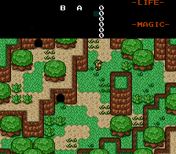
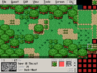
As for your current palette, as others have pointed out it's rather boring. You should consider yellow-shifting your grass colours, as grass isn't usually greener than leaves. You also need to add more contrast to your leaves, and brighten up the dirt. At the moment the dirt looks very grey and washed out. I'll do a quick recolour as a suggestion (still needs tweaking, but right away it looks much better IMO). Yours on the left, mine of the right:

I also noticed that you're using a LOT of colours, and many of those colours are very similar to each other. There's absolutely no reason to use five shades for grass, five for leaves, and five for dirt. You should be able to easily fit grass, dirt, mountains, and maybe even leaves into a single cset, yet you've used almost one and a half. Unless you
need the flexibility you should really try to blend your colour sets more - like having your dirt the same colour as mountain highlights, or having your grass and leaves share darker shades, and use highlights to differentiate the two (you can seriously trick the eye into believing a single colour is a variety of different colours, just by its proximity to others). This has two main benefits: it uses less palette space (giving you more breathing space for colour variety) and gives the scene harmony. It makes your scene look like a whole picture, rather than individual bits and pieces stuck together.
Anyway, I suggest you research a bit on colour theory - particularly regarding pixel art. Learn how to get the most out of a limited palette, rather than creating so many superfluous shades of each colour.