Shoshon the Elegant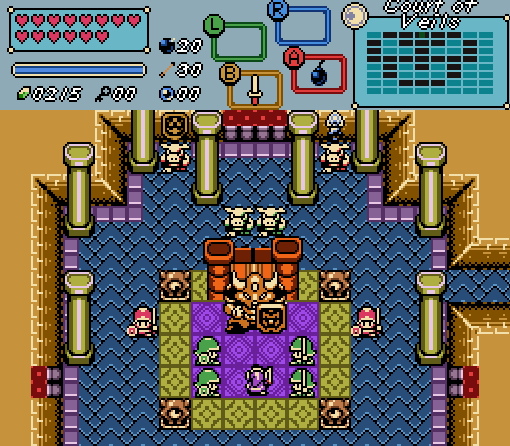
Link approaches the king of the Court of Veils.
xanadude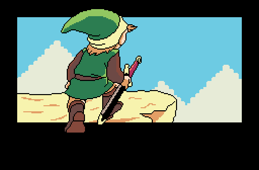
"Just then, a boy from a far off land arrived to Hyrule, with only a rusted sword in hand..."
Ecruteak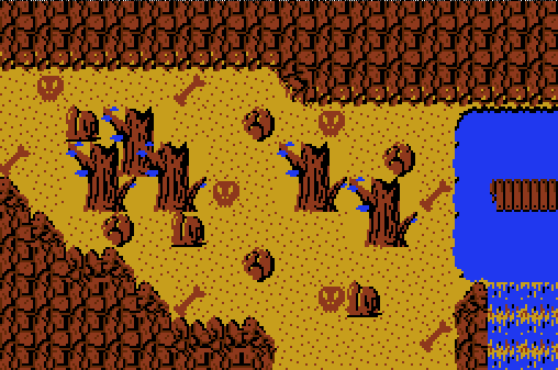
Basic.
Dimentio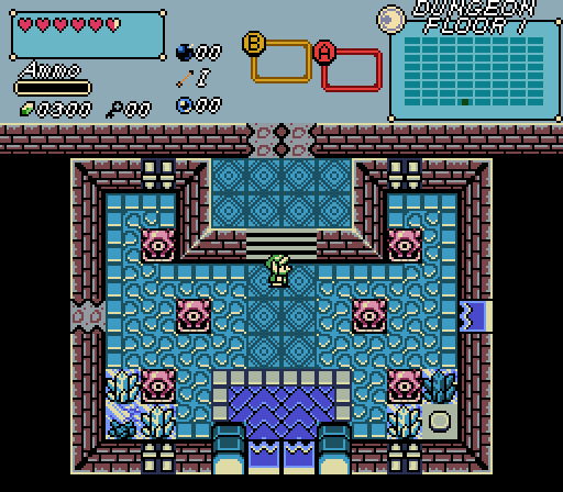
"Man, th-this place is ch-chilly! I-I probably sh-shouldn't have t-turned off those t-t-torches..."

Screenshot of the Week 646
Started by
Neppy
, Jan 21 2018 10:50 PM
Shoshon the Elegant xanadude Ecruteak Dimentio
-
 This topic is locked
20 replies to this topic
#1

Neppy
-

- Members
-

Grand Overlord Empress
- Real Name:It's dangerous to go alone. Take Nep!
- Location:Minnesota
Posted 21 January 2018 - 10:50 PM
#2
Eddy
-

- Moderators
-

ringle
- Real Name:Edward
- Pronouns:He / Him
- Location:London, United Kingdom
Posted 22 January 2018 - 07:30 AM
Shoshon the Elegant - This seems pretty good, I really like the general structure and design of the screen. Pretty interesting to see an Armos Knight being used as a king too. I don't really have any complaints about this one so nice job.
xanadude - This looks really nice! Besides the clouds in the background, was this all sprited yourself? The only thing that really bothers me is the fact that Link kinda goes outside the box at the top or bottom. I think it would look much better if he was cut off at the sides just so it doesn't have this weird effect taking place.
Ecruteak - Basic but good. I like the custom mountains and tiles you have here, they definitely make the area look quite unique. As a suggestion, maybe you could make the bones and stuff white instead of brown? I imagine it might make the screen look a bit better, but that's up to you.
Dimentio - Oh no are you making an ice dungeon? reeeeee Ok but seriously, this looks pretty neat and I like the design of the screen. I personally find it a bit weird how the top wall kinda just goes off to the sides there with the black void just below it. I generally try to avoid doing things like that since it looks a bit weird, maybe you could try and cover up the void at the top by extending the walls or something? Either way, looks good.
Kinda tough to choose this week, but I'm gonna go for Shoshon.
#3
Architect Abdiel
-

- Members
-

Kingdom Builder
- Real Name:Michael
- Location:Florida
Posted 22 January 2018 - 07:37 AM
Thanks. I don't really want to keep the Armos Knight as the king tbh. Since we are restricted from making our own tiles in the contest though, I just liked him more than the other options I saw.
Another thing, that throne is made with a bunch of FFCs throne on top of 2 chair combos.
I would change a few things with my own tiles though.
Another thing, that throne is made with a bunch of FFCs throne on top of 2 chair combos.
I would change a few things with my own tiles though.
- Eddy likes this
#4
Architect Abdiel
-
- Members
-
Kingdom Builder
- Real Name:Michael
- Location:Florida
Posted 23 January 2018 - 06:30 PM
Shoshon:
I finished this dungeon aside from a little refinement earlier.
xanadude:
I have a hard time looking at this as a "screenshot" personally, but it still looks very nice. You got the shape down pretty much spot on, though I would put Link's foot on ground instead of black.
Ecruteak:
Love the mountains. I feel like the screen might be cramped however and it's lacking in contrast. My advice is to throw in different colors.
Dimentio:
Excellent. If I were to vote out of the three that aren't mine, I'd vote here. Solid composition and pretty colors.
#5
xanadude
-

- Members
-

heh
- Real Name:Ethan
- Location:New Jersey
Posted 23 January 2018 - 10:12 PM
xanadude:
I have a hard time looking at this as a "screenshot" personally, but it still looks very nice. You got the shape down pretty much spot on, though I would put Link's foot on ground instead of black.
I mean, it's shot of a screen from my game, so I don't see why it wouldn't count. The reason Link goes out of the artwork is for many creative reasons I personally thought were useful. For one, it actually looks more jarring if Link's sprite is cut off, since the frame of the scene needs to be a certain size to match the others. And the main reason I chose to display him this way is because it's the shot where Link enters Hyrule. He is entering the scene of the game, and the art reflects that by showing him walk into the scene.
- Matthew likes this
#6
Architect Abdiel
-
- Members
-
Kingdom Builder
- Real Name:Michael
- Location:Florida
Posted 23 January 2018 - 11:25 PM
I'd never argue that it wouldn't count. It's just a personal preference I suppose.
Now that you mention it that way, I can see Link walking into the shot. Which is kind of cool after a second look.
I wasn't talking about cutting off his foot before, just bringing the rock down. This is your vision though. And I think it's fine as is.
Now that you mention it that way, I can see Link walking into the shot. Which is kind of cool after a second look.
I wasn't talking about cutting off his foot before, just bringing the rock down. This is your vision though. And I think it's fine as is.
#7
Evan20000
-

- Members
-

P͏҉ę͟w͜� ̢͝!
- Real Name:B̵̴̡̕a҉̵̷ņ̢͘͢͜n̷̷ę́͢d̢̨͟͞
- Location:B̕҉̶͘͝a̶̵҉͝ǹ̵̛͘n̵e̸͜͜͢d҉̶
Posted 24 January 2018 - 12:38 PM
Dimentio - Oh no are you making an ice dungeon? reeeeee Ok but seriously, this looks pretty neat and I like the design of the screen. I personally find it a bit weird how the top wall kinda just goes off to the sides there with the black void just below it. I generally try to avoid doing things like that since it looks a bit weird, maybe you could try and cover up the void at the top by extending the walls or something? Either way, looks good.
Kinda glad I'm not the only one triggered by void-ceiling in gameboy! ![]()
I'll write up a detailed post later.
#8
Deedee
-

- Moderators
-
Bug Frog Dragon Girl
- Real Name:Deedee
- Pronouns:She / Her, They / Them
- Location:Canada
Posted 24 January 2018 - 03:19 PM
The entire point of the void ceiling was to make the dungeon feel more LA-like. The top wall is an except I wasn't sure of how to handle.
- Architect Abdiel likes this
#9
Anthus
-

- Members
-
Lord of Liquids
- Location:Ohio
Posted 24 January 2018 - 04:53 PM
Fwiw, I like the black void.
#10
trudatman
-

- Members
-

one point nine hero
- Real Name:that guy
- Location:State Of Love And Trust, The United State Of Amorica.
Posted 24 January 2018 - 11:50 PM
nope.
- Jenny, Deedee and Matthew like this
#11
Neppy
-
- Members
-
Grand Overlord Empress
- Real Name:It's dangerous to go alone. Take Nep!
- Location:Minnesota
Posted 25 January 2018 - 12:13 AM
You've been told that this is unacceptable by Einsiety, and I posted about how this is against SotW rules, and even PureZC rules in the last SotW.nope.
Einsiety's post...
This is what I led in with on last weeks SotW.Looks like someone could use some edumacation.screenshot critique is a different thread, but, generally, I vote for pretty ones and/or ones I want to play. thank you.
1. When commenting on screenshots, please leave constructive feedback.
Screenshot of the Week 645
This is spam, and is unacceptable by both SotW, and PureZC rules. Further posts like this will result in actions being taken, including removing your access to Screenshot of the Week.Just putting this here as a reminder to the rules in Screenshot of the Week.
There should not be any one or two word posts... anywhere on PureZC, as it counts as substance-less. If you don't have anything to comment on for any of the screens, then there isn't really any reason to post at all. Thank you.1. When commenting on screenshots, please leave constructive feedback. The screenmaker will find it most helpful if you list both the positive and negative aspects of their screen in a clear, polite manner.
- Jared likes this
#12
trudatman
-
- Members
-
one point nine hero
- Real Name:that guy
- Location:State Of Love And Trust, The United State Of Amorica.
Posted 27 January 2018 - 12:27 PM
gotcha. absurd, but understood. it is absurd because the thread type is polling. "who is most likely to talk to themselves?" Culex. adding more words wastes my time and y'all's. "which entry is best?" Dave's. in such a case the post isn't needed, but when NOT selecting one of the choices, the post seems helpful in itself, brief as it may be. overzealous staff action is corrosive. having rules and searching for drama based on those rules negatively affects the community. I have been around long enough to see the rules and rulers cycle through repeatedly. keeping up with the current whims of staff I have never heard of... is work. please don't reactionarily delete this. please don't tack on further demerits for daring to publicly examine degradation of our coherence. please just understand that my intent is pure and that I am not reading every word of this site. taking away my access to screenshot threads seems extreme. but if the rush inherent in realizing your power to do that is important to you, I am powerless. yay?
#13
Espilan
-

- Members
-

Peahat.
- Real Name:Michael
- Pronouns:He / Him
- Location:Ohio
Posted 27 January 2018 - 12:44 PM
If you're not voting, you could still explain why. I mean, don't like any of the shots? Why not point out what it is that you dislike about them, instead of just indicating that you do dislike them?
- Shane likes this
#14
Shane
-

- Moderators
-
💙
- Pronouns:He / Him
- Location:South Australia
Posted 27 January 2018 - 12:51 PM
adding more words wastes my time and y'all's.
How about not posting if you don't want to waste our time presenting an opinion then? This isn't a "you're mean please keep your opinion to yourself" kind of post but your logic is quite baffling here. If you have enough time to express the bare minimum of an opinion surely you have enough time to at least justify and validate your post just a smidget so it doesn't come off as spam. A sentence at most. It's a message forum, you're not wasting anyone's time making us read a sentence or two. ![]()
--
I voted Dimentio! I like the vibe I get from his dungeon screen, good job.
- Neppy, Cukeman and Deedee like this
#15
Espilan
-
- Members
-
Peahat.
- Real Name:Michael
- Pronouns:He / Him
- Location:Ohio
Posted 27 January 2018 - 01:29 PM
Hi Shane.
Now for an on-topic post myself: I voted for Shoshon. It was a toss-up between his or Dimentio's because I'm a sucker for GB/C graphics, but his won out mostly by means of literal coin-flip. Comments below:
@Shoshon
The bottom of the throne lacking black lines makes it looks kind of like it actually clips into (or is actually attached to) the floor. I don't know if it's intentional, but it does look slightly odd. As for the four torches at the top of the screen, I'd probably take off the ones on the outside and leave the center two, but that's just me.
The dmap name and the R-button item box both slightly clipping off the top of the sceen does bug me a bit, though. Would you be able to bump them (and the A-button and the map itself) down like two or three pixels in the subscreen editor?
@xanadude
This doesn't look bad, but something about those clouds just bugs me, and I can't really put my finger on it at the moment. The side of the cliff can probably be a different (slightly-darker?) color, depending on where the sun's supposed to be; the shading on Link implies that the sun is somewhere in front of him, so the cliffside probably should be darker, as it's facing the screen.
@Ecruteak
Honestly, this shot feels a bit incomplete; you've added some more color to the mountains and bridge, but to nothing else, which makes things feel to me like they clash just a little bit. The ground tiles can probably get away with being left alone (if not having the brown they use be a lighter one), but if you're adding an extra color to things you might want a look at the trees and the rocks as well, and possibly the waterfall.
@Dimentio
The black space is a little jarring, but when you're making a room that's smaller than the whole screen, what can you do? Also, the double hole in the northern wall looks funny, have you considered doing shifted hole-in-the-wall tiles to have it as a single centered hole? Making the bottom door a single large shutter instead of two shutters side-by-side probably wouldn't hurt anything either.
As with Shoshon's shot, the dmap name barely clipping off the top does bug me a bit. A small subscreen edit would take care of that, though.
Also tagged with one or more of these keywords: Shoshon the Elegant, xanadude, Ecruteak, Dimentio


0 user(s) are reading this topic
0 members, 0 guests, 0 anonymous users

