Jump to content

Photo

Screenshot of the Week 760

Aslion Demonlink Rambly TheManHimself Twilight Knight

  • This topic is locked This topic is locked
16 replies to this topic

Poll: Screenshot of the Week 760 (45 member(s) have cast votes)

Cast your vote!

You cannot see the results of the poll until you have voted. Please login and cast your vote to see the results of this poll.
Vote

#1 David

David

    Fallen leaves... adorn my night.

  • Administrators
  • Real Name:David
  • Pronouns:He / Him

Posted 01 August 2021 - 10:16 PM

Aslion

Aslion.png

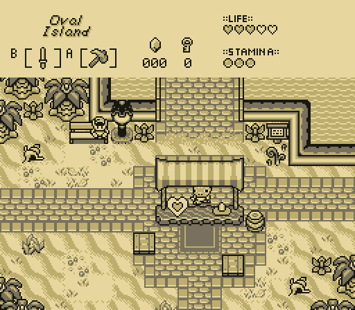
make a sentence out of these words: I, bored, of, lyin', on, this, beach, am


Demonlink

Demonlink.png

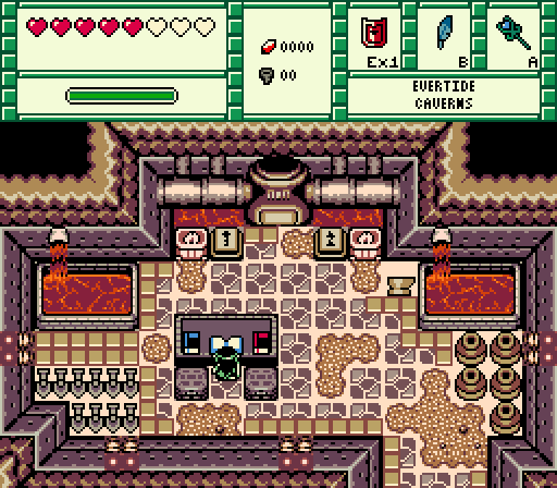
Interesting... a book on how to use the furnace to melt ore...


Rambly

Rambly.png

merely dearly departed juveniles get a clue

twenty-seven ways to lie &

subtle ways to tell a lie &


TheManHimself

TheManHimself.png


Twilight Knight

Twilight%20Knight.png

Everybody wants to rule the world...


  • ShadowTiger, DarkFlameSheep, Twilight Knight and 1 other like this

#2 Moosh

Moosh

    Tiny Little Questmaker

  • ZC Developers

Posted 01 August 2021 - 10:21 PM

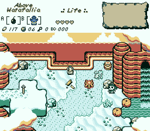
Rambly! For your crimes against palette design and gameboy mountain perspective, I sentence you to receiving my vote. I really like this screen. I just think it's neat.


  • Rambly, Aslion and Sheik like this

#3 Nicholas Steel

Nicholas Steel

    Hero of Time

  • Members
  • Location:Australia

Posted 01 August 2021 - 10:51 PM

Beach for the win.


#4 SkyLizardGirl

SkyLizardGirl

    Unbeknownst to danger we call upon your help

  • Banned
  • Real Name:Arianna Crystal Ritter
  • Location:Earthia

Posted 02 August 2021 - 02:38 AM

I like the Vending lizard sitting under that stand.

Aslion


Did you create a new blacksmith system?

Demonlink


Your snow setting looks like mint an chip Ice cream.

Rambly


Are you going to put a ladder and diving board on the edge there?

TheManHimself


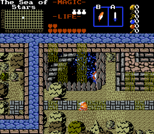
Is that Bubble Bass?

Twilight Knight


Edited by SkyLizardGirl, 02 August 2021 - 02:44 AM.

  • Rambly, Twilight Knight, Aslion and 2 others like this

#5 Twilight Knight

Twilight Knight

    Tell all with glee, Argon's on PureZC

  • Members
  • Real Name:Sven
  • Location:Rotterdam, NL

Posted 02 August 2021 - 05:30 AM

I voted for Rambly, really sweet design and an unique atmosphere!

It wasn't an easy choice though, the other 3 submissions (other than my own) are really good as well.


Is that Bubble Bass?

Twilight Knight

Haha, they definitely share some resemblance now I look at it!


  • SkyLizardGirl likes this

#6 Aslion

Aslion

    End Fascism

  • Members
  • Real Name:Ryan
  • Location:Plug One's spectacles

Posted 02 August 2021 - 09:36 AM

stacked week


  • coolgamer012345 likes this

#7 Ghost

Ghost

    Experienced Forumer

  • Members

Posted 03 August 2021 - 02:59 PM

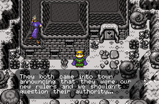
Twilight knight easily. who are those men, why are they so huge, interesting use of building tiles.


shame how much gb graphics dominate these competitions, though they are pretty.


  • Twilight Knight likes this

#8 Riflezen

Riflezen

    sometimes does stuff

  • Members
  • Real Name:Gus
  • Location:in the trees

Posted 03 August 2021 - 04:35 PM

Both DemonLink's and Alison's shots look nice, but I went with the latter for looking less... video-gamey.

bored of lyin' on this beach, i am


Rambly has commited a crime against perspective, brain is registering that ocean as a side-view area. Interesting palette though!


The perspective also looks really bizzare in TheManHimself's shot, I'm not a fan of how the trees go into the wall.


I don't really have a lot to say about Twilight Knight's shot, other than how it doesn't look very "SotW" to me, idk.


Sorry for being mostly negative this time around.


Edited by Riflezen, 07 August 2021 - 12:45 PM.

  • Twilight Knight and Demonlink like this

#9 Ether

Ether

    Pale Stranger

  • Members
  • Pronouns:She / Her

Posted 05 August 2021 - 11:19 PM

Aslion's screen is a pretty nice screen that I might have voted for in a different week, but it's taking third here. Also is that tokay selling a wizzrobe? Is this trafficking?
 
I voted Demonlink, partly because nobody else who posted did and I felt bad, and partly because, well, it's a cool screen with a cool concept! I kind of think the books could stand to be a bit more color-coordinated, though. I'm not sure that the crusted lava was necessarily the best choice for a basin that's actively having more lava poured into it, but this might work better when it's animated.
 
Rambly's palette is so weird and pretty and I would have happily voted here too. I'm not a huge fan of those mountaintops, though, they...kind of remind me of termite mounds? It's a shame, because I don't love standard GB mountains either and I definitely wish there were more ways to do them. And I feel like there's got to be a way for this general approach to work, and I'm glad that this was even attempted! But these particular mountains just feel small and flat, especially with that waterfall mouth so close to the top. Where could that water even be coming from?
 
TheManHimself's screen doesn't work for me at all...I don't understand what I'm looking at. Are the blue stone tiles a wall or a sidewalk or a pit? Why are bits of tree vanishing into the I'm-not-entirely-sure-what-those-brown-border-tiles-are? Everything feels so jarringly disjointed, like it's clearly trying to imply depth in some places like the starry void and the ridge next to it, and in other spots depth is totally optional, including the north sides of that same starry void and ridge. I think I have this problem with a lot of Them Bones screens, unfortunately, which I guess is fine because I know that it clicks with a lot of other people.
 
I'm not really sure what to say about Twilight Knight's screen. The guy on the left does have a surprisingly fitting skulking-on-a-roof pose. Are those guys going to be two to three times the size of Link when you inevitably fight them? 

Edited by Ether, 05 August 2021 - 11:33 PM.
  • Twilight Knight and Demonlink like this

#10 Twilight Knight

Twilight Knight

    Tell all with glee, Argon's on PureZC

  • Members
  • Real Name:Sven
  • Location:Rotterdam, NL

Posted 06 August 2021 - 09:29 AM

I don't really have a lot to say about Twilight Knight's shot, other than how it doesn't look very "SotW" to me, idk.

I was also doubtful of submitting the shot, since cutscenes usually don't do that well, but I was proud of this long cutscene I just made :-)

Also don't worry about having more negative feedback than positive. I think it's fine and you're being nice with it, so it's alright!


The guy on the left does have a surprisingly fitting skulking-on-a-roof pose. Are those guys going to be two to three times the size of Link when you inevitably fight them?

Indeed, the left one has a only a sitting pose, it's a bit of a running gag in the quest. (totally not too lazy to make more sprites  :shy: )
You're also right about the sprite size during the boss battle(s).


#11 Rambly

Rambly

  • Members

Posted 06 August 2021 - 06:05 PM

Rambly's palette is so weird and pretty and I would have happily voted here too. I'm not a huge fan of those mountaintops, though, they...kind of remind me of termite mounds? It's a shame, because I don't love standard GB mountains either and I definitely wish there were more ways to do them. And I feel like there's got to be a way for this general approach to work, and I'm glad that this was even attempted! But these particular mountains just feel small and flat, especially with that waterfall mouth so close to the top. Where could that water even be coming from?

aww, thanks!

yeah, the quest i made this shot for (it's for Aslion's project) uses a lot of old Newfirst/pre-1.92 Game Boy mountains so i figured i'd just roll with it. i was trying to create something that felt like big craggy pointed rocks sticking out of the ground while also adhering to the same general style as everything else. i don't think that's been done much in ZC yet, but the fact that it's hard to actually pull off probably has something to do with why... (the palette is also Aslion's, so credit to him. it was actually a test palette, but i saw it and loved it so much that i just had to try using it in a shot. i thought it gave the appearance of something cold and minty but also being bathed in bright orange sunset colors, which i thought was a really cool contrast)

i hope you guys like this style of shot because it's coming back next week. one of the rules for this quest is that every single screen made in it has to be submitted to Screenshot of the Week, and i ended up making two screens, so.


Your snow setting looks like mint an chip Ice cream.
Rambly

thanks! this is one of the nicest compliments i've ever gotten about a screenshot


really good week this week i think, i nulled but i liked everyone's screens, i think they all work really well on some level. if i hadn't entered i probably would have gone for TheManHimself just cuz it's so trippy and neat lol


  • Twilight Knight and TheManHimself like this

#12 Ether

Ether

    Pale Stranger

  • Members
  • Pronouns:She / Her

Posted 06 August 2021 - 06:18 PM

Actually, I'm wondering now how it would've looked if the top right had another crag behind the existing crags, instead of open horizon.


  • Twilight Knight likes this

#13 DarkFlameSheep

DarkFlameSheep

    She looks like Vanice?

  • Members
  • Location:Japan

Posted 07 August 2021 - 09:46 PM

I'm glad to see Lemonhead at TK's screenshot.


  • Twilight Knight likes this

#14 Twilight Knight

Twilight Knight

    Tell all with glee, Argon's on PureZC

  • Members
  • Real Name:Sven
  • Location:Rotterdam, NL

Posted 08 August 2021 - 04:02 AM

I'm glad to see Lemonhead at TK's screenshot.

I thought I got rid of the lemon-y look  :lol:​  
j3YWjYx.png


  • DarkFlameSheep likes this

#15 TheManHimself

TheManHimself

    Real Human Bean

  • Members
  • Real Name:Shane

Posted 12 August 2021 - 01:07 PM

R.E. the "wall" perspective. It's an aqueduct that probably makes way more sense in the context of the map as a whole. Trees go "into" the wall because they are under it.

As far as the perspective issues are concerned, i really don't see an issue with it, considering that a consistent perspective is completely absent in the tileset itself: love it or hate it, it's a part of classic. Any more detail might make it look better, sure, but at some point it is no longer classic.

Edited by TheManHimself, 12 August 2021 - 01:15 PM.

  • Twilight Knight likes this


Also tagged with one or more of these keywords: Aslion, Demonlink, Rambly, TheManHimself, Twilight Knight

1 user(s) are reading this topic

0 members, 1 guests, 0 anonymous users