Jump to content

Photo

Screenshot of the Week 748

Aslion Ephemeral.7 Haritiro HeroOfFire Jared ywkls

  • This topic is locked This topic is locked
13 replies to this topic

Poll: Screenshot of the Week 748 (47 member(s) have cast votes)

Cast your vote!

You cannot see the results of the poll until you have voted. Please login and cast your vote to see the results of this poll.
Vote

#1 Aevin

Aevin

  • Members
  • Pronouns:He / Him
  • Location:Oregon

Posted 02 February 2021 - 12:51 PM

And here we are with six new shots. Cast a vote for your favorite, and leave some feedback. Thanks so much to our participants this week.
 
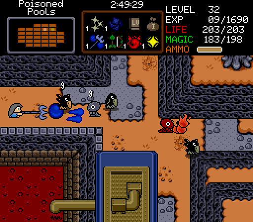
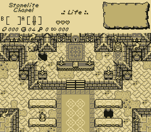
Aslion
Aslion.png
however you're feeling i can make you feel better

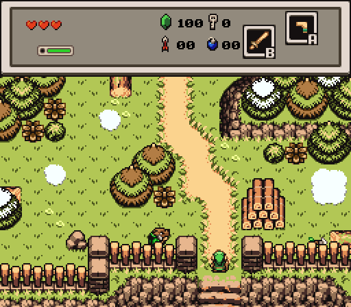
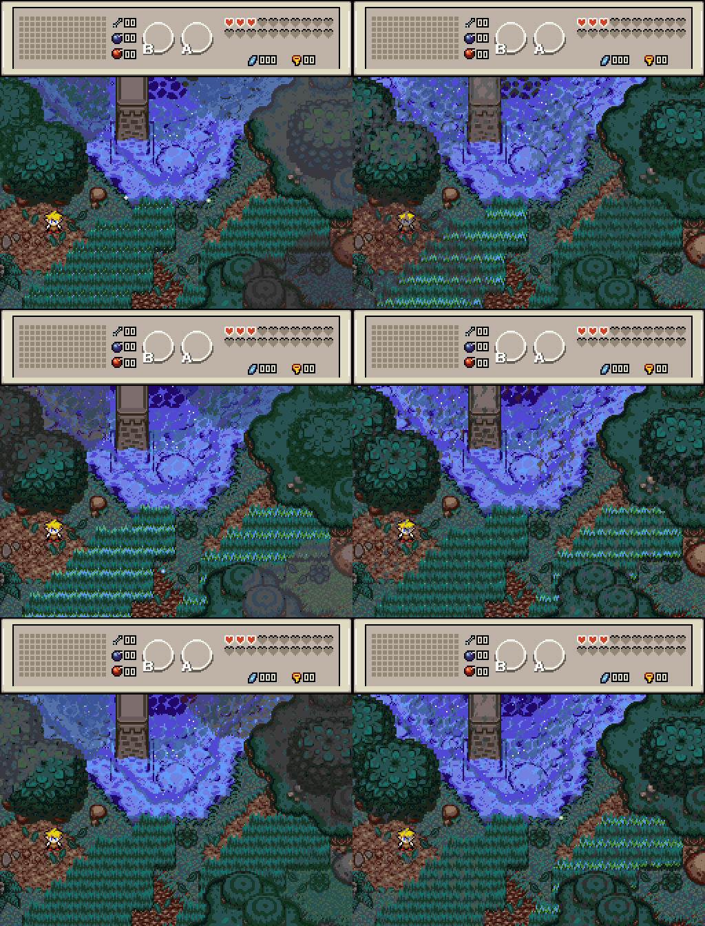
Ephemeral.7
Ephemeral.gif
I swear I dropped my sword over here somewhere.... :whistle:

Haritiro
Haritiro.png
What secrets could this ancient temple hide, here in the heart of the swamp?

HeroOfFire
HeroOfFire.png
Tales from the Palette Shuffler: Spooky Science?

Jared
Jared.png
Hebra Wilds

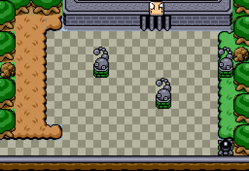
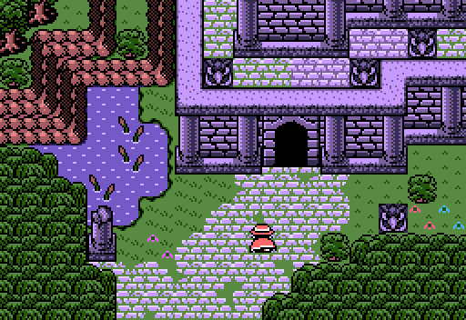
ywkls
ywkls.png
The Tail Cave isn't quite the same as it used to be.
  • SkyLizardGirl likes this

#2 ywkls

ywkls

    Master

  • Members

Posted 02 February 2021 - 01:27 PM

Not voting since I'm in this one.


Aslion- Definitely captures the idea conveyed by name of the area. My only complaint is the monochromatic nature of the screen.


Ephemeral.7- That's a nice, atmospheric; animated region. The clouds make some of the detail difficult to make out.


Haritiro- I really like this one. What tileset is this?


HeroOfFire- Could that be a screen in the same tileset I'm using? I'd be interested in seeing the rest of the area.


Jared- Sometimes you don't need a complicated screen. Simple yet satisfying.


As always, a good turnout. I'm looking forward to seeing how this goes.


  • SkyLizardGirl likes this

#3 klop422

klop422

    Guess I'm full of monsters and treasure

  • Members
  • Real Name:Not George
  • Location:Planet Earth

Posted 02 February 2021 - 01:41 PM

They're all great, but imo Asilon's and Haritiro's are especially beautiful. And that's not a word I use often!


I voted Haritiro, but honestly, for me it was an arbitrary choice at that point.


  • SkyLizardGirl likes this

#4 Mani Kanina

Mani Kanina

    Rabbits!

  • Members

Posted 02 February 2021 - 01:56 PM

Ephemeral.7
Ephemeral.gif
I swear I dropped my sword over here somewhere.... :whistle:

It's extraordinary how long this animation loop is, I was just sitting and watching it for a while as I was doing other things, the fact that the "clouds" comes in two different waves is impressive.

Sadly the scene itself does not interest me so I voted elsewhere, but I just had to comment on it.
  • SkyLizardGirl likes this

#5 Mitchfork

Mitchfork

    no fun. not ever.

  • Members
  • Real Name:Mitch
  • Location:Alabama

Posted 02 February 2021 - 01:59 PM

My favorites this week were Haritiro's and Aslion's.  Haritiro has a really great tileset coming together, it's very consistent in detail.  I really like the edits you made to those eagle statue to fit the slightly noisier style of the rest of the walls.  I will say it doesn't really scream "swamp" to me - maybe there are some palette tweaks you could make for this area to bring out more of the greens and moodier swamp elements.  Of course, it's hard to judge this just based on one screen - the rest of the area may already sell this well enough.
 
I'm a little biased because I got to see Aslion's shot evolve from concept to final, but I think it came out extremely well.  The detail level is nicely balanced, shade blocking is strong between the walls and walkable area of the screen, and the overall layout is pretty perfect for this kind of dungeon introduction.  This is a major revision from previous Stonelite Chapels and it really sells the church sanctuary here I think.  If I had to make one minor criticism, it's that there are simply too many colors. Please reduce to 3 for future SotW entries. Thank you.
  • SkyLizardGirl and Matthew like this

#6 Shane

Shane

    🩶

  • Moderators
  • Location:South Australia

Posted 02 February 2021 - 04:02 PM

It's weird seeing my tiles from a cancelled project a while back fly around recently. Not that I'm complaining. :P


I voted Jared. I'm a sucker for those kinds of areas. Hari was a close second but he supports eagle supremacy over owl supremacy so he gets dungeon (10 years).


  • Jared, Hari, Deedee and 1 other like this

#7 Deedee

Deedee

    Bug Frog Dragon Girl

  • Moderators
  • Real Name:Deedee
  • Pronouns:She / Her, They / Them
  • Location:Canada

Posted 02 February 2021 - 07:16 PM

Almost every shot here is amazing. I don't think I can single out a single best shot, they're all great. Instead of picking a best, I'm gonna pick one that I disliked the most and try and give some criticism that hopefully improve the next shot.

ywkls's shot I really didn't like. You can see color clashing with the rocks on the left side and some layer issues with the grass borders, the entire screen is square and unnatural, and it's just empty. I very much get the impression that it's a generic classic tileset screen converted to a more modern tileset. A good rule of thumb is that nature is unnatural and wild and curves in weird ways, while manmade stuff is build on top of that and has a more structured form; but nature will always try and fight back if the place isn't kept with good upkeep.

You could easily improve the screen by adding some bends to the southern mountain; make it curve and give a bit in places. Then place some singular trees in semi-unnatural ways. This place seems like a ruined building, so why not add some grass growing in misshapen ways overtop the paved stone? Finally, you are wasting Pure GB's greatest selling point: it's unique approach to elevation. Add some elevation in here! Why not have the building and the statues on a plateau, with a staircase leading up to it?  Don't just translate Link's Awakening's original screen: reimagine it! Throw creativity at it until it's stuffed to the brim with creativity! Take risks! Put your own spin on things! Even if the creativity makes it bad, bad is always better than boring when it comes to screen design, cause at least you'll remember it!


  • Professor Bedwetter, Mani Kanina, Shane and 1 other like this

#8 ywkls

ywkls

    Master

  • Members

Posted 03 February 2021 - 10:46 AM

ywkls's shot I really didn't like. You can see color clashing with the rocks on the left side and some layer issues with the grass borders, the entire screen is square and unnatural, and it's just empty.

I spotted some issues at the last second after the shot had been submitted.
I attempted to replace that shot, but for whatever reason the original seems to be what was shown here.
So, I'm aware that those things exist. 
As for the shot being empty, it's meant to be basically the same as the way the entrance to the Tail Cave looks in LA.
 

Finally, you are wasting Pure GB's greatest selling point: it's unique approach to elevation. Add some elevation in here! Why not have the building and the statues on a plateau, with a staircase leading up to it? 

This isn't the Pure GB Tileset. 
It's the Super GameBoy Tileset by Hero of Fire.

As for whether changes in elevation would improve the screen, I feel that's a matter of opinion.

My goal was to have it be recognizable but different.


Don't just translate Link's Awakening's original screen: reimagine it! Throw creativity at it until it's stuffed to the brim with creativity! Take risks! Put your own spin on things! Even if the creativity makes it bad, bad is always better than boring when it comes to screen design, cause at least you'll remember it!

So, as it happens I have done more original variations on existing LA screens in other places.

I plan to submit some of them to future contests.

The work I did with this screen is one of the things that inspired me to create those.

It was the motivation for expanding and adding details to those areas.

When I compare how this looks now to how it appeared in the tileset I was working with when I started this quest; it's definitely better.
  • SkyLizardGirl likes this

#9 Shane

Shane

    🩶

  • Moderators
  • Location:South Australia

Posted 03 February 2021 - 12:36 PM

As for the shot being empty, it's meant to be basically the same as the way the entrance to the Tail Cave looks in LA.

The problem with this mentality (I was guilty of this in the past, in a way) is that Link's Awakening/official Gameboy Zelda screens have less detail because of the screen size differences. With ZC, it makes this level of detail look empty which isn't an approach I don't think Nintendo would do themselves. I'm not saying you should fill in every square with detail, just go above the detailing one might expect from the Gameboy Zeldas.


To suggest ways to detail the screen without it breaking away from LA too much: Adding varied path tiles, adding bushes, adding more trees to give the screen a more interesting shape... Things like that can go a long way while not removing the Gameboy Zelda screen feel! I'm sure if Gameboy Zeldas were afforded this much screen space they'd do the same. But at the end of the day it is your screen, so do whatever you feel is most comfortable. :P But there is an objective difference when translating Link's Awakening screens to ZC that might be best to consider. Good luck with the project!


  • Professor Bedwetter, Jared, SkyLizardGirl and 1 other like this

#10 BigJoe

BigJoe

    Apprentice

  • Members

Posted 04 February 2021 - 10:43 AM

My vote goes to HeroOfFire.  His screenshot reaches me on a personal level.


  • SkyLizardGirl likes this

#11 SkyLizardGirl

SkyLizardGirl

    Unbeknownst to danger we call upon your help

  • Banned
  • Real Name:Arianna Crystal Ritter
  • Location:Earthia

Posted 12 February 2021 - 12:14 AM

Ephemeral.7 and HeroOfFire


Amazing."


Edited by SkyLizardGirl, 12 February 2021 - 12:15 AM.


#12 Twilight Knight

Twilight Knight

    Tell all with glee, Argon's on PureZC

  • Members
  • Real Name:Sven
  • Location:Rotterdam, NL

Posted 12 February 2021 - 11:12 AM

I voted for Aslion for the great atmosphere, detailing and design. Great dungeon screen!


#13 Hari

Hari

    Snivy Gang

  • Members
  • Pronouns:She / Her

Posted 13 February 2021 - 11:14 PM

Haritiro- I really like this one. What tileset is this?


It's a concoction of ripped and edited tiles, custom tiles, and EZGBZ tiles, using the EZGBZ palette structure.


#14 sutibu

sutibu

    Initiate

  • Members

Posted 14 February 2021 - 12:52 PM

For me it came down to Asilon and Ephemeral.


Asilon - This screen gave me a bit of a nostalgic feel and brought me back to Chrono Trigger. The feel of it reminded me of the chapel in the woods. I really love the feel of this screen. The detailing is excellent. This is probably the screen that made me want to play that quest the most of all the others. I want to explore that area and see what there is to see. It looked the most complete of all the others.


Ephemeral - All I can say is wow. I love how you added different timings to the animations of the grass and clouds. If I were to play this quest, I could see myself just hanging out on some of the screens just to look at them and see how they move and interact. I used to think how it would be so cool to have a Yoshi's Island quest where all the tiles are animated. This is the first time I've seen a quest where there is so much going on with movement in the tiles. Someone already pointed out the clouds. In the bottom corner I mistook the clouds for the shadow of the trees with it looking like the leaves were rustling in the wind. That could be another cool effect to add. This is where my vote went this week.


Some of the palettes and perspectives of the other shots didn't really work for me. Overall, I really enjoy everyone's work and creativity though and have loved this contest for many many years now. Thank you all so much for all your wonderful work.


スティーブ


Also tagged with one or more of these keywords: Aslion, Ephemeral.7, Haritiro, HeroOfFire, Jared, ywkls

0 user(s) are reading this topic

0 members, 0 guests, 0 anonymous users