Sheik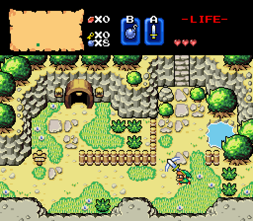
Anthus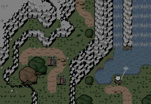
"Thunder rumbles overhead, as the sky gets ready to release a downpour. Spring is here."
Dimentio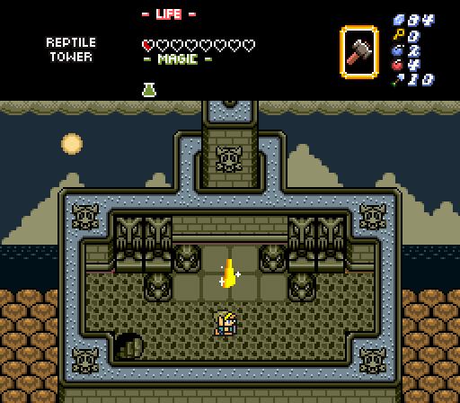
"Wow! What are all those heads?"
"These, Link, are the Faces of Evil. You must conquer each."
"I guess I better get going."

-
 This topic is locked
15 replies to this topic
#1

Neppy
-

- Members
-

Grand Overlord Empress
- Real Name:It's dangerous to go alone. Take Nep!
- Location:Minnesota
Posted 18 June 2017 - 10:18 PM
- Deedee and Matthew like this
#2
strike
-

- Members
-

life is fragile, temporary, and precious
- Real Name:Olórin
Posted 18 June 2017 - 10:23 PM
Sheik's is the boldest, most refreshing shot in my opinion.
-Strike

#4
Moosh
-

- ZC Developers
-

Tiny Little Questmaker
Posted 18 June 2017 - 10:56 PM
Something about Anthus's screen really speaks to me this week. Despite the awkward mix of different styles and perspectives going on, I just had to vote for it.
- Anthus likes this
#5
strike
-
- Members
-
life is fragile, temporary, and precious
- Real Name:Olórin
Posted 18 June 2017 - 11:09 PM
Moosh- I think Anthus's shot transmits a lot of character. The ponderous mountains make you examine the screen at a slower pace. And the guy facing away doing a solitary activity helps this I think. The screen is essentially one of transit, a place connecting other places, but the guy and the mountains get you to slow down and more carefully examine what is happening. Thee reference to Spring compliments this. I am tired and don't know what I am talking about : P
-Strike
- Naru likes this
#6
Cukeman
-

- Banned
-

"Tra la la, look for Sahasrahla. ... ... ..."
- Location:Hyrule/USA
Posted 19 June 2017 - 12:05 AM
I like Sheik's a lot, despite the awkward frame where Link's hand reaches out before the sword gets there (maybe he's using the Force). I know that's just part of ZC so it's not really a drawback. Nice topography on Anthus' but the palette is not to my taste. Dimentio's is demented, which made me laugh, but it's a nice use of castle elements, and the distant trees are GB epic (voted).
*waiting for a 616 universe joke*
Edited by Cukeman, 19 June 2017 - 12:08 AM.
#7
Jenny
-

- Members
-

Hero of Time
- Real Name:Jennette
- Pronouns:She / Her
Posted 19 June 2017 - 12:43 AM
I really like Sheik and Anthus' screens, but the bland colors in Anthus' shot bring it down a bit for me despite the design overall being really good.
Still voted for Anthus though.
#8
Sheik
-

- Members
-
Deified
Posted 19 June 2017 - 02:05 AM
*Takes a second look at Sheik's image*
Mosquitos are the worst though!
That is what he's attacking, right?
The absolute worst.
#9
Deedee
-

- Moderators
-

Bug Frog Dragon Girl
- Real Name:Deedee
- Pronouns:She / Her, They / Them
- Location:Canada
Posted 19 June 2017 - 02:06 AM
Hurray for summer mosquitos.
#10
Sheik
-
- Members
-
Deified
Posted 19 June 2017 - 06:29 AM
@Anthus: May I suggest that you make the colors on the armos statues a lot darker? They almost blend with the ground color and given they are significant interactive objects the player should be given a chance to tell them apart. Simply darkening the particular set of browns involved should suffice. Maybe like this:
- Jenny likes this
#11
Eddard McHorn Van-Schnuder
-

- Members
-
smash the bye button
- Real Name:Ronny Wiltersen
Posted 19 June 2017 - 06:42 AM
*Takes a second look at Sheik's image*
Mosquitos are the worst though!
That is what he's attacking, right?
He's not attacking anything, he threw his sword in the air and it hit his head. This is clearly pictured:

- Eddy likes this
#12
Eddy
-

- Moderators
-
ringle
- Real Name:Edward
- Pronouns:He / Him
- Location:London, United Kingdom
Posted 19 June 2017 - 08:11 AM
Sheik - An absolutely beautiful screen. I really love the bright colours and the tiles used, makes the screen look nice.
Anthus - Looks pretty interesting. The mountains seem to be used kinda strangely and incorrectly in places, but generally it looks nice. The style clash of classic and BS looks a bit odd, but it's not too bad to look at.
Dimentio - Not bad at all, the screen looks pretty nice. It does seem a little weird for the sun to be so high in the sky when the area looks so dark, but besides that it looks like quite a solid screen.
I voted for Sheik this week.
- Neppy likes this
#13
CimFighter
-

- Members
-

CimFam/Writer
- Real Name:Michael
- Location:Connecticut
Posted 19 June 2017 - 08:05 PM
I love Dimentio's screen. It's the most unique and aesthetically pleasing to me. And that sun in the background wins it for me too. The background scenery is the best part of this for me.
- Cukeman likes this
#14
Titanium Justice
-

- Members
-

Justice is served!
- Real Name:Jared
- Location:Ontario
Posted 22 June 2017 - 12:17 PM
I voted for Sheik this week, and Anthus was a very close second.
#15
Architect Abdiel
-

- Members
-

Kingdom Builder
- Real Name:Michael
- Location:Florida
Posted 22 June 2017 - 12:24 PM
I voted for Anthus cause I liked Anthus' the most.
Also tagged with one or more of these keywords: Sheik, Anthus, Dimentio


0 user(s) are reading this topic
0 members, 0 guests, 0 anonymous users

