I did?
Also, I meant to cross that out. Oh well. ![]()

 This topic is locked
Deified

Posted 28 February 2016 - 07:25 PM
I did?
Also, I meant to cross that out. Oh well. ![]()
Germanize

Posted 28 February 2016 - 08:05 PM
So much goodness ![]()
Couple quick comments, since I forgot the thread was going to be closing by now.
Sparkster: Auf Deutsch!! ![]()
...
But more to the point, design observation: dual horizon lines.
First off, love the default tiles and palette.
That said, ZC always provides a perspective challenge with more advanced tilesets, and sometimes the best literal layout plan doesn't translate to the best visual design.
In this particular case, I think you've got a great layout. The hallway, ending at a narrow bridge over a large pit. The two torches on the ground, marking the beginning of the bridge. The two wall torches by the side of the bridge. The giant ice crystals in the pit. And the pots on the side. It's all a good floorplan.
The problem comes when you factor in the perspectives of the tiles you're using. The torches on the ground rising past the torches on the wall below makes for an incredibly sharp shift in perspective from looking upward to looking downward. Makes me think of the Inception city-folding scene, since it's the opposite of how horizon lines typically work. But then, just above that bottom wall and below the crystals, we get another shift in perspective, from looking downward back to looking upward. The two horizon lines just don't work for me. I mean, I think we're all used to seeing upward-facing objects in the bottom halves of dungeon rooms, but those objects are usually still above the downward-facing walls, not below them.
I'd suggest two options. First, do a vertical flip on the torch (and probably pot) tiles. It would solve the perspective issue, but at the same time, it would likely look odd to long-time players. Second, simplify a bit. Bring those ice block tiles in the center path up another row to meet the bridge, then replace the torches/pots with standard corner borders. Not as good-looking, but at the same time, better-looking.
I'll also agree with Jared about the giant ice crystals not quite matching the rest of the scene. The coloring helps them fit in, but the design style is notably different. I think they're fine by themselves, and I can think of other similarly-styled games they'd fit into quite nicely, but I'm not sure this is one of them.
All that to say, I do quite like it, it's just that the dual-horizon-line-thingy could stand to be resolved one way or another.
...
Alright, so much for "quick comments," heh. Let's try that again.
Jared: You seriously make me want to play LttP one more time. Looks both authentic and great in its own regard.
Plus, multi-tiered dungeon water ![]()
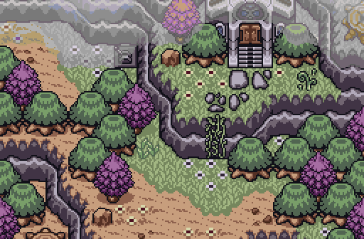
Shane: There's so much I could say, but I'll just say, purple trees FTW.
Aevin: Walking above clouds that are pouring rain below... I don't... yeah, I don't think I've ever seen a thing like that before. Most creative shot I've seen in quite a while.
With all the good entries in this week, I guess it's no surprise next week's contest got delayed for no submissions. This is pretty much 2 weeks worth of creativity anyway.
Deified

Posted 28 February 2016 - 08:52 PM
Eddy: Your screen is solid, what you'd expect to see from a GB tileset screen. However it's a bit dull and boring.
Joelmacool: Great screen, though the long grass tiles feels a bit out of place. This screen would have done much better without those 4 tiles.
Sparkster: I like what you are trying to do here, but the perspective feels a little forced in.
Rambly: That description! lol
Jared: Pretty much the same I can say about Eddy's submission. Pretty legit piece of work, but a tad on the boring side.
Shane: Trying to bring the purple trees back, are we? I would have voted for this image, but I really don't like how the clouds blend in with the stone. If only the clouds were a bit darker like a shadow of a cloud instead or something.
Feenicks: Whoa! Explode Forest? Unique name for a rather not so unique looking environment. Either way, I like it.
Aevin: Looks like another custom tileset made by Aevin? For the very reason this one looks like it was built from the ground up, I have to really give credit where it is due. It's nice, but it doesn't get my vote.
It was a tough decision, but I'm gonna have to go with Joel on this one.
May the way of the Hero lead to the Triforce.

Posted 28 February 2016 - 09:21 PM
With 64.71% of the vote, the winner of Screenshot of the Week 547 is Shane!
Congratulations!
Voting totals:
- Eddy (0 votes [0.00%])
- Joelmacool (4 votes [7.84%])
- Sparkster (4 votes [7.84%])
- Rambly (3 votes [5.88%])
- Jared (3 votes [5.88%])
- Shane (33 votes [64.71%])
- Feenicks (0 votes [0.00%])
- Aevin (4 votes [7.84%])
PureZC Events →
Screenshot of the Week →
Poll Screenshot of the Week 812Started by Taco Chopper , 15 Apr 2024 |
|

|
||
 |
Matthew
PureZC Events →
Screenshot of the Week →
Poll Screenshot of the Week 811Started by Taco Chopper , 01 Apr 2024 |
|

|
|
PureZC Events →
Screenshot of the Week →
Poll Screenshot of the Month 200Started by Taco Chopper , 01 Apr 2024 |
|
|
||
|
|
Shane
PureZC Events →
Screenshot of the Week →
Poll Screenshot of the Week 810Started by Taco Chopper , 20 Mar 2024 |
|
|
|
|
|
Phosphor
PureZC Events →
Map of the Month →
Poll Map of the Month 149Started by Shane , 02 Feb 2024 |
|

|
0 members, 0 guests, 0 anonymous users

