
My goal is to make you change your mind about it if that is possible. Yes, somethings do seem wrong with the extra tiles I added, I already planned on fixing most of them. And palettes, I want to start making my own. And yes, it's very over used right now, but wasn't every new tileset? Even if it is overused, I still love it, it reminds me of GBA but more SNES to it if you know what I mean.

Screenshot of the Week 638
Started by
Neppy
, Nov 26 2017 09:56 PM
Mibbitable Anthus Avataro Shoshon the Elegant
-
 This topic is locked
27 replies to this topic
#17

Neppy
-

- Members
-

Grand Overlord Empress
- Real Name:It's dangerous to go alone. Take Nep!
- Location:Minnesota
Posted 27 November 2017 - 01:57 PM
Yeah, most every tileset ends up being overused in the beginning, and after a while things calm down regarding their use. I remember back when the Pure tileset was new, it seemed to be the only set that anyone was using for quite a while.And yes, it's very over used right now, but wasn't every new tileset? Even if it is overused, I still love it, it reminds me of GBA but more SNES to it if you know what I mean.
- Mibbitable likes this
#18
trudatman
-

- Members
-

one point nine hero
- Real Name:that guy
- Location:State Of Love And Trust, The United State Of Amorica.
Posted 27 November 2017 - 02:07 PM
"That's me in the corner, that's me in the spotlight, losing my religion."
"I'm that kid in the corner, all fucked up and I wanna, so I'm gonna."
I am as unimpressed as that guy in the nonsense room. none are bad. none earn a vote.
"I'm that kid in the corner, all fucked up and I wanna, so I'm gonna."
I am as unimpressed as that guy in the nonsense room. none are bad. none earn a vote.
- Anthus and Deedee like this
#19
Anthus
-

- Members
-
Lord of Liquids
- Location:Ohio
Posted 27 November 2017 - 03:05 PM
"That's me in the corner, that's me in the spotlight, losing my religion."
"I'm that kid in the corner, all fucked up and I wanna, so I'm gonna."
I am as unimpressed as that guy in the nonsense room. none are bad. none earn a vote.
This. This is bigger. Bigger than you, and you are not me~
Okay sorry, but I like that song.
#20
Eddy
-

- Moderators
-

ringle
- Real Name:Edward
- Pronouns:He / Him
- Location:London, United Kingdom
Posted 27 November 2017 - 03:20 PM
Anthus - Oh dear god, it's the return of these nipple guys! Anyways, the screen looks pretty neat and I like the elevation you have here, definitely adds depth to the screen. I imagine wondering around this place must be quite terrifying with those dudes everywhere ![]()
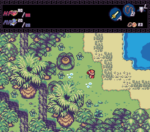
Mibbitable - Looks nice, though I do agree with Anthus about the trees. I would also suggest to try and add a bit more detail in the dirt region on the top-right corner. I haven't looked through the tileset properly, but I'm sure there would be rocks or some kind of ground detail to make that area look a bit less empty. Nice job all around though.
Avataro - That's some nice Pure stuff you got here. I agree with Shane about how the carpets look a little off with that colour, but all around it's a nice simple screen. I don't exactly remember if there is additional house stuff in that Pure set you're using, but it would be neat to see some wall deco maybe, like windows or paintings or something (I know that stuff was in one of the Pure sets lol). But yeah, nice job.
Shoshon - I really like the palette of this and the screen overall. It looks nice and snowy, ignoring the tile error on the right side there of course ![]() Can't really think of anything to add to this, though does that grave have a sand tile under it? I can kinda recognise it I think, and if so that's really weird to have sand in a snowy mountain peak lol. But yeah, very minor thing, good work anyway.
Can't really think of anything to add to this, though does that grave have a sand tile under it? I can kinda recognise it I think, and if so that's really weird to have sand in a snowy mountain peak lol. But yeah, very minor thing, good work anyway.
Quite tough this week actually, but I'll go for Anthus. Those nipple monsters won me over this time ![]() (and the overall screen)
(and the overall screen)
- Anthus and Shane like this
#21
Sheik
-

- Members
-
Deified
Posted 27 November 2017 - 04:54 PM
I said they made me feel nauseous, and I personally think it's a shitty, overhyped tileset. In a month or so the hype will die down and everyone will forget about it, just like firebird.
I don't contest your opinion on the tileset as a whole. I don't particularly care about it either given how it is little beyond pointless ranting. You are allowed to have this opinion for all I care, too. I singled out your critique of the palettes as uninformed. I don't know whether you have spend some time on ZC palette structure and building (as in building a palette structure from scratch) yet so maybe you quite simply overlooked some of the aspects that I value about the LS palettes.
Anyways, what I meant to say is that LS has a very good palette structure (except for the somewhat weaker water-CSet 4) acheiving a lot of depth and variety with a quite limited amount of colors and without the use of 8bit mode, too. That goes beyond the overworld and dungeon palettes and extends to the sprite CSet structure. As for the actual overworld and dungeon palettes: from the point of view of color theory the colors are very nicely chosen, harmonizing with each other. Artistically, the shifts towards yellows in the highlights and towards purples and blues in the shadows makes for very nice dynamics. I especially appreciate how the palettes manage to be quite elaborate while still sticking to a cartoonish feeling. Kind of like pastell SD3 palettes, really. I think you underestimate the amount of work that went into their making and the level of sophistication the results reflect.
There's a line between not being a fan of a work of art and being insincere. I am not a fan of the DoR tileset but I can certainly appreciate the skill that went into its making. Not being able to acknowledge that would simply be poor judgment. Hence my comment above.
Edited by Sheik, 27 November 2017 - 04:57 PM.
- Jared likes this
#22
NoeL
-

- Members
-

Legend
- Real Name:Jerram
Posted 27 November 2017 - 05:21 PM
Some of the assets in NoeL's set are really old. The dungeon walls were used in a few of his older SotW entries.
Fun fact: The walls were completely redrawn to better fit the "mechanics" of Zelda, which is also why the doors are recessed into the walls (in order to keep things aligned to the grid whilst using a non-zelda perspective). In the original set the doors sat flush, but this created a problem with the south-facing doors as you needed to have the overhead part on a separate layer. I'm surprised I never addressed it back then - it's so freaking awkward. But yeah, a significant chunk of the LS assets are at least four years old (though a lot of them were touched up). The bushes actually go back further - someone with a keen eye will notice they're from my old "quest" Link Legends, which according to the title screen was made in 2007!
But back on topic. Unfortunately I can't say there are any stand-outs this week in terms of design, but Shoshon has the best composition for my money. Anthus has the best-looking screen though, with nice art (minus the nipple statues ![]() ) and an interesting location.
) and an interesting location.
I singled out your critique of the palettes as uninformed.
To be fair, all he said was that the palettes make him feel nauseous, which is a perfectly legitimate criticism even if it's not a common one. He didn't comment on the palette structure or versatility so your response seems unwarranted here.
- Anthus, Deedee and Naru like this
#23
Architect Abdiel
-

- Members
-

Kingdom Builder
- Real Name:Michael
- Location:Florida
Posted 27 November 2017 - 05:49 PM
Thanks on the composition compliment. I try to go for that with every screen.
I didn't even plan on making a SotW until a half hour before the topic was posted.
I didn't even plan on making a SotW until a half hour before the topic was posted.
- Naru likes this
#24
HeroHyrum
-

- Members
-

Generic angsty teenager
- Real Name:Hyrum
- Location:Oregon
Posted 27 November 2017 - 07:41 PM
I really liked mibbitable's screen, it looks nice and clean and overall very nice, also what tileset is used in it?
#25
David
-

- Administrators
-

Fallen leaves... adorn my night.
- Real Name:David
- Pronouns:He / Him
Posted 27 November 2017 - 08:25 PM
The tileset is this one right here: https://www.purezc.n...showtopic=73047
It's called Linked Seasons. 
#26
peteandwally
-

- Members
-

chiubicabachiukicaca
Posted 30 November 2017 - 09:37 PM
Damn, Anthus. When I saw the nipples again I peed a little laughing so hard.
- Anthus likes this
#27
Anthus
-
- Members
-
Lord of Liquids
- Location:Ohio
Posted 01 December 2017 - 12:17 AM
Oh, just to clarify, Mibbitable, I was referring to the large palms. The smaller ones look fine. ![]()
And looks like I have a meme boss to make.
#28
Neppy
-
- Members
-
Grand Overlord Empress
- Real Name:It's dangerous to go alone. Take Nep!
- Location:Minnesota
Posted 03 December 2017 - 10:44 PM
With 43.24% of the vote, the winner of Screenshot of the Week 638 is Mibbitable!
Congrats!!
Voting totals:
- Anthus - 7 votes [18.92%]
- Mibbitable - 16 votes [43.24%]
- Avataro - 4 votes [10.81%]
- Shoshon the Elegant - 10 votes [27.03%]
Also tagged with one or more of these keywords: Mibbitable, Anthus, Avataro, Shoshon the Elegant


0 user(s) are reading this topic
0 members, 0 guests, 0 anonymous users

