Prometheus has a message for Eddy.
ywkls
I'm going to have to come here more than once, aren't I?- Nayru
Joelmacool
Is this normal?

 This topic is locked
Grand Overlord Empress

Posted 11 February 2018 - 11:00 PM
Bug Frog Dragon Girl

Posted 11 February 2018 - 11:02 PM
none.
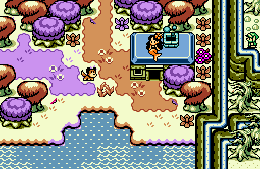
voted JoelMaCool that's a nice mermaid and I thought the dog was the player for
a sec but oh well just boring old LInk yayayayaya
May the way of the Hero lead to the Triforce.

Posted 11 February 2018 - 11:17 PM
Not gonna lie, I can't understand the perspective in either Shoshon's or ywkls's shots. Especially ywkls's, is the player standing on higher elevation? Lower? The same? I just can't tell.
Voted for Joel's here, which is a well-composed shot. The water borders shifting in color is a little jarring, I'm sure it's the intent looking at the rest of the screen, but it's a lot less smooth there than it is in the grass and tree tiles.
Master
Posted 11 February 2018 - 11:24 PM
Didn't vote since I'm in this one.
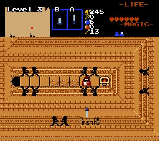
Shoshon the Elegant- I think the joke was funnier when it was in smaller print. For added comic relief, it should have been in Aurebesh. Otherwise, the screen isn't particularly complicated.
Joelmacool- Lots of pretty, bright colors and an interesting screen. I like.
On the perspective in mine, it's a dungeon with raised and lowered floors. The idea was sort of inspired by a discussion with Eppy, but in the end I settled on the concept of a dungeon within a dungeon; where getting the main item makes you have to go back to places you'd already been to reach new stuff.
May the best screenshot win!
"Tra la la, look for Sahasrahla. ... ... ..."

Posted 12 February 2018 - 01:31 AM
Shoshon, I can see what you're going for with the perspective, and while it makes sense, I agree with TS that it's really difficult to make out because the walls and floors have very little color variation. I did a quick edit recoloring the floor and making the walls in light and shadow to make it easier to see what's going on. Dunno if you wanna go to all the work of doing something like that, but it does make it much easier to read (and to see what's going on) :

I voted JMC because it's really appealing and playful, and I like the colors. I do agree that water borders should all be orange or purple though, so it's not so jarring.
Edited by Cukeman, 12 February 2018 - 02:34 AM.
Kingdom Builder

Posted 12 February 2018 - 01:43 AM
Hero of Time

Posted 12 February 2018 - 09:07 AM
Yes
voted for joel
Addicted to Overwatch

Posted 12 February 2018 - 10:31 AM
I do suppose mixing the colours on the border was a tad too much. Though, the idea of the screen was to mix all colours to try and unify them to create one, complete screen.
life is fragile, temporary, and precious

Posted 12 February 2018 - 10:36 AM
Yeah the water borders didn't work but I do think overall you did a good job with your goal. It feels very complete to me. Definitely the clear best shot in my opinion.
-Strike
Bug Frog Dragon Girl
Posted 12 February 2018 - 10:57 AM
The real, real question Soshon needs to be asked: 2018, or Mega Man X8?
Lurking in the shadows...

Posted 12 February 2018 - 10:58 AM
I do suppose mixing the colours on the border was a tad too much. Though, the idea of the screen was to mix all colours to try and unify them to create one, complete screen.
ringle

Posted 12 February 2018 - 01:15 PM
Shoshon the Elegant - My thoughts are generally similar to that of everyone else. The perspective makes sense, but I guess it isn't clear enough unless you look at it for a while. Still though, nice easter egg you have here ![]() However, the sword going towards the message means that you just killed finishing AR3 and so you just cancelled the quest again >=(
However, the sword going towards the message means that you just killed finishing AR3 and so you just cancelled the quest again >=(
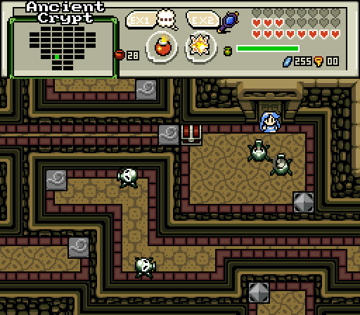
ywkls - Seems fairly complex, I assume those wind tiles on the floor are going to be making some kind of use. Detail is a bit lacking for the most part and the shot looks a bit plain. Maybe try to add a bit of wall detail or maybe add some more objects like pots or torches.
Joelmacool - My favourite this week, I really like the wacky colours of this one. I do agree that the water borders changing colour is a bit weird, but that's probably the only minor thing I can think of. Nice job overall, and I have no clue how that mermaid got on the roof like that lol.
I voted for Joel this week.
one point nine hero

Posted 13 February 2018 - 09:53 AM
chiubicabachiukicaca

Posted 17 February 2018 - 11:02 PM
Easy mermaid house vote
Trofessional Pransposer

Posted 18 February 2018 - 05:31 AM
PureZC Events →
Map of the Month →
Poll Map of the Month 151Started by Shane , 02 May 2024 |
|

|
||
PureZC Events →
Screenshot of the Week →
Poll Screenshot of the Week 813Started by Taco Chopper , 29 Apr 2024 |
|

|
||
 |
Phosphor
PureZC Events →
Map of the Month →
Poll Map of the Month 149Started by Shane , 02 Feb 2024 |
|

|
|
|
|
Anthus
PureZC Events →
Screenshot of the Week →
Poll Screenshot of the Year 2023 - Blue BracketStarted by Taco Chopper , 22 Jan 2024 |
|

|
|
|
|
Joelmacool
PureZC Events →
Screenshot of the Week →
Poll Screenshot of the Month 199Started by Taco Chopper , 07 Jan 2024 |
|
|
0 members, 0 guests, 0 anonymous users

