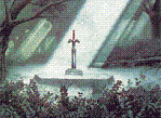
)-( Marchland Malady )-(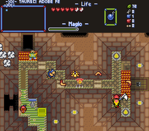
)O- Looks like Link is... Well, what can I say? This is me trying out those layer-based shading tiles of mine again, but with different floor heights this time. I hope that you can perceive depth here, because things would look pretty flat otherwise. -O(
Shane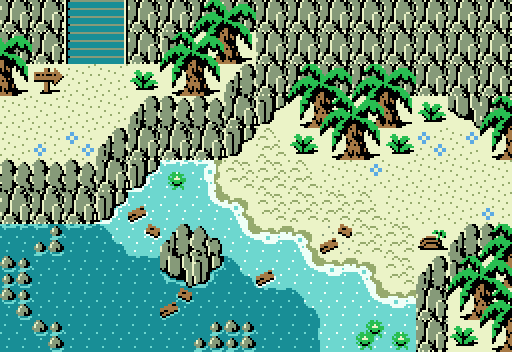
The crystalline shores are a refreshing stop for any pilgrim.
Taco Chopper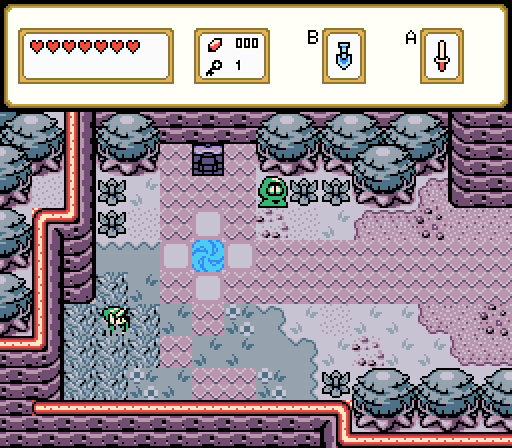
Portal III
Twilight Knight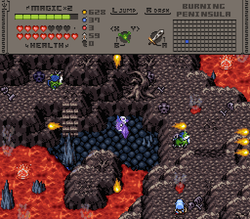
Fuming

Screenshot of the Week 810
#1

Posted 20 March 2024 - 09:41 AM
- Twilight Knight likes this
#2

Posted 21 March 2024 - 02:38 PM
The simplicity of Shane's is what gets me.
- Twilight Knight likes this
#3

Posted 23 March 2024 - 02:19 AM
The compexity of Twilight Knight's is what gets me.
- Twilight Knight likes this
#4

Posted 23 March 2024 - 09:41 AM
Man, this was another close one.
Marchland Malady: I actually really like the screen composition on this one. The tiles themselves are a bit hard to make out though. Too much dithering.
Shane: This one is absolutely gorgeous. Simple, but effective. This feels like the kind of shot Cambria was made for.
Taco Chopper: It feels very GB-esque, by which mean it's simpler than a lot of the GB shots I see from groups like Ambient Silence, and that's honestly kind of refreshing in its own way. If every screen in the game is a complex, multi-layered, award-winning work of art, the game becomes unplayable due to the visual complexity. Simpler shots like this do wonders for the pacing and playability.
Twilight Knight: I really dig this one. I like the complex layering of elevation going on here, and it does a wonderful job of setting an oppressive atmosphere. I do have one complaint though. In theory, I really love the hardening lava crusting over the molten lava near the center of the screen. In practice, on the left side of the rock, it looks like the molten lava is at a higher elevation than the hardened lava. On the right side of the rock, the perspective can be clearly seen, but on the left, especially with how the lava interacts with the mountains, its a bit harder, and every time I glance there, my mind reorients the shot so that the lava is pouring down onto the little hardened area. With that said, I'm not actually sure how I'd fix it. Maybe a more clearly defined border like what exists on the right side of the rock? Either way, it's disorienting and distracts from what's otherwise a beautiful shot.
I ended up going with Shane this time for the beautiful simplicity of it, though Twilight Knight's a very close second
- Twilight Knight, Taco Chopper and Shane like this
#5

Posted 23 March 2024 - 02:48 PM
Shane's screen has a simple, elegant, appealing palette and more detail than meets the eye at a glance. It's a very well constructed scene and my vote for this week.
Taco Chopper's screen is a perfectly fine GB-style shot and gives the player plenty of breathing room, which I appreciate while playing quests. It's on the simpler side. Without any attention-grabbing features, palette, or other hook, it doesn't quite stand out for SotW. But, again, I'd love to encounter a screen designed like this while playing.
Twilight Knight's shot is very atmospheric and has a threatening aura. Very nice subscreen, too. I don't have much feedback. It's just that I prefer Shane's screen by a hair.
- Twilight Knight, Taco Chopper and Shane like this
#6

Posted 24 March 2024 - 04:52 PM
In theory, I really love the hardening lava crusting over the molten lava near the center of the screen. In practice, on the left side of the rock, it looks like the molten lava is at a higher elevation than the hardened lava. On the right side of the rock, the perspective can be clearly seen, but on the left, especially with how the lava interacts with the mountains, its a bit harder, and every time I glance there, my mind reorients the shot so that the lava is pouring down onto the little hardened area. With that said, I'm not actually sure how I'd fix it. Maybe a more clearly defined border like what exists on the right side of the rock? Either way, it's disorienting and distracts from what's otherwise a beautiful shot.
Hmm I see what you mean indeed. I should look into that.
Thank you for the feedback!
#7

Posted 30 March 2024 - 12:20 AM
Gonna keep voting for you )-( Marchland Malady )-( until you win one of these with your eclectic tile pile screens. Keep at it.
#8

Posted 01 April 2024 - 01:18 AM

Congratulations!
Voting totals:
- Shane - 15 (51.16%)
- Twilight Knight - 9 (29.03%)
- )-( Marchland Malady )-( - 4 (12.90%)
- Taco Chopper - 2 (6.45%)
Also tagged with one or more of these keywords: Shane, )-( Marchland Malady )-(, Taco Chopper, Twilight Knight
 |
PureZC Events →
Screenshot of the Week →
Poll Screenshot of the Week 824Started by Taco Chopper , 14 Oct 2024 |
|
|
|
PureZC Events →
Screenshot of the Week →
Poll Screenshot of the Month 203Started by Taco Chopper , 01 Oct 2024 |
|

|
||
 |
Haylee
PureZC Events →
Screenshot of the Week →
Poll Screenshot of the Week 821Started by Taco Chopper , 02 Sep 2024 |
|

|
|
 |
Twilight Knight
PureZC Events →
Screenshot of the Week →
Poll Screenshot of the Week 819Started by Taco Chopper , 05 Aug 2024 |
|

|
|
 |
Matthew
PureZC Events →
Screenshot of the Week →
Poll Screenshot of the Month 202Started by Taco Chopper , 05 Aug 2024 |
|

|
1 user(s) are reading this topic
0 members, 1 guests, 0 anonymous users

 This topic is locked
