
I do like the older cartoon styles for shows like Space Ghost, He Man, etc. While they were used quite a lot, they were also proportionate and looked okay. The character's eyes could've used some color, though.
I like anime art styles that aren't overly ambitious with cuteness, as in the eyes don't take up 80% of the person's face.
The Sonic art style is a hit a miss...I like the toony aspect of it, however, the eyeballs are too big with irises that aren't big enough to accommodate all of that space. So let's just say this one is tolerable.
On to specific aspects of styles:
I don't really care for merged eyes. It looks a bit strange; some characters pull it off okay, but you wouldn't REALLY see that. Tight eyes (where it doesn't look like they have space inbetween, and look like 8 ) are also a bit weird.
I absolutely HATE spaghetti limbs. In other words, in those cartoons I never cared for anyway: Adventure Time, Flapjack, Regular Show, etc., the way they draw limbs is atrocious. There ARE NO elbows or knees, and everything is just a curved line, like a C to represent lifting an arm. This is NOT how limbs work. I could understand if something happened like on Tom and Jerry where one character stretched out another characters arm, and then it became all flimsy and stuff; that's just for the toon moment, but limbs shouldn't be like that ALL OF THE TIME. It looks strange and unappealing.
I do NOT like extremely blocky cartoon styles. Powerpuff girls...Johnny Bravo himself; they have rectangle heads and such. I stomached my distate for the art because I actually liked the shows, but the artstyle was still pretty blegh.
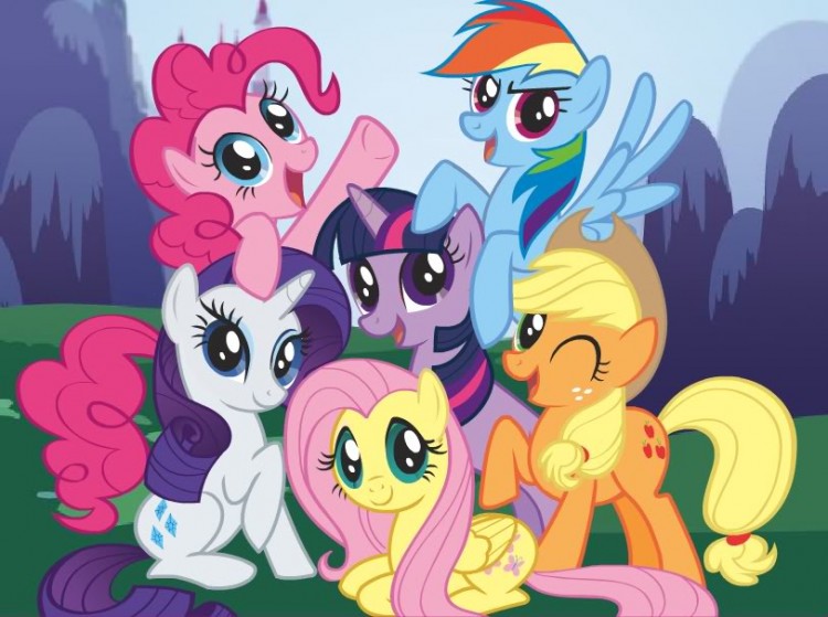
I do NOT like overly cute art styles...Care Bears, Dora the Explorer, My Little Pony, etc. It's too cutesy to take anything seriously, and is not my cup of tea.
Oh, and I don't like the styles that look like they were animated in flash using the features. Many fall into this one.
Edited by Koh, 22 July 2012 - 01:23 PM.