 This topic is locked
Gashin: Fantastic as usual.
Mighty: Like the bubbles.
Revfan: I understand the need for the snow, but it obscures the shot in this case.
Radien: Cool representation of the Fortress from OoT....maybe a tad bit more color, but I love the guards.
I vote for Radien just to spread the love a bit.

Screenshot of the Week 125
Started by
link3505
, Jun 05 2006 04:17 PM
47 replies to this topic
#16

Pol's Voice
-

- Members
-

Adept
- Real Name:Justin
- Location:Pittsburgh, PA
Posted 06 June 2006 - 09:16 AM
#17
Deathbringer
-

- Members
-

Master
- Real Name:Chris
- Location:Why should you care?
Posted 06 June 2006 - 09:53 AM
I'd have to say Gashin.
Mighty's is nice but it's nothing SOTW quality, that doesn't mean that I don't want the tileset.
Radien gets 2nd place.
Revfan get's last. Those mountain tiles don't right next to those lava falls and the grass is dull.
Mighty's is nice but it's nothing SOTW quality, that doesn't mean that I don't want the tileset.
Radien gets 2nd place.
Revfan get's last. Those mountain tiles don't right next to those lava falls and the grass is dull.
#18
Zemious
-

- Members
-

Magicite: Bahamut
Posted 06 June 2006 - 11:21 AM
QUOTE
Revfan: I understand the need for the snow, but it obscures the shot in this case.
That is not snow. @_@
That's ash from the volcano, hence the lava?
#19
Bonegolem
-

- Members
-

Doyen(ne)
- Location:TEXAS
Posted 06 June 2006 - 12:45 PM
Gashin gets my vote. The palette is really eye-pleasing and you just can't beat those palm trees. I also like Mighty Darknut's submission, the outer wall structures in his screenshot give it an enigmatic quality.
#20
Sharon Daniel
-
- Banned
-

.
Posted 06 June 2006 - 02:51 PM
QUOTE(Jonathan @ Jun 6 2006, 09:45 AM)
and Mighty Darknut have you given thought to using tiles that arnt from a metriod game for a metriod quest?
i think gradius tiles could make your quest look more original
i think gradius tiles could make your quest look more original

Well, I am using quite a bit of tiles from BS Zelda and the gameboy Zeldas, plus a bit of custom tiles.
I'm not really a gamer, so I don't know what kind of graphics are out there that I could use. I'll take a look at some Gradius tiles though; thanks for the suggestion.
#21
link3505
-

- Members
-
Ancient
- Real Name:Ben
- Location:The Edge of Infinity
Posted 06 June 2006 - 02:53 PM
QUOTE(NateA80 @ Jun 5 2006, 05:39 PM)
Gashin's screen seems to have the most going on, and looks like it was the biggest effort. It is tough to top all of that. I question the color pattern on the bridge, but then again I am not sure what I am trying to say.
here's a better shot of the bridge, and even some incomplete Zoras!

#22
Sharon Daniel
-
- Banned
-
.
Posted 06 June 2006 - 03:17 PM
I like the pattern on the bridge; it makes it more interesting.
Awesome Zolas, by the way. XD
Awesome Zolas, by the way. XD
Edited by Mighty Darknut, 06 June 2006 - 03:17 PM.
#23
Theryan
-

- Members
-

Burrito
Posted 06 June 2006 - 03:29 PM
I really love the edited walls used in Radien's shot.
But Gashin's palm trees are da bomb! I vote Gashin.
But Gashin's palm trees are da bomb! I vote Gashin.
#24
Pol's Voice
-
- Members
-
Adept
- Real Name:Justin
- Location:Pittsburgh, PA
Posted 06 June 2006 - 04:15 PM
QUOTE(Zemious @ Jun 6 2006, 10:21 AM)
That is not snow. @_@
That's ash from the volcano, hence the lava?
That's ash from the volcano, hence the lava?
Oops....makes more sense now.
I dunno, maybe a little more gray and a little less white then.
#25
NineLives
-

- Members
-
Boom. Zoom. Dakota.
- Location:Los Angeles, California
Posted 06 June 2006 - 05:12 PM
MD, what did you use for the B button?
#26
Sharon Daniel
-
- Banned
-
.
Posted 06 June 2006 - 05:36 PM
QUOTE(XdragonSB @ Jun 6 2006, 06:12 PM)
MD, what did you use for the B button?
That's actually an old sprite that I was using for the wand. I've edited it so the grey ends are bigger and lighter.
#27
Anthus
-

- Members
-

Lord of Liquids
- Location:Ohio
Posted 06 June 2006 - 07:34 PM
Gashin:
Awesome as usual. However, I can't help but notice you like black outlines, which IMO looks better. My poiny is, maybe you should add a black outline in with those path tiles some where. They do kinda clash. Either that are make them darker.
Mighty Darknut:
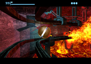
This is also a splendid shot. But, I don't really like the GBC lava... I never really did. I was always more of a fan of the MM or TMC style "32x32" gradient lava. Also, I agree with Radien. There should be more things strewn about the room.
Radien:
This shot has a very nice layout, but the colors are very bland. I can also see that you went back to the small Serenia tiles. I suggest making the fortress a more redish, or goldish color palettes permitting of course.
RevFan9:
Nice layout. I have nothing against this shot, but what is up with that purpleish goo? Is is supposed to be lava?
I null'd.
Awesome as usual. However, I can't help but notice you like black outlines, which IMO looks better. My poiny is, maybe you should add a black outline in with those path tiles some where. They do kinda clash. Either that are make them darker.
Mighty Darknut:
This is also a splendid shot. But, I don't really like the GBC lava... I never really did. I was always more of a fan of the MM or TMC style "32x32" gradient lava. Also, I agree with Radien. There should be more things strewn about the room.
Radien:
This shot has a very nice layout, but the colors are very bland. I can also see that you went back to the small Serenia tiles. I suggest making the fortress a more redish, or goldish color palettes permitting of course.
RevFan9:
Nice layout. I have nothing against this shot, but what is up with that purpleish goo? Is is supposed to be lava?
I null'd.
#28
Sharon Daniel
-
- Banned
-
.
Posted 06 June 2006 - 08:49 PM
Aww, you don't like the Mystic Land lava Rex?
I personally love the colors, despite the fact that it's fire-colored rather than lava-colored. Nevertheless, Prince did an excellent job editing the aLttP (not GBC ) lava, so that's what I'm using.
I personally love the colors, despite the fact that it's fire-colored rather than lava-colored. Nevertheless, Prince did an excellent job editing the aLttP (not GBC
#29
Theryan
-
- Members
-
Burrito
Posted 07 June 2006 - 08:22 AM
I honestly think you should change the pallette, Revfan.
you should make the lava a bit more... fiery. And try making the ash a bit grayer.
you should make the lava a bit more... fiery. And try making the ash a bit grayer.
#30
Zemious
-
- Members
-
Magicite: Bahamut
Posted 07 June 2006 - 11:53 AM
Mighty Darknut, you know alot more than me about Metroid, anyone for that fact knows more than me.
But I did a google search for the lava tiles and found a picture of the 3d moddeled metroud prime.
I think this is the name. @_@
http://www.1101.com/...VA-CAVES_02.jpg
Compare yours and theirs, why don't you try using Rex's lava tiles: http://purezc.com/in...ge=tiles&id=446
or the DoR tilesets lava by Radien?
http://purezc.com/in...ge=tiles&id=470
0 user(s) are reading this topic
0 members, 0 guests, 0 anonymous users

