Anthus
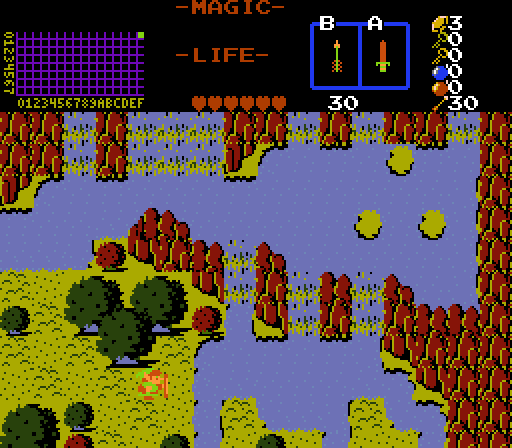
I've got to admit, I ran away from your screen because of the palette making me a little nauseous. But on closer look it is a really neat area in that is has a lot of geography that's pretty elaborate in the sense that there's a lot going on and no real wasted space, but it also doesn't feel crowded, which is a hard balance to pull off. However, I do have one gripe with it. The water in the upper right is at a higher elevation than the water in the upper left, but there's no visual clues in the water to indicate that.
(The body of water between the north and south waterfalls appears to be entirely on the same elevation level until you realize that the left portion is level with the ground at Link's feet and the right portion is coming down a waterfall two combos taller than the ground at Link's feet). Once you realize that it does break the perspective. On the plus side, it's kind of subtle and you won't see it unless you're looking for it. And I know the tileset doesn't come with any sideways waterfall tiles to fix that little problem (Classic wasn't made to be that flexible), but a new combo or two could be created to make that possible...
allb
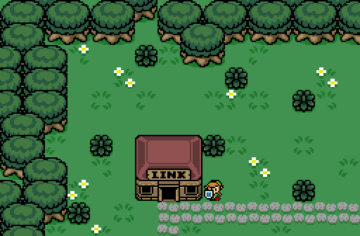
As the others said, great start, looks a little simple (kind of like the upper left corner of a box). Nothing to be ashamed of, it's good, and you'll improve with practice.
Shoshon
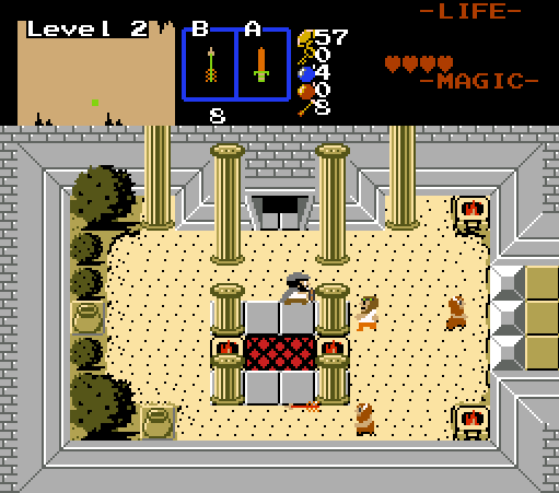
I like this a lot and voted for it. You have a knack for breathing life into Classic. I didn't notice until Eddy pointed it out, but yeah using different colored water (and water borders) for sand looks a little odd. I get that you're doing grass overlapping sand, but I feel like you should use grass/sand borders and try using the "bumpy" ground tile instead (combo 14 in 2.50.2). One last thing, but it's very minor, the tree trunk is as black as its shadow, I'd like to see a brown (even a very dark brown) especially as the room looks very bright and well lit, it feels like we're losing detail on the tree without a reason, given this isn't an area with low visibility or unique lighting making lots of dark shadows. I like how the pillars make the room feel like we have a really high ceiling, but they would logically stop at the top of the walls. Pretty minor considering Z1 perspective feels unnatural to begin with. You could fix it by lowering the pillars to the height of the wall, or editing the wall to be taller. Not a big deal though, just something I thought I'd mention. Sorry to nitpick so much, it's really a great looking screen and I love the theme, and you did steal my vote  .
.
Edited by Cukeman, 16 January 2018 - 11:44 AM.

 This topic is locked