Jump to content

Photo

Need some suggestions


  • Please log in to reply
9 replies to this topic

#1 Radien

Radien

    Courage

  • Members
  • Real Name:Steve
  • Location:Oregon

Posted 26 October 2007 - 11:46 PM

All right. Here's the deal.

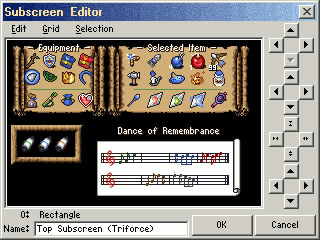
Lately, people have been coming up with some pretty awesome subscreens. This is frustrating, because I would like quality too, but almost all of them (the good ones, at least) are Wind Waker/Minish Cap style. That means a composite set of frames that look like etched stone, and have "indentations" where all of the items go.

I could easily try to make a subscreen like that, either by ripping from Minish Cap or just winging it in the tile editor. But that's not the style I want for DoR, and what I DO want is so different from that style, that I haven't found anything even slightly similar to use as a model or a guesstimate.

Recently I found a frickin' sweet parchment graphic that will make an AWESOME map. I could even use it as frames for my entire subscreen, even though I'd have to edit the various menu frames manually due to the heavy detail. However, that alone isn't enough. icon_unsettled.gif It looks great as a map, but Zelda typically mixes medieval elements with more modern elements, and having a subscreen comprised entirely of parchment is like writing "YE OLDE VIDEO GAEME" on the quest itself. icon_blah.gif

My original idea was for pretty wooden frames covered in vines, because DoR's story will frequently refer back to the forest. However, the wood-and-vine idea is best suited for a black background inside a "picture frame," and that's too sparse. So... I need suggestions. Ones that don't involve stone. You don't necessarily have to refer to existing styles you have seen, ZC or otherwise, but screenshots of anything are welcome if you have them on hand. I CAN draw my own graphics if needed...to a certain extent.

Any ideas?... icon_confused2.gif


Edit: After posting this in my QPF, I thought better of it and decided to move it to Custom Quest Discussion. I'd like as much input as possible.

Edited by Radien, 27 October 2007 - 02:38 AM.


#2 Colin

Colin

    Coblin the Goblin

  • Members

Posted 27 October 2007 - 01:14 AM

Well, if you do anything, make sure you don't overdecorate your passive subscreen. Save the decorations for the active subscreen.

I made those jeweled frames, but those probably aren't what you are looking for... but I have an idea, what if you make a portrait type background for your active subscreen that's like a wooden lattice fencing covered in ivy. Then, stick the items where the ivy would be really thick, maybe have little indents in the clustered ivy for items... and then put a standing rock, or carved stone in the middle where the triforce type things you have are placed... aren't they songs or notes or something?

I dunno, it sounded cool...

You know, though... sometimes the classic subscreen is the best subscreen.

Edited by Nuvo, 27 October 2007 - 01:14 AM.


#3 Radien

Radien

    Courage

  • Members
  • Real Name:Steve
  • Location:Oregon

Posted 27 October 2007 - 02:55 AM

I doubt I'll overdecorate the passive subscreen. If I could have it my way, I would make the hearts and other information appear as an overlay on top of the action screen, just like OoT. icon_wink.gif But there's a sizable area reserved for the passive subscreen, so it'd be wasteful to put anything much below it, even if that were possible.

Hmm, I don't think I've seen your jeweled frames. Can I, out of curiosity? I probably won't use them, as "jeweled" sounds a bit too grandiose for my quest, but it's always nice to see custom work.

Yes, classic can be best, but I'm not down with the whole "negative space" thing. There's too much black; people don't like seeing items on a void (players abhor a vacuum. icon_razz.gif) My beef with people's fancy new subscreens isn't usually the graphics, it's that they often "overcategorize" subscreen information. Especially when it comes to button items.

If you're curious, here's a working example of my subscreen. Definitely a work in progress, but I'm not totally displeased with it.

IPB Image

Please don't comment on alignment. I know it's not perfect yet. Also, that wooden frame in the bottom left is probably gonna go. Well, I'll replace it with another frame, that is.

#4 Joe123

Joe123

    Retired

  • Members

Posted 27 October 2007 - 04:49 AM

That looks great Radien, I'm glad you've ditched those bushy borders from the tileset, they look awful.

IPB Image
he he he he :isproudofselfsmiley:

#5 Russ

Russ

    Caelan, the Encouraging

  • Administrators
  • Location:Washington

Posted 27 October 2007 - 10:36 AM

Radien, the subscreen looks very good. Here is how I think you should improve it: The black spaces in between frames don't look so good. What you could do is get sheet music for the Zelda main theme, and then put that as a backround item. That way, it sticks with the games musical theme, and improves the look of your subscreen at the same time. Or another idea you could consider is keep the black backround and make the frame with the items look like musical notes. Just make all those musical lines (I never can remember what they're called) for the frame, and then position the items on them like notes.

#6 Colin

Colin

    Coblin the Goblin

  • Members

Posted 27 October 2007 - 11:43 AM

IPB Image
Jeweled borders, just a metallic border with gems set in the corners. You may have seen these floating around on several quests, well I'm the original artist of them. Avoid the top one, it looks too... flashy for it's own good. The metal ring and the keys were originally for the keyring on The Lock of the Spirits.


#7 Dechipher

Dechipher

    Junior

  • Members

Posted 27 October 2007 - 12:18 PM

I don't like the notes you're using for the Dance of Remembrance.

icon_razz.gif

#8 Radien

Radien

    Courage

  • Members
  • Real Name:Steve
  • Location:Oregon

Posted 27 October 2007 - 02:51 PM

QUOTE(Joe123 @ Oct 27 2007, 02:49 AM) View Post
That looks great Radien, I'm glad you've ditched those bushy borders from the tileset, they look awful.

Heyyy, I was fond of them. icon_frown.gif I mean, yeah, they're totally not good for frames (especially small ones), but I did like them.

Maybe I should put the wooden ones into DoR v1.2 for others to use, even though I probably won't be using them...

QUOTE(russadwan @ Oct 27 2007, 08:36 AM) View Post

Radien, the subscreen looks very good. Here is how I think you should improve it: The black spaces in between frames don't look so good. What you could do is get sheet music for the Zelda main theme, and then put that as a backround item. That way, it sticks with the games musical theme, and improves the look of your subscreen at the same time. Or another idea you could consider is keep the black backround and make the frame with the items look like musical notes. Just make all those musical lines (I never can remember what they're called) for the frame, and then position the items on them like notes.

That's a pretty clever idea. icon_smile.gif Thanks for the suggestion. I'll see if it's possible to a do variation of some sort. I'm not sure how well it will work, but it's definitely appropriate.

Oh, and I'm pretty sure they are called ledger lines.


QUOTE(Nuvo @ Oct 27 2007, 09:43 AM) View Post

IPB Image
Jeweled borders, just a metallic border with gems set in the corners. You may have seen these floating around on several quests, well I'm the original artist of them. Avoid the top one, it looks too... flashy for it's own good. The metal ring and the keys were originally for the keyring on The Lock of the Spirits.

Ah, just as I expected... really nice, but not fitting more my quest. Oh well. Good job there.


QUOTE(MidiMan @ Oct 27 2007, 10:18 AM) View Post
I don't like the notes you're using for the Dance of Remembrance.

icon_razz.gif

Ha, leave it to the musician. icon_razz.gif What don't you like about them? At least they're real notes... (even if the score has the wrong number of ledger lines)

#9 Joe123

Joe123

    Retired

  • Members

Posted 27 October 2007 - 03:03 PM

Those lines that you place notes on normally are called the stave. And you do have an incorrect number as it's meant to be 5, which does actually look a little strange. Is the tune in it a real one, or just a random assorment of notes that looks good?

Ledger Lines are when you have notes that are higher or lower than the pitches that the stave you are using will accomodate for; in which case you draw extra little lines just for those notes above and/or below the stave.

#10 Radien

Radien

    Courage

  • Members
  • Real Name:Steve
  • Location:Oregon

Posted 27 October 2007 - 03:19 PM

QUOTE(Joe123 @ Oct 27 2007, 01:03 PM) View Post

Those lines that you place notes on normally are called the stave. And you do have an incorrect number as it's meant to be 5, which does actually look a little strange. Is the tune in it a real one, or just a random assorment of notes that looks good?

Ledger Lines are when you have notes that are higher or lower than the pitches that the stave you are using will accomodate for; in which case you draw extra little lines just for those notes above and/or below the stave.

Isn't it called a "staff"? Staves would be plural.

I knew that five lines together make a staff. I thought ledger lines referred to individual lines of either variety, though it's been awhile since I've been in a choir that used sheet music (gospel doesn't, and that's the last choir I was in). But that I might've remembered incorrectly.

The notes aren't a random assortment... they're excerpts from various songs you can learn. Most come from OoT. For instance, the first three green notes are the Song of Storms. I actually listened to them and made sure I wrote down the first few notes of each, correctly. The beats-per-measure and the number of lines on the staff are both intentionally incorrect, because I needed to do it that way to fit them all on the map graphic. (Most stylized music notes in popular entertainment are even less accurate... I often see backwards eighth notes, and rarely see anything longer than a quarter note)


Anyway, back to what could make the subscreen better. I'm more concerned with the appearance of the notes than making them more musically accurate. And I'm more concerned with the menu frames than the musical score.


1 user(s) are reading this topic

0 members, 1 guests, 0 anonymous users