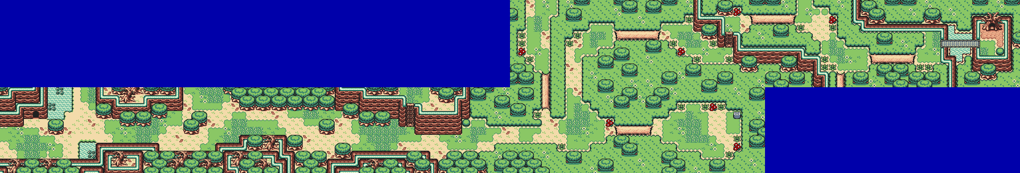
Overworld (so far) of something I'm working on
Rastael
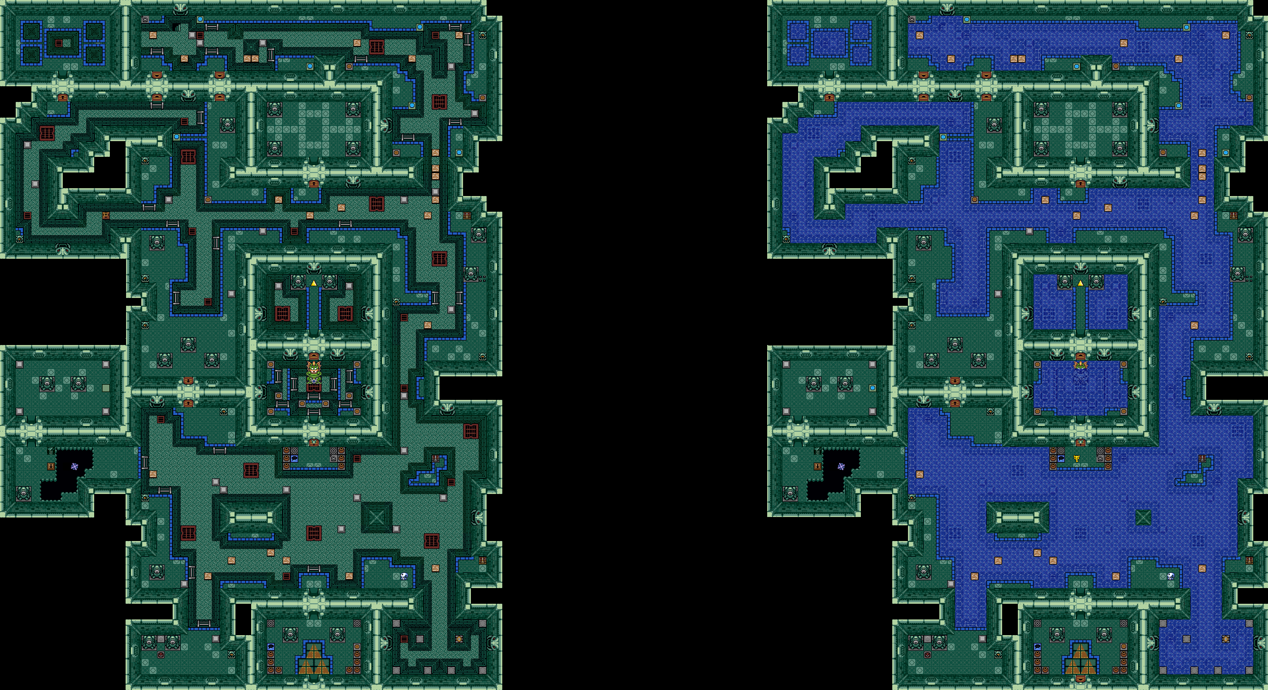
A great water temple in a zelda-game? It's not impossible.

 This topic is locked
Trofessional Pransposer

Posted 01 March 2016 - 02:58 AM
💙

Posted 01 March 2016 - 03:28 AM
Joelmacool: I'm starting to not like that palette if I have to be honest. Feels too pastel for my tastes, and I am a fan of pastel palettes. I like the structure though. There's nothing truly wrong with your map, it's great if anything, but it's too small and basic in comparison to what it's up against.
Rastael: I voted here. I wouldn't call it a "great water temple", I've seen worse (in terms of being overly complex), but that doesn't mean it doesn't look great because it does! However, I am not a fan of the wall and floor graphics nor the iron grates being joined together like that to make 2x2 iron grates (they're designed to be on the walls and all). The design and structure is my favorite parts of this map. It does look fun to play and the size is more reasonable for Map of the Month. Hence my vote.
Everything must go away

Posted 01 March 2016 - 03:35 AM
I'm getting some MAJOR Hero of Dreams vibes from Rastael's map. I'm a little biased, so I'm placing my vote here.
Wizard

Posted 01 March 2016 - 04:57 AM
Damn, I just realised that I forgot to remove the test-bosskey in front of the bossdoor. XD
Thx for the comments. ![]()
(nulled of course)
Edited by Rastael, 01 March 2016 - 04:57 AM.
ringle

Posted 01 March 2016 - 12:08 PM
Joelmacool - Nice job with the map here. I like how everything looks, colours, detail, design, everything. Kinda wish it was bigger and had more screens, but it's good.
Rastael - Awesome job with the dungeon. I really like the Swamp Palace feel to it and everything looks really well done. Nice job.
Both maps were really well done, and I really wish I could vote for both lol. I went for Joel this month though, I just really like how the map is laid out and looks ever so slightly better than Rastael's IMO, even if it is a bit small for my tastes.
Formerly Lineas

Posted 13 March 2016 - 11:04 PM
Ok, so my two cents (not that it means anything. It's not like I've ever won)
Joelmacool: That map is... Nice? I guess? I mean, it's structured well, I like your usage of the tileset, and it's not so much that I feel it's too small... It feels very linear and incomplete. As pretty as it is, I have no desire to explore that area, because it doesn't seem like there's much to explore; just a long hallway to the next plot point. A bit more area, a little more detail, I would have voted, here, but as it stands, it just doesn't grab my attention enough.
Rastael: The concept's been done to death, but I do like the way you've used it. good tilework, good detail, looks like an enjoyable dungeon to crawl. I hesitate to call it great, however, but I guess I won't know that until I've played it. i voted here.
Posted 16 March 2016 - 04:36 PM
one point nine hero

Posted 16 March 2016 - 05:52 PM
Apprentice

Posted 16 March 2016 - 05:55 PM
You will leave your money AND your life, buffoons!
I liked Rastael's, and will study it , as I need water temple inspiration.
Yes I'm that guy who dreamt Dani was Zelda. LOL Cimfam/zelda

Posted 17 March 2016 - 08:12 AM
I have to agree with Binx
Joelmacool: That map is... Nice? I guess? I mean, it's structured well, I like your usage of the tileset, and it's not so much that I feel it's too small... It feels very linear and incomplete. As pretty as it is, I have no desire to explore that area, because it doesn't seem like there's much to explore; just a long hallway to the next plot point. A bit more area, a little more detail, I would have voted, here, but as it stands, it just doesn't grab my attention enough.
The fact it feels linear and incomplete, it kinda throws me off a bit. It's a very nicely done map, don't get me wrong, it's just that it feels incomplete to me. I've made a quest before and I was too linear on mine, so I know that feeling. That said, it's a good effort you made.
Regardless, my vote goes to Rastael. This is a beautifully done map. The design is pretty strong. Is this the best water temple-styled theme ever? No. But it's right up there. Great job.
I think even if Joel's was more complete and not as linear, my vote still is clear.
Rastael for me. Great job.
Addicted to Overwatch

Posted 17 March 2016 - 10:34 AM
Thanks for all the feedback! I guess I have now learnt that I must make my maps bigger before submitting them, so expect something in the future ![]()
Rastael's map is amazing! Though, I do think that the walls look too pasty, but maybe that's how I see it. Also, when the water is drained the blue stripes look a bit bold... other than that it's great ![]() Sadly, I cannot vote for it because I am in the competition...
Sadly, I cannot vote for it because I am in the competition...
Edited by Joelmacool, 17 March 2016 - 10:38 AM.
Trofessional Pransposer
Posted 18 March 2016 - 01:33 AM
You're always welcome to cast a vote if you want to, even for yourself.Rastael's map is amazing! [...] Sadly, I cannot vote for it because I am in the competition...
Deified

Posted 18 March 2016 - 05:18 AM
You're always welcome to cast a vote if you want to, even for yourself.
But Ed! The ethics of PZC contests! The moral outrage!
Ahem. I myself have voted for Joel. I especially like the palette.
Edited by Sheik, 18 March 2016 - 05:18 AM.
Yes I'm that guy who dreamt Dani was Zelda. LOL Cimfam/zelda
Posted 30 March 2016 - 07:08 PM
The palette's fine, it's just that it screams incomplete to me. You're all certainly better at this than I am. I admire all of your work.
Trofessional Pransposer
Posted 01 April 2016 - 01:01 AM
0 members, 1 guests, 0 anonymous users


