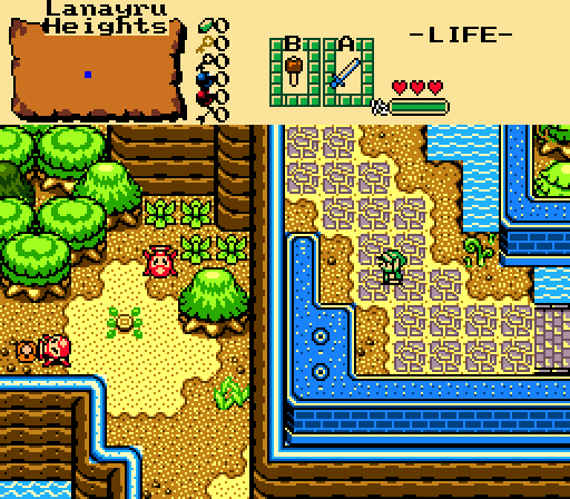
Zaxarone - This looks pretty good, I really like what you've done to the mountain walls at the top. Screen design in general is pretty nice too, though I'd probably try and add more detail to the top-left corner.
Dimentio - Pretty good screen here, I like this one a lot too. I'd probably try not to use multiple kinds of mountains in the same area since it looks a little weird to me IMO. Also that dark green tree at the top-left corner looks really out of place. Other than that, not bad at all.
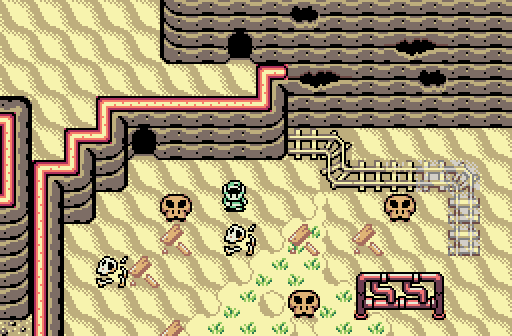
Alison - This is pretty cool and I really like the monochrome colours you have here. It looks like there's plenty of stuff going on which is pretty nice, and the screen design looks really good too.
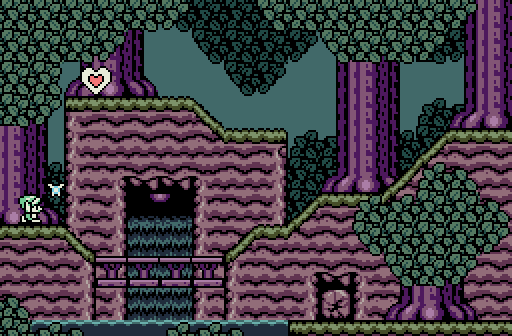
Polaris - Great sideview shot. The colours really make this look awesome and this does actually remind me a lot of Hollow Forest.
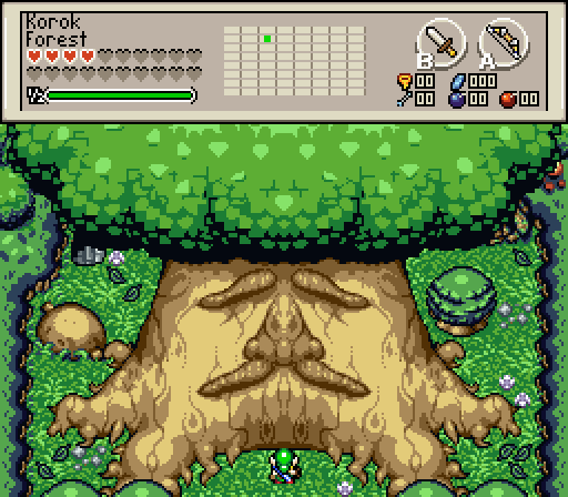
GrantGreif - Interesting idea, and I can definitely see the OoT resemblance here. The Deku Tree looks a little weird though, especially with how both sides are completely symmetrical (even with the leaves at the top).
I voted for Polaris this week, with Alison in a close second.

 This topic is locked