Wow, what a good turnout. I planned on entering, but I forgot, obviously.
TheRock:
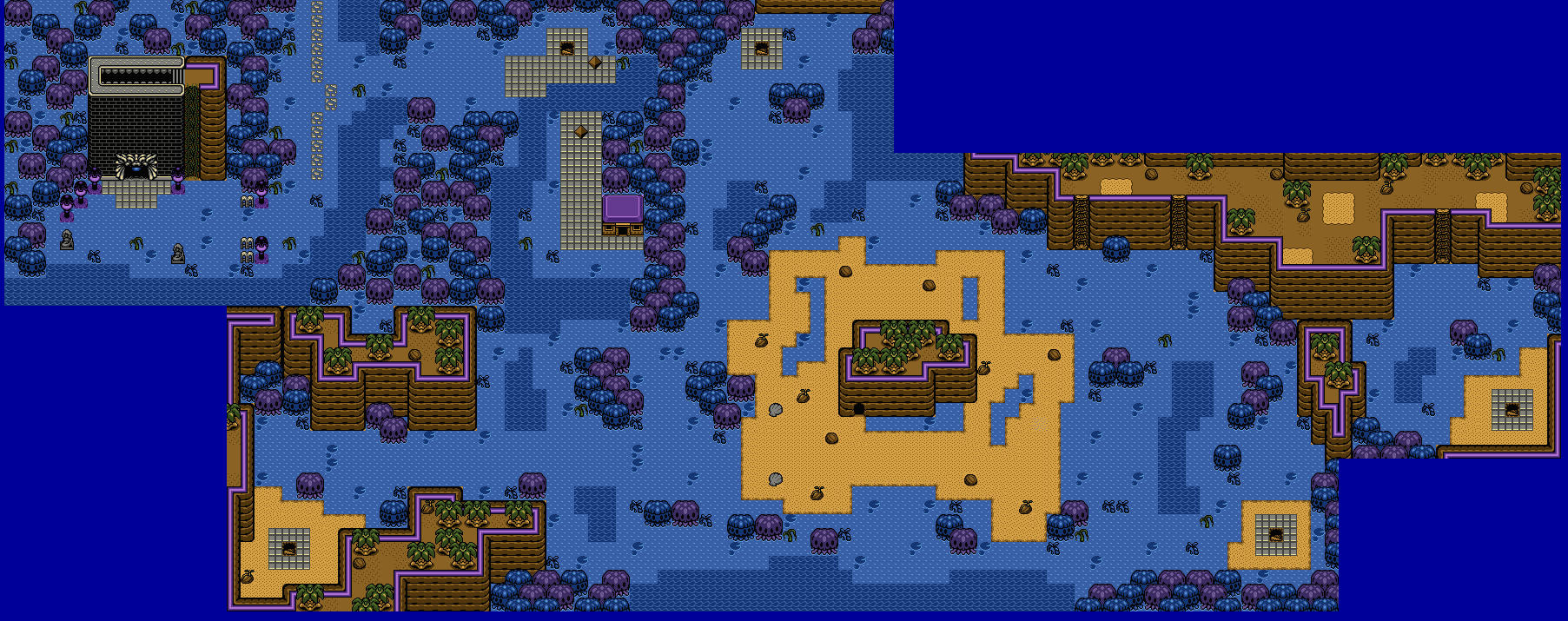
Almost voted for this one. I really like the palette, and I've always been a fan of the blue/ purple trees. This looks like a swamp I'd make, if I used GB. Second place, for me.
Eddy:
If less is more, than this is a lot! I love it. It's a simple Classic map that is very reminiscent of the first quest. I voted for this one, but if I may offer one critique, you should make some areas use different palettes. I'm not sure how authentic you're going for here, but a little color variety goes a looooong way in Classic. Still, good work.
Hubydweyer:
This one is third for me. I really like how good only 4 colors can look. It's a testament to how well designed the GB graphics really are. This looks like it could have been in a real GB game.
Joelmacool:
See how just a slight palette swap can bring new life to an old classic? Also, those 64x64 tress are great, who ever made those is obviously the best person on Earth.
Avataro:
Not a bad map, but compared to the others, it's not as breathtaking. By looking at it, I can tell it would play fine, but the large chunks of mountains look a bit bland when looked at as a map. Again, it's not horrible, but it's not the best this month either 


 This topic is locked