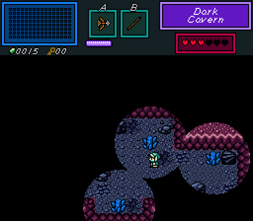
Lunaria - I like the gimmick you got going on here, but as far as a screenshot contest goes, the majority of the screen is just black and there isn't really much to judge on since I can't see anything else. From what I can see though, it looks nice and the palette fits quite well.
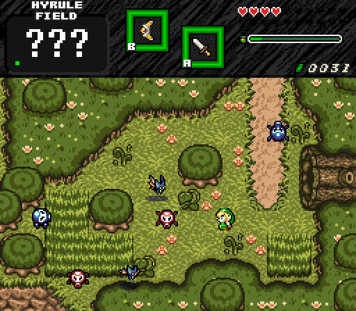
Sephiroth - Very nice shot. I don't really have any major complaints with this one. I really like how the screen is structured and it all looks nicely made. I would probably try and make the top-left corner of forest brush not so straight though (unless there's a mountain on the left screen, but even then it looks a bit weird).
Joelmacool - Nice and simplistic. There's definitely more detail than the original version but other than that, there isn't really anything else I can say. Nice castle though.
GrantGreif - Decent screen, but something about the shadows makes the palette look really messed up. I just really dislike the blue shades here, and you should probably try and fix up the shadow tiles so that it looks darker than the normal palette, rather than adding all this blue.
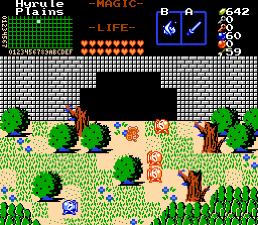
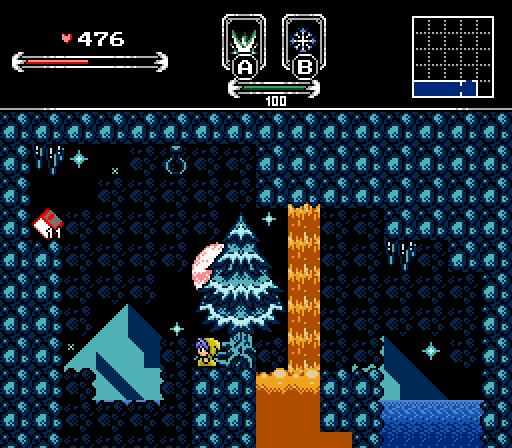
Russ - Nice job with this screen, it all looks really nicely done. I do slightly agree with Naru on the magma, but it doesn't really bother me at all. Also, nice floppy disk lel
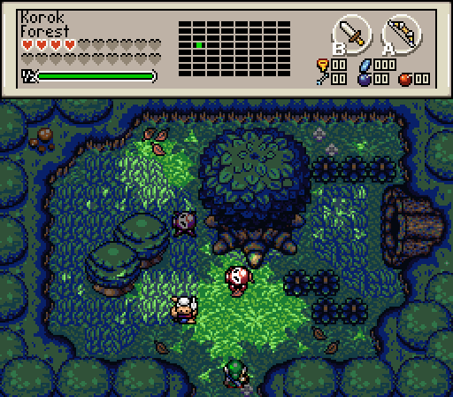
Avataro - Nice and basic. I'm not so sure on the extremely bright spikes going with the floor, since that looks kinda weird, but everything else is good.
It was close between Russ and Sephiroth this week, but I'm gonna give it to Sephiroth.

 This topic is locked