Jump to content

Photo

New dungeon tiles!


  • Please log in to reply
16 replies to this topic

#1 Revfan9

Revfan9

    Hero of Time

  • Banned
  • Real Name:Dr. Pajamas
  • Location:In front of a screen

Posted 24 March 2007 - 01:25 AM

I got incredibly bored and drew these. Note that this is only my second attempt at drawing dungeon tiles from scratch.

IPB Image

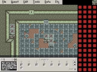
I drew it using GBC-walls because they are much simpler. An abandoned warehouse? Maybe? I think it came out pretty well considering it's only my second attempt at doing anything like it. At least it is WAAAAAAAYYY better than my first attempt:

IPB Image

As for my walls, I know the bottoms need a proper texture instead of just a gradient. The corners need to be smoothened out as well. I also need to give the "dirt" some sort of texture instead of just dots of different browns.


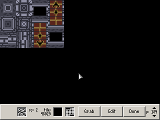
They only use 1 Cset and are perfectly usable in ZC as they are. Feel free to use them if you want.

#2 Evile

Evile

    Dolphinslayer

  • Members

Posted 24 March 2007 - 02:17 AM

The 'warehouse style' ones look pretty cool. I especialy like the colors you chose out for them. Good job on these, I hope to see some more from you.

#3 Silence429

Silence429

    Recipient of Ways

  • Members
  • Real Name:Brian
  • Location:Tampa Bay Area

Posted 24 March 2007 - 11:03 AM

Great tiles dude. I might actually use a warehouse type thing in my quest.
icon_biggrin.gif

#4 Revfan9

Revfan9

    Hero of Time

  • Banned
  • Real Name:Dr. Pajamas
  • Location:In front of a screen

Posted 24 March 2007 - 07:13 PM

IPB Image

Thanks for the compliments. I am expanding them a bit. Not a lot, but it's still changed.

#5 Linkus

Linkus

    .

  • Members
  • Real Name:Adam

Posted 24 March 2007 - 07:46 PM

Hmm... not bad. Definitely liked the floor tiles from the first version, though. Actually, take the floor tiles from the second version and make them darker and less varied in contrast; the result should look much better.

The walls are not much to talk about, however; they're too bright, and would look better if the they were darker from the floor up. Also, please don't use pillow shading--I know you're starting out, but it is a horror beyond experienced pixel artists and those who play games.

#6 Revfan9

Revfan9

    Hero of Time

  • Banned
  • Real Name:Dr. Pajamas
  • Location:In front of a screen

Posted 25 March 2007 - 12:29 AM

IPB Image

Only 1 new tile this time... And I think I took your advice wrong, Linkus. I darkened up the walls, but now they look too dark to me. I also think I took your advice wrong on the floor tiles...

And I know I need to get rid of the pillow shading on the walls, I'm just too lazy to do it right now.

#7 Lemon

Lemon

    Legend

  • Members

Posted 25 March 2007 - 01:28 AM

Lighten the walls a bit, and fix up those walls. Reminds me of a Pure meets Sd3 kinda. Your finnaly getting decent at custom tiles, congrats.

#8 Evile

Evile

    Dolphinslayer

  • Members

Posted 25 March 2007 - 01:57 AM

Yes Revfan those tiles just keep improving. Keep up the good work and you'll have a real nice dungeon set here.

#9 Revfan9

Revfan9

    Hero of Time

  • Banned
  • Real Name:Dr. Pajamas
  • Location:In front of a screen

Posted 25 March 2007 - 02:43 PM

IPB Image

I fixed the pillow shading and added texture to all of the walls and doors. Does the texturing give too much contrast?

Also, I tried doing a version of the crate where part of it was torn off or something, but it looks like total crap, and I have no idea where to go from here on improving it.

#10 Lemon

Lemon

    Legend

  • Members

Posted 25 March 2007 - 02:55 PM

Egad, the pallet keep getting worse. Go with the first or second. Walls do look better though colors aside. The cracked floors could use some work though, as I can tell if you used them it would look really repdative... try making em a bit cleaner.

#11 Revfan9

Revfan9

    Hero of Time

  • Banned
  • Real Name:Dr. Pajamas
  • Location:In front of a screen

Posted 25 March 2007 - 03:06 PM

IPB Image

I tried going back to the first palette, and I don't think the texture looks as good with it being brighter. I have no idea what you are talking about with the cracked floor tiles, so I didn't even attempt it.

#12 Lemon

Lemon

    Legend

  • Members

Posted 25 March 2007 - 03:30 PM

The black lines on there look exactly like black lines splated on the floor. Not cracks as what your trying to convey. Using those would end up with obvious repeats and not look as smooth as others. Look at some LttP cracked tiles for a beter idea.

#13 Revfan9

Revfan9

    Hero of Time

  • Banned
  • Real Name:Dr. Pajamas
  • Location:In front of a screen

Posted 25 March 2007 - 03:39 PM

Black lines? There aren't any black lines in that image. Still dunno what you are talking about... You mean the broken floor tiles? Obviously, they weren't meant to be put together in large groups..


EDIT:

Added a few more tiles, and ditched the "broken" crate tiles in favor of really dirty ones.

IPB Image

RETURN OF THE EDIT:

IPB Image

How they look when used.

Edited by Revfan9, 25 March 2007 - 04:16 PM.


#14 Koh

Koh

    Tamer Koh

  • Members
  • Real Name:Dominic
  • Location:Monsbaiya, Virginia

Posted 25 March 2007 - 09:01 PM

They look very swell, would you mind if I used them in GB Masterquest 2? They might work differently in Game Makre icon_biggrin.gif.

#15 Revfan9

Revfan9

    Hero of Time

  • Banned
  • Real Name:Dr. Pajamas
  • Location:In front of a screen

Posted 25 March 2007 - 09:04 PM

Umm... Sure?


0 user(s) are reading this topic

0 members, 0 guests, 0 anonymous users