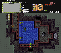
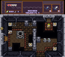
Screenshot of the Week 407
#1
Posted 21 April 2013 - 06:09 PM
Reminder to myself that I still technically still owe Russ a dungeon set [and that I seriously need to get on with messing about with my subscreen].
Scootaloo
Well, at least it's not EZGBZ.
jetbox
The entrance to the Moblin Fort.
Moosh
He thinks he's going to win SotW with a classic shot! laughinggirls.png
Jared
The Ruined Tower
#2
Posted 21 April 2013 - 07:35 PM
Scootaloo: This is just all around a really great screen. My only real complaint is that it's a little cramped but since it has so few enemies I don't think that's really a problem at all. 9/10
Jetbox: I can't say I'm a fan of CSet 0. I think it would look better as CSet 11. That's just me, though. It has some serious perspective clash even for classic. I feel like if it wasn't as tall or you had walls on both sides to it would look less flat. 5/10
Moosh: It's-a-me! Style clash! 6.28318530717598/10
Jared: Pretty solid screen, but dat painful tile error in the bottom left! Pleasefixpleasefixpleasefix! 7/10
Voted for Scoot. She really needs to make a quest.
Edited by Moosh, 21 April 2013 - 07:38 PM.
- Rambly likes this
#3
Posted 21 April 2013 - 07:39 PM
But I like the concept of a dungeon in the sky. :3
#4
Posted 21 April 2013 - 08:17 PM
#5
Posted 21 April 2013 - 08:23 PM
Jetbox: I can't say I'm a fan of CSet 0. I think it would look better as CSet 11. That's just me, though. It has some serious perspective clash even for classic. I feel like if it wasn't as tall or you had walls on both sides to it would look less flat. 5/10
Okay, Moosh, I don't know what you mean by "If it had walls on both sides" because it does. Also, it's not on C-set 11 because it is supposed to be a forest.
I voted for Feenick's because it looks like a really cool dungeon!
#6
Posted 21 April 2013 - 08:33 PM
#7
Posted 21 April 2013 - 08:37 PM
I don't understand what you mean. CSet 0 uses overworld palette structure. Those tiles you're using use dungeon palette structure. CSet 11 follows dungeon palette structure. Why would you use CSet 0? As for the walls on both sides, I meant behind the main structure it would look better to have walls stretching out to the edges of the screen on the left and right. Right now it kinda looks like a gateway in the middle of nowhere.Okay, Moosh, I don't know what you mean by "If it had walls on both sides" because it does. Also, it's not on C-set 11 because it is supposed to be a forest.
I voted for Feenick's because it looks like a really cool dungeon!
#8
Posted 21 April 2013 - 09:10 PM
#9
Posted 21 April 2013 - 09:34 PM
Okay, I understand what you mean now. I have edited the part so it will go to the edges of the screen. But about using CSet 0, I did it because i can't draw tiles for crap. I mean, I couldn't draw stick figures until 6th grade, which is terrible. Also, I thought it was the closest thing to a fort in the preset tiles. I only used them because I thought the looked cool.I can understand your point of view and agree with you.I don't understand what you mean. CSet 0 uses overworld palette structure. Those tiles you're using use dungeon palette structure. CSet 11 follows dungeon palette structure. Why would you use CSet 0? As for the walls on both sides, I meant behind the main structure it would look better to have walls stretching out to the edges of the screen on the left and right. Right now it kinda looks like a gateway in the middle of nowhere.
#10
Posted 21 April 2013 - 10:29 PM
#11
Posted 21 April 2013 - 11:22 PM
Anyways, I voted for Jared this week.
Edited by Sheik, 21 April 2013 - 11:25 PM.
#12
Posted 21 April 2013 - 11:40 PM
#13
Posted 22 April 2013 - 12:07 AM
Feenicks: I don't really feel that the custom dungeon sets that come with PTUX really work well with the GB/LTTP tiles that Pure's mostly made out of, so I ended up making these.
Scootaloo: I'm not really all that fond of the construction of this screen, as there's just a million things going on at once. I guess my biggest issue is the orange brush that bisects the screen being far more eyecatching than the stuff that is actually relevant to traversing the screen, but I'm not sure how you'd go about fixing that.
jetbox: ...it's a symmetrical classic screen? Not really much to say here, other than echoing the calls to switch the CSet you're using for the building.
Moosh: Why are there three or four perspectives going on at once there? Why does the floor seem to be paper-thin?
Jared: I like this, but there's a few things that just bother me, really. The pit placement seems kinda strange, I'm not sure what you're trying to get across with the way the floor borders and the two floor types are working together, and the post of that fence thing in the bottom left is missing its top.
#14
Posted 22 April 2013 - 12:38 AM
jetbox's is pretty alright. Jared's is alright as well, but it seems like a pain to play through. You're so limited in space and fighting pretty high HP enemies for level 2.
The perspective on Moosh's shot is wacky as h-e-double-hockey-sticks (there's a sideways upright pillar next to a vertical upright pillar) and that's really throwing me for a loop.
#15
Posted 22 April 2013 - 04:16 AM
My second place vote would be Feenicks. While nothing special about it, it's really solid. It does the job.
Scootaloo's is a nice screen but it's a little hard to tell what was going on. I thought the orange was a river or lava or something until I realized it was forest brush.
Jetbox's screen to be honest I like the way it is. It's simple and effective and it gives me a sense of wondering what lies ahead. Kind of an ominous dungeon entrance and the colors look fine the way they are.
Moosh's screen as everyone else has already pointed out, the perspective is way off. I'd remove those wall pillars all together. The torches look okay but I can't really tell what's going on with the wall. The wall borders look okay but I think having the same brick pattern behind it really destroys the perspective. I think the forest pallet does work with the brown but those green sphere things don't quite fit. Potential is there, but it needs some touching up.
First time I've done a review for SotW. Was fun. Nice turnout for the nice new layout of this site.
Also tagged with one or more of these keywords: Jared, Feenicks, Scootaloo, jetbox, Moosh
|
Sheik
PureZC Events →
Screenshot of the Week →
Poll Screenshot of the Year 2023Started by Taco Chopper , 29 Jan 2024 Sheik, Anthus, Moosh |
|
|
|
|
Moosh
PureZC Events →
Screenshot of the Week →
Poll Screenshot of the Year 2023 - Red BracketStarted by Taco Chopper , 15 Jan 2024 Moosh, Anthus, Twilight Knight |
|
|
|
|
Joelmacool
PureZC Events →
Screenshot of the Week →
Poll Screenshot of the Week 793Started by Deedee , 05 Sep 2023 Joelmacool, Architect Abdiel and 2 more... |
|
|
|
|
Moosh
PureZC Events →
Screenshot of the Week →
Poll Screenshot of the Month 195Started by Taco Chopper , 04 Sep 2023 Moosh, Anthus, Shane and 1 more... |
|
|
|
|
Anthus
PureZC Events →
Screen Rebirth →
Poll Screen Rebirth 6! The Contest!Started by Mitchfork , 21 Aug 2023 Anthus, Shane, Taco Chopper and 1 more... |
|
|
0 user(s) are reading this topic
0 members, 0 guests, 0 anonymous users