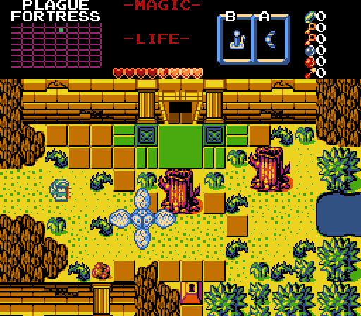
Alestance - Unfortunately, this screenshot continues to echo problems I have with Koten as a set. In this case, the colors make everything feel very un-integrated. Especially the dead tree compared to the other trees. I think it comes down to the fact that the dead tree appears brighter of a color than the other ones in the bottom right of the screen, which really seems out of place. Also, Link and the Manhandla appear to exist "on top" of everything as opposed to being a part of the world. I don't think the screen as a whole is designed poorly, I just really don't like the stylistic elements that are rooted in the tileset of choice.
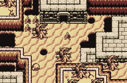
Moosh - This screen bleeds atmosphere, and someone really needs to get a mop to clean that up. I love the more monochromatic palette here and this comes off as a place I'd love to explore. I do wish we could see enemies/Link on the screen, because I always prefer seeing how the screen looks in action, but that doesn't detract from how inspiring this looks.
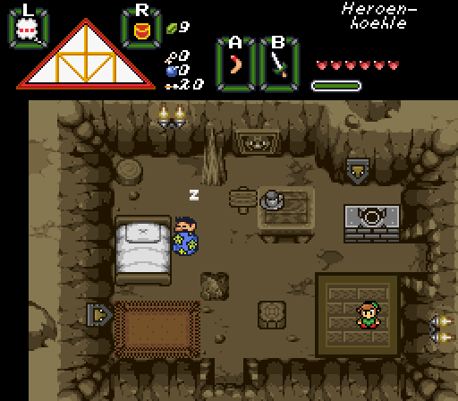
Rastael - Does... does Talon not know how beds work? Don't get me wrong, the screen is a very effective cave dwelling and I really like the overall way it feels. I'm not a huge fan of the wooden floor in the bottom right, since it feels very... separate from the rest of the cave floor. It'd be great if there was a way to make it look more integrated as opposed to having it more like a wooden rug.
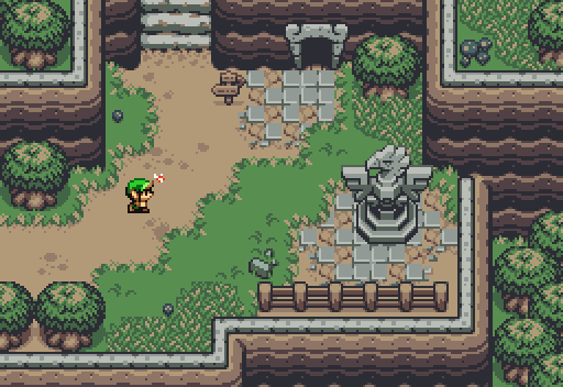
Migokalle - For my analysis, let me pretend Link isn't there for a moment. The screen's colors are really nice and muted, giving almost a foreboding feeling. As if there's a storm brewing or some sort of dark cloud hangs over everything. I don't know if that was the intent, but it feels that way and works very well if it was the goal. Unfortunately, then we have to add Link back in, who sticks out like a sore thumb on this screen. While I get wanting to make sure the player can be easily found among the background, here he just seems out of place, almost as if he's on a different plane from the rest of the world. His colors are too bright and I feel it distracts from an otherwise very nice screen.
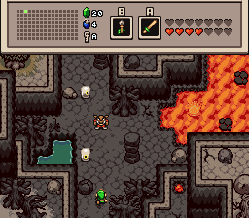
Linkus - Not only would Link's face melt in more realistic conditions, but I'm pretty sure that water would evaporate as well. I actually find my eye drawn to the water pool and asking "why is that here?" I think the colors of the screen and the way it's laid out are very nice and pleasing to the eye, and provide an area that I would like to see more of. But that water pool and then that tree in the upper left corner just sort of seem out of place? That's probably being nitpicky (not everything has to be realistic, I get that), but I do think the screen would work better and have a more consistent tone without them. Also, this appears to be the same tileset from Migo's shot, but Link looks perfectly fine here, so that's odd.
Overall, I'm giving the nod to Moosh this week, but just barely over Migokalle and Linkus.

 This topic is locked