Jump to content

Photo

THE COW SET!!!


  • Please log in to reply
22 replies to this topic

#1 TetriTek

TetriTek

    Wizard

  • Members
  • Real Name:Joshua Johnson
  • Location:Clinton

Posted 30 December 2007 - 06:43 PM

so i am working on the mountains, and this is what i have so far.

IPB Image

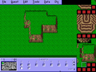
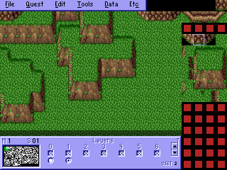
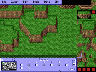
yes, the grass is repetative, but i had touse something. what do you think about the grass, mountains, and pallete so far? just look at the screen, not the tiles.


#2 Twilight Knight

Twilight Knight

    Tell all with glee, Argon's on PureZC

  • Members
  • Real Name:Sven
  • Location:Rotterdam, NL

Posted 30 December 2007 - 06:58 PM

I like the mountains. The grass is ok, I could use more patterns. The palette, nah, the browns are good, but the greens..., I don't like them, they are too green. icon_unsettled.gif

#3 ElLibertador

ElLibertador

    Love and Peace

  • Members

Posted 30 December 2007 - 07:00 PM

The mountains are great, I really like those.

The grass...I don't like so much. I also don't like the grass at the top of the mountain. It looks too dark, and it looks like it fades into the grass below it.

The palette is ok. I really like the browns, but the grass is too green for me.

My two cents.

#4 Titanium Justice

Titanium Justice

    Justice is served!

  • Members
  • Real Name:Jared
  • Location:Ontario

Posted 30 December 2007 - 07:04 PM

The Cow Set wow icon_wow.gif
looks like it will be an awesome tileset icon_thumbsup.gif
QUOTE
yes, the grass is repetative

Yes it kinda is icon_rolleyes.gif but mostly on the top of the mountains, and usually the grass on top of the mountains are slightly different.

#5 TetriTek

TetriTek

    Wizard

  • Members
  • Real Name:Joshua Johnson
  • Location:Clinton

Posted 30 December 2007 - 07:08 PM

thanks for the feedback. i was going to make the grass on the mountains lighter. but im not sure. i will change the green. and the mountain grass a bit.

#6 ElLibertador

ElLibertador

    Love and Peace

  • Members

Posted 30 December 2007 - 07:14 PM

Suggestion...

It seems the mountains will get repetitive in lined usage.

You should try making four different tiles for the wall of the mountain.

XOXOXOX
OXOXOXO

So it would go like that. Get it? I almost don't so icon_shrug.gif icon_razz.gif

#7 TetriTek

TetriTek

    Wizard

  • Members
  • Real Name:Joshua Johnson
  • Location:Clinton

Posted 30 December 2007 - 07:21 PM

oh, no, i understand exactly what you are talking about, thats how i like to use them. its kinda like dithering.
i just havent got around to making a new tile for those. i will later.

Update: worked on the pallete. and a little of the mountains.
New.
IPB Image
How do you like the mountains in the corner of the screen? thats all i have of them, but should i finish them?

Old.
IPB Image
yeah, way too green.

what do you think?


#8 KaBoom

KaBoom

    Experienced Forumer

  • Members
  • Real Name:Carlos
  • Location:New York

Posted 31 December 2007 - 01:08 AM

The grass is much better now, and the overall palette now has a desaturated look that works well. The new rocky mountains are very good too, I like them even better than the first ones.

#9 NoeL

NoeL

    Legend

  • Members
  • Real Name:Jerram

Posted 31 December 2007 - 11:36 AM

Very square. Reminds me of an old DOS game for some reason.

#10 TetriTek

TetriTek

    Wizard

  • Members
  • Real Name:Joshua Johnson
  • Location:Clinton

Posted 31 December 2007 - 01:24 PM

thanks, anything i can do to the mountains that would make them look better?

#11 CastChaos

CastChaos

    Deified

  • Members

Posted 31 December 2007 - 03:05 PM

I think the mountains are perfect. I like them also because they are like some surface mine walls and "next to road" mountains around the town I live. Though, these were made artificially when opening stone/clay mines and building inter-town roads...

And the new grass is also really great.

#12 TetriTek

TetriTek

    Wizard

  • Members
  • Real Name:Joshua Johnson
  • Location:Clinton

Posted 31 December 2007 - 03:59 PM

Thanks CC.

Update: added new diagonal mountain tiles.
IPB Image
only have the front facing ones, but how do they look?


#13 CastChaos

CastChaos

    Deified

  • Members

Posted 31 December 2007 - 04:34 PM

They as good as the straight ones, except that the straight ones have some little grass/leaf outcrops. You should add some to the diagonals, too. Diagonal is very important if you don't go for some simple rectangular design.

#14 Twilight Knight

Twilight Knight

    Tell all with glee, Argon's on PureZC

  • Members
  • Real Name:Sven
  • Location:Rotterdam, NL

Posted 31 December 2007 - 07:48 PM

Hmm, the grass looks good now, less repitive. The palette is better too.
Good job! icon_thumbsup.gif

#15 link3505

link3505

    Ancient

  • Members
  • Real Name:Ben
  • Location:The Edge of Infinity

Posted 01 January 2008 - 12:37 AM

The angles are far too sharp. They need to be much rounder. However, I love how they show depth. Very nice


0 user(s) are reading this topic

0 members, 0 guests, 0 anonymous users