Jump to content

Photo

Desert Mountains!


  • Please log in to reply
23 replies to this topic

#1 Eddard McHorn Van-Schnuder

Eddard McHorn Van-Schnuder

    smash the bye button

  • Members
  • Real Name:Ronny Wiltersen

Posted 14 October 2007 - 04:08 PM

Okay... these are 100% custom drawn, except the sand... now, they're not finished. I'm going to edit the top a little bit, but now I want to know what you think I should do to improve the ''wall''
IPB Image
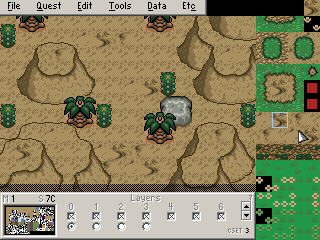
I figured we needed somthing to use in deserts instead of mountains...
So, comments and suggetions GREATLY apreciated!


#2 Professor Bedwetter

Professor Bedwetter

    Strangers when we meet

  • Members
  • Real Name:Zack Zack Zack Zack Zack Zack Zack Zack Zack Zack

Posted 14 October 2007 - 04:10 PM

WOW that is total ownage!

#3 Eddard McHorn Van-Schnuder

Eddard McHorn Van-Schnuder

    smash the bye button

  • Members
  • Real Name:Ronny Wiltersen

Posted 14 October 2007 - 04:12 PM

Thanks! icon_biggrin.gif But they're not done, remember that.
And they're going to be pretty hard to use!

#4 linkootsp

linkootsp

    Junior

  • Members
  • Real Name:Robert
  • Location:pennsylvania

Posted 14 October 2007 - 04:36 PM

It all depends if youre going for a custom feel or a zelda feel. If youre going for a realistic zelda feel, square off the mountains like in LTTP. other Than that they rock,Go Migokalle

Edited by linkootsp, 14 October 2007 - 04:36 PM.


#5 Plissken

Plissken

    What's with these homies dissing our girls?

  • Members

Posted 14 October 2007 - 04:39 PM

Thanks Mig. As said in chat, I've needed something like this for awhile now. icon_biggrin.gif

Edited by Plissken, 14 October 2007 - 04:39 PM.


#6 Eddard McHorn Van-Schnuder

Eddard McHorn Van-Schnuder

    smash the bye button

  • Members
  • Real Name:Ronny Wiltersen

Posted 14 October 2007 - 04:40 PM

still, please remember that these need some finishing up. I'm going to edit the top a little bit next. What I want now, is ideas on how to improve the ''walls''... or are they good enough?

#7 Mitchfork

Mitchfork

    no fun. not ever.

  • Members
  • Real Name:Mitch
  • Location:Alabama

Posted 14 October 2007 - 04:42 PM

You should probably go for more shading on the walls. As it stands, it's just not too realistic. However, it looks like you nailed the shape, so half the battle is won.

#8 ElLibertador

ElLibertador

    Love and Peace

  • Members

Posted 14 October 2007 - 04:46 PM

These are great. I'm not going to bite you for this but shouldn't the shading be reversed. You know...light hitting the wrong side.

About the walls...I think the shading should break later. The shading in general needs a little work...otherwise these are really cool. I will definitely use these.

#9 Eddard McHorn Van-Schnuder

Eddard McHorn Van-Schnuder

    smash the bye button

  • Members
  • Real Name:Ronny Wiltersen

Posted 14 October 2007 - 04:49 PM

Oh, that's cool! I'll work more on these tomorrow... Maybe they'll even be customary in every tileset when they're finished? To be honest, that IS my hope icon_razz.gif

#10 linkootsp

linkootsp

    Junior

  • Members
  • Real Name:Robert
  • Location:pennsylvania

Posted 14 October 2007 - 05:02 PM

These are good and all they need is shading. I'm still working on tiling ,and shading isn't my strongpoint so like I said YAY Go migokalle, I'll probably use these If I have a desert level in my quest.

#11 Joe123

Joe123

    Retired

  • Members

Posted 14 October 2007 - 05:27 PM

They look really good actually. But, as LinkMystro said, the light's coming from the wrong side which really is quite a problem, seeing as just about everything else ever seems to have it coming from the top left, and the shading on the left hand side that is a darker texture with dots in looks horrible.

EDIT: Sorry, Simmilar names and all.

Edited by Joe123, 14 October 2007 - 05:44 PM.


#12 Linkus

Linkus

    .

  • Members
  • Real Name:Adam

Posted 14 October 2007 - 05:36 PM

Joe, when did I say that? This is my first post on the topic icon_razz.gif

On the other hand, they're not exactly well-rounded. They look odd, and the edges where sand meets falloff are too outlined. But as pointed out, they are a work in progress.

#13 ElLibertador

ElLibertador

    Love and Peace

  • Members

Posted 14 October 2007 - 05:39 PM

What would looks really cool is if the top sand rolled off the edge onto the wall. At least I think so.

BTW Joe, I said that, not Linkus.

#14 lucas92

lucas92

    Defender

  • Members

Posted 14 October 2007 - 05:52 PM

I would go with a more orange sand for the vertical faces. It seems too similar to the ground right now.

It's looking very good though, looks like the gerudo desert in TP. icon_smile.gif

#15 Evile

Evile

    Dolphinslayer

  • Members

Posted 14 October 2007 - 05:56 PM

They look pretty good. Probably look better if it wasn't a jpg.


0 user(s) are reading this topic

0 members, 0 guests, 0 anonymous users