Lunaria
Just testing out how a GBC set works, sorta
Polaris
Evan20000
What's inside that skull? A dungeon? Treasure? Nudes of The Satellite?

 This topic is locked
May the way of the Hero lead to the Triforce.

Posted 15 August 2016 - 08:28 PM
Lunaria
Just testing out how a GBC set works, sorta
Polaris
Evan20000
What's inside that skull? A dungeon? Treasure? Nudes of The Satellite?
Ironically bald furry

Posted 15 August 2016 - 08:36 PM
572 wins 572. Just sayin.
Kidding aside. Voted for Polaris.
Ultra Miyoa Extraordinaire!

Posted 15 August 2016 - 09:15 PM
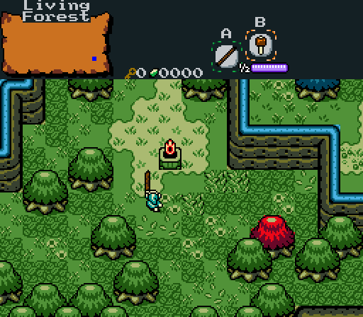
Lunaria: I quite like your detail here! I like your usage of multiple tiles on the ground to add detail.
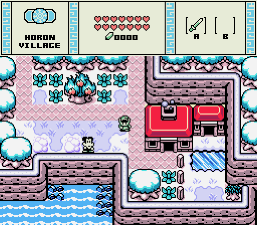
Polaris: Nice remake, but...the palette is EXTREMELY bright on my eyes. As good of a remake as it is...I just can't pick it, I'm sorry. ![]()
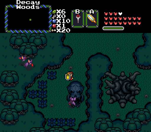
Evan: There's...really not much to look at here, and the palette is too dark for me. I wish you'd added more details SOMEWHERE in the screen! ![]()
Lunaria's my pick
Lurking in the shadows...

Posted 15 August 2016 - 09:19 PM
Didn't vote for Evan because he has nudes of the Satellite... *shivers*
My name is NOT Jason!

Posted 15 August 2016 - 09:31 PM
I haven't voted in SotW for a long time! I ended up voting for Shane!
Yes I'm that guy who dreamt Dani was Zelda. LOL Cimfam/zelda

Posted 15 August 2016 - 10:08 PM
Toss up between Lunaria and Polaris. Im going Lunaria but barely. The color is slightly better on my eyes with Lunaria's and that's really the sole reason for my vote.
Saint Alestance - Eliminator of the ZGP format

Posted 16 August 2016 - 03:38 AM
If I vote for Evan, do I get a peak at those nudes?
I voted for Polaris by the way, but I could be swayed to change my vote.
"Tra la la, look for Sahasrahla. ... ... ..."

Posted 16 August 2016 - 03:51 PM
Nothing against Polaris' screen, but it's highly derivative (which is neither a secret nor an insult).
Lunaria's is appealing, but is perhaps too open.
I voted for Evan because I feel like it has more purpose and design to it.
On a side note, I always liked how the winter snowflake icon looks like a peppermint candy.
Edited by Cukeman, 16 August 2016 - 03:52 PM.

Posted 16 August 2016 - 10:56 PM
The angular mountains and simplistic beauty of Polaris' screen does a very good job of evoking the OoS feel. I voted here.
ringle

Posted 21 August 2016 - 06:21 AM
Lunaria - Pretty nice and simple screenshot here. I'm gonna assume that's a deku stick weapon you have there which will burn up that red tree? The only thing that looks a bit out of place are those 3 grass tiles near the torch, maybe just use the same tile as all the other grass tiles and it wouldn't look so out of place. Good job nonetheless.
Polaris - Really nice screenshot. OoS remake in the making I see ![]() Like with everyone else said, the palette might be a little too bright for my eyes (just slightly), but the details and everything are still very clearly visible, and you done a good job making a very authentic remake of an in-game screen.
Like with everyone else said, the palette might be a little too bright for my eyes (just slightly), but the details and everything are still very clearly visible, and you done a good job making a very authentic remake of an in-game screen.
Evan - Looks pretty basic and simple. I like the dark feeling to the place, makes it feel quite a bit like a forest. Though there isn't really anything going on here and the ground seems a little bit too empty of anything (with the exception of those holes on the ground). Looks nice though.
My vote is Polaris this week.
May the way of the Hero lead to the Triforce.
Posted 21 August 2016 - 06:53 PM
With 68.97% of the vote, the winner of Screenshot of the Week 572 is Polaris!
Congratulations!
Voting totals:
- Lunaria (9 votes [15.52%])
- Polaris (40 votes [68.97%])
- Evan20000 (9 votes [15.52%])
0 members, 0 guests, 0 anonymous users