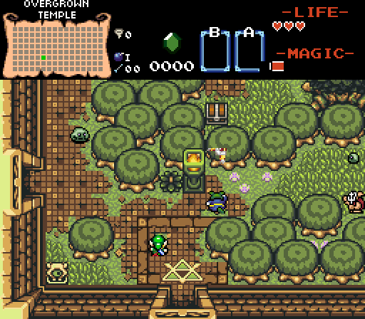
Mr Pow - Very nice dungeon shot here. I like what you got going so far, though a few things I'd change: the statue on the bottom-left looks a bit out of place with everything, and the torch looks weird with that colour (probably go for something more white). I'd also go against stacking trees on top of each other like you did, since it just doesn't look right IMO. I'd make them diagonally spaced out like the trees at the top-left of the screen.
Null vote because I'm in this week.
I appreciate the feedback as I am still trying to wrap my head around all the different tiles in the DoR Hybrid tileset, and, not to mention, I know little to nothing about pallets and csets. 
Here is my human attempt to rationalize my decisions:
- This dungeon has many of those little eyeball statues, as if the whole temple is watching you, but I could probably get rid of that first one.
- I know the torch looks weird but I was trying to go for a mossy look (I probably need to make custom tiles or tweak the pallets or something)
- The trees are stacked so it limits the path the player can take. (It might make more sense if you got to see more of the dungeon) It is supposed to be like "oh damn, I cant go this way because these damn trees have blocked the path." But I will see if I can come up with a more visually appealing way to do that.
That out of the way, I really liked all entries this week.
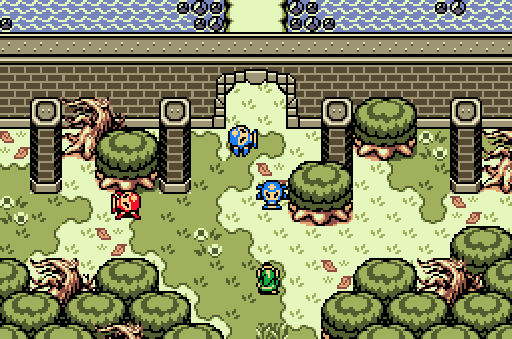
Shiek - This is beautiful. Teach me how to shading. (Is this like a Secret of Mana tileset or something? I dunno, looks SoMish to me)
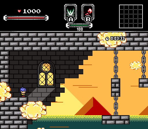
Russ - This looks like a trailer for a LoZ action movie, and I LOVE IT!!
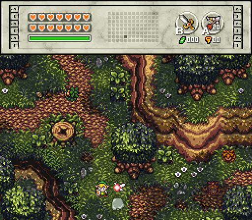
Joelmacool - This screen is just great. Link's Awakening was my first (and favorite) Zelda game so the GB graphics really hit home for me. Love the layout of the trees. This screen makes me want to explore.
Edit: Added a missing period (see if you can guess which one) 
Edited by MrPow, 24 October 2016 - 10:01 AM.

 This topic is locked