 This topic is locked
Last time I checked, Sun Tower didn't have those doors, unless /M/ ripped them in...
DoR and Sun Tower look so similar in terms of palette that it's difficult to tell just by looking... My mistake.

Screenshot of the Week 153
Started by
Neppy
, Jan 29 2007 06:05 PM
60 replies to this topic
#46

Revfan9
-

- Banned
-

Hero of Time
- Real Name:Dr. Pajamas
- Location:In front of a screen
Posted 03 February 2007 - 08:44 PM
#47
/M/
-

- Members
-

6♣7♠8♥9♥10♥
- Location:Gotham City
Posted 03 February 2007 - 09:20 PM
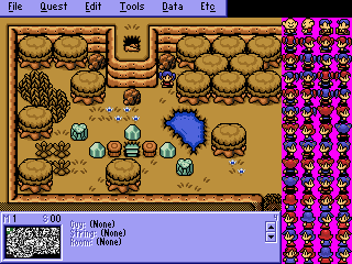
Wow Revfan9... 
Almost all of the tiles you see there aren't originally in the Sun Tower set. The Sun Tower tileset is almost empty, sort of like PrinceMSC's Mystic Land set in our database.
Almost all of the tiles you see there aren't originally in the Sun Tower set. The Sun Tower tileset is almost empty, sort of like PrinceMSC's Mystic Land set in our database.
Edited by /M/, 03 February 2007 - 09:29 PM.
#48
Revfan9
-
- Banned
-
Hero of Time
- Real Name:Dr. Pajamas
- Location:In front of a screen
Posted 03 February 2007 - 09:29 PM
:[ Sorry that I suck...
#49
NoeL
-

- Members
-

Legend
- Real Name:Jerram
Posted 04 February 2007 - 06:36 AM
QUOTE(Revfan9 @ Feb 3 2007, 08:29 PM) 
:[ Sorry that I suck...
... so what's everyone talking about?
#50
Peteo
-

- Members
-
Back in Business!
- Real Name:Pete
- Location:Finland
Posted 04 February 2007 - 08:09 AM
Erm... these threads are getting weirder every time.
But things that never change:
Revfan is upset, .TakaM seems harsh, Johan licks NoeL's *** and NoeL is just plain weird. lol
Sorry, a bit of topic, I know, but i guess we all should congrulate Shoelace now.
But things that never change:
Revfan is upset, .TakaM seems harsh, Johan licks NoeL's *** and NoeL is just plain weird. lol
Sorry, a bit of topic, I know, but i guess we all should congrulate Shoelace now.
#51
NoeL
-
- Members
-
Legend
- Real Name:Jerram
Posted 04 February 2007 - 09:29 AM
QUOTE(Peteo @ Feb 4 2007, 07:09 AM)
Erm... these threads are getting weirder every time.
But things that never change:
Revfan is upset, .TakaM seems harsh, Johan licks NoeL's *** and NoeL is just plain weird. lol
Sorry, a bit of topic, I know, but i guess we all should congrulate Shoelace now.
And Peteo remains Finnish... *shakes head* Nightwish rule
#52
Anthus
-

- Members
-

Lord of Liquids
- Location:Ohio
Posted 04 February 2007 - 10:05 AM
Aribar: Nice Pure shot. There is nothing jaw dropping about it though...
Revfan: I don't have any real complaints here. Maybe the screen seems too open?
Sharon: This is another very good shot. I'm surprised there is no advanced grass, or Pink MC trees . Fourth place.
/M/: Very nice. The lamps and Snowman are a nice touch. I would have voted for this one.
NoeL: I love the cliffs. They are very cartoony, which I like. The only thing I don't like is how they contrast with the ground tiles. I'd make those cartoony as well. This is still my second favorite though.
Moonwhisper: I love Autumn, too, but shouldn't those trees be orange? This shot just seems too uniform. I'm not really sure how else to explain it. It's not bad though.
Nuvo: Nice, I guess, but I can't even tell where, or what this is. Is it a ship?
Shoelace: I love the water. I also like the blue leaves. I'd make them purple, personally, but it is still a very nice touch. Third place.
Man, this was a lot this week
EDIT:
..Right. Care to elaborate why? Anyone else who commented gave a reason why they didn't like them, or on what could be done better. You just keep on, keepin' on with your ... habbits...
EDIT2:
LAWL'd!!
Ooh, what, are you the Juggernaut? Are you Rick James? Do you work for a game company? Man. you crack me up, my elitist good sir. Your getting sick of making this personal? Then why don't you be a little nicer. If you don't want to take place in our "small fangame competition" them why are you in a thread, at a community about it? Are you here for the sole purpose of being rude, and useless? Aribar wrote a paragraph about each shot, and what he liked about it, how it could have been made better, etc. You posted one liners about why each shot sucked. Most people here would appreciate the constructive criticism. I would. Telling me that I fail at making NES graphics work doesn't help a whole lot.
I've seen your work, and you think just because it's good, that you can bash us like there's no tommorow. Well, I hope you know that somewhere out there, there is someone better than you. There is always someone better. I think NoeL and Relic are both just as good as you. They don't bash others. They aren't elitists pricks. There are many other spriters that are pretty damn good. Exate, EatinCake, and Sharon to name a few. Not to mention ShadowTiger, and Radien.
Revfan: I don't have any real complaints here. Maybe the screen seems too open?
Sharon: This is another very good shot. I'm surprised there is no advanced grass, or Pink MC trees
/M/: Very nice. The lamps and Snowman are a nice touch. I would have voted for this one.
NoeL: I love the cliffs. They are very cartoony, which I like. The only thing I don't like is how they contrast with the ground tiles. I'd make those cartoony as well. This is still my second favorite though.
Moonwhisper: I love Autumn, too, but shouldn't those trees be orange
Nuvo: Nice, I guess, but I can't even tell where, or what this is. Is it a ship?
Shoelace: I love the water. I also like the blue leaves. I'd make them purple, personally, but it is still a very nice touch. Third place.
Man, this was a lot this week
EDIT:
QUOTE( .TakaM)
Anthus - Hard to make NES tiles look good, didn't succeed.
..Right. Care to elaborate why? Anyone else who commented gave a reason why they didn't like them, or on what could be done better. You just keep on, keepin' on with your ... habbits...
EDIT2:
QUOTE( .TakaM)
and thirdly, I'm really getting sick of you people trying to make this personal, how I obviously have no talent since I don't partake in some small fangame competition, you don't even know who I am.
LAWL'd!!
Ooh, what, are you the Juggernaut? Are you Rick James? Do you work for a game company? Man. you crack me up, my elitist good sir. Your getting sick of making this personal? Then why don't you be a little nicer. If you don't want to take place in our "small fangame competition" them why are you in a thread, at a community about it? Are you here for the sole purpose of being rude, and useless? Aribar wrote a paragraph about each shot, and what he liked about it, how it could have been made better, etc. You posted one liners about why each shot sucked. Most people here would appreciate the constructive criticism. I would. Telling me that I fail at making NES graphics work doesn't help a whole lot.
I've seen your work, and you think just because it's good, that you can bash us like there's no tommorow. Well, I hope you know that somewhere out there, there is someone better than you. There is always someone better. I think NoeL and Relic are both just as good as you. They don't bash others. They aren't elitists pricks. There are many other spriters that are pretty damn good. Exate, EatinCake, and Sharon to name a few. Not to mention ShadowTiger, and Radien.
Edited by Anthus, 04 February 2007 - 10:43 AM.
#53
Revfan9
-
- Banned
-
Hero of Time
- Real Name:Dr. Pajamas
- Location:In front of a screen
Posted 05 February 2007 - 01:16 AM
*slides this under Moonwhisper's door...*
#54
link3505
-

- Members
-
Ancient
- Real Name:Ben
- Location:The Edge of Infinity
Posted 05 February 2007 - 02:52 AM
QUOTE(/M/ @ Feb 3 2007, 06:20 PM)
Wow Revfan9...
Almost all of the tiles you see there aren't originally in the Sun Tower set.
...Eat your words. Those mountains, fences (I think), pathway, dirt, treasure chest, and possibly the streetlight tiles are all from my ST tileset
As well, the bomb icons, the bomb sprite, menu background color, and map/item frames
#55
Radien
-

- Members
-
Courage
- Real Name:Steve
- Location:Oregon
Posted 05 February 2007 - 03:45 AM
Okay, I'm back to vote and all.
Aribar:
Not bad in some ways, but I have a lot of issues with it. I don't like seeing tiles stacked when they weren't designed for it, for starters (those house tiles). Secondly, that's a stone statue, and it doesn't look right in solud green. I've never really been crazy about those wooden structure tiles. The bottom half of this screen is all right, but I don't really like the rest.
Anthus:
I've never been fond of "Dark Worlds," as you may know. It's possible to sell me on them, but not like this. The palette looks like you just shifted all the hues about 40% in one direction (thinking of "hues" in Paintshop terms). As for design, Classic mountains may be capable of that sort of layout, but I don't particularly like it. Also, the water tiles look hapazardly placed. The Catfish entrance doesn't particularly look like "Classic."
Revfan9:
Hey hey, getting better. There's little empty grass space, there are enemies on the screen (though I'm not sure whether they're functional), and some design thought went into this one. Now all you need is a little action. But other than that, this is very good.
Sharon Daniel:
A well designed Pure-style screen, but I've seen dozens in this style. It needs something to set it apart, at least; to say "this is MY quest." The TP-style door and the mushroom enemies aren't quite enough on their own.
/M/:
Very nice screen. Everything blends together well, and your additions to the original tiles work out pretty well. The only criticism I have is to say that the browns should be lighter when shown next to that much snow. Snow reflects light, and should cause everything around it to also be slightly brighter.
NoeL:
Very nice custom graphics. I think my issues with this screen are not at all different from the issues you have with it yourself. So I won't go into more detail. The cliffs are pretty well-drawn, although they could use a slight bit more detail. Cel-shading style isn't quite enough to account for all of their simplicity.
Moonwhisper:
I used to think Ccc was a custom graphics god, but wasn't quite sure what it was that bugged me about his stuff. Now I know: he uses symmetry and pillow shading excessively.
I know that's not really your fault since it's not your tileset, but really, those mountains are way too patterned. You might consider looking into some replacement mountains, at least.
The screen is okay, but absolutely nothing is happening there -- there isn't even a treasure chest -- so it might as well be a ZQuest shot.
Nuvo:
I think the pseudo-3D of these graphics has finally failed here. It just doesn't look right. And the brown all bleeds into eachother. It's okay to do away with solid black, but if you're still using outlines you have to make sure that the outlines are of a color that's high enough contrast that it'll define the graphics. And don't always use the same color for outlining; that defeats the purpose of phasing out the solid black.
Shoelace:
Hey, nice use of a lot of my graphics/edits. It's a bit convoluted of a shot to cram onto a small single screen, though. You might also want to mess around with the palette if you're going to try to have semi-transparent water. When water is transparent enough to see everything beneath it, the dividing line of what is above water and what is below is not quite that obvious.
I'm going to have to go with /M/ this time. It's a good use of the already impressive Sun Tower tileset, a tileset that deserves to be used well. (I'm also going to ignore the fact that you're arguing with the set's creator, because I'm judging the shot alone here... )
Aribar:
Not bad in some ways, but I have a lot of issues with it. I don't like seeing tiles stacked when they weren't designed for it, for starters (those house tiles). Secondly, that's a stone statue, and it doesn't look right in solud green. I've never really been crazy about those wooden structure tiles. The bottom half of this screen is all right, but I don't really like the rest.
Anthus:
I've never been fond of "Dark Worlds," as you may know. It's possible to sell me on them, but not like this. The palette looks like you just shifted all the hues about 40% in one direction (thinking of "hues" in Paintshop terms). As for design, Classic mountains may be capable of that sort of layout, but I don't particularly like it. Also, the water tiles look hapazardly placed. The Catfish entrance doesn't particularly look like "Classic."
Revfan9:
Hey hey, getting better.
Sharon Daniel:
A well designed Pure-style screen, but I've seen dozens in this style.
/M/:
Very nice screen.
NoeL:
Very nice custom graphics. I think my issues with this screen are not at all different from the issues you have with it yourself.
Moonwhisper:
I used to think Ccc was a custom graphics god, but wasn't quite sure what it was that bugged me about his stuff. Now I know: he uses symmetry and pillow shading excessively.
I know that's not really your fault since it's not your tileset, but really, those mountains are way too patterned.
The screen is okay, but absolutely nothing is happening there -- there isn't even a treasure chest -- so it might as well be a ZQuest shot.
Nuvo:
I think the pseudo-3D of these graphics has finally failed here. It just doesn't look right. And the brown all bleeds into eachother. It's okay to do away with solid black, but if you're still using outlines you have to make sure that the outlines are of a color that's high enough contrast that it'll define the graphics. And don't always use the same color for outlining; that defeats the purpose of phasing out the solid black.
Shoelace:
Hey, nice use of a lot of my graphics/edits.
I'm going to have to go with /M/ this time. It's a good use of the already impressive Sun Tower tileset, a tileset that deserves to be used well. (I'm also going to ignore the fact that you're arguing with the set's creator, because I'm judging the shot alone here...
#56
/M/
-
- Members
-
6♣7♠8♥9♥10♥
- Location:Gotham City
Posted 05 February 2007 - 03:07 PM
QUOTE(Relic @ Feb 5 2007, 02:52 AM)
...Eat your words. Those mountains, fences (I think), pathway, dirt, treasure chest, and possibly the streetlight tiles are all from my ST tileset
As well, the bomb icons, the bomb sprite, menu background color, and map/item frames
The menu background color wasn't from the ST set. Your Sun Tower palette was brighter. The maps was ripped from Exate's LTTS ( Or whatever it was called, can't remember) and were edited. . Treasure chest wasn't in the Sun Tower set. I don't even recall there being any sort of "chests" in the Sun Tower set. It was ripped and edited from DoR. The Streetlights aren't in the Sun Tower either. I don't think you know how much ripping/editing I've done and have yet to do for this set. Even though I owe you most of the credit.
QUOTE
mountains ( GB), dirt, fence, bombs
Thats about it. And you can count the grass also since you decided to count the most commonly used dirt tile.
QUOTE
/M/: That's jes too cool... but the way the grass is while overlapping the other terrain sticks out like a black line in a white field... which is close to what it is. If the colors were blended in more and so that the black doesn't stick out as much, I think I would have easily voted this one.
That has been fixed. Thanks anyways.
QUOTE
2. /M/ Nice shot, lots of detail etc. etc. ... I like the colors and stuff. If it does "look better in ZC", let me tell you it looks quite awesome here too! I also like your custom subscreen / item display area.
It looks alot better. At first I thought I saved it as a JPG since it doesn't even look the same..
QUOTE
/M/-Are you sure Winter is suppossed to be yellow?
There has to be an issue with your monitor color settings, since it is based on pink. Not yellow. <.<
Edited by /M/, 05 February 2007 - 03:12 PM.
#57
link3505
-
- Members
-
Ancient
- Real Name:Ben
- Location:The Edge of Infinity
Posted 05 February 2007 - 03:41 PM
QUOTE(/M/ @ Feb 5 2007, 12:07 PM)
The menu background color wasn't from the ST set. Your Sun Tower palette was brighter. The maps was ripped from Exate's LTTS ( Or whatever it was called, can't remember) and were edited. . Treasure chest wasn't in the Sun Tower set. I don't even recall there being any sort of "chests" in the Sun Tower set. It was ripped and edited from DoR. The Streetlights aren't in the Sun Tower either. I don't think you know how much ripping/editing I've done and have yet to do for this set. Even though I owe you most of the credit.
Thats about it. And you can count the grass also since you decided to count the most commonly used dirt tile.
Thats about it. And you can count the grass also since you decided to count the most commonly used dirt tile.
Okay, I looked at the screen closer, and I've compiled a list of the things that ARE from my tileset
Bomb sprite
Bomb minitile
Super Bomb minitile
Dirt edges (I count these because I edited them for Sun Tower)
Fences at the top-left
Mountain tiles (Again, I edited them to fit ST)
Banner-thingies on the house (They have an extra white color in your shot, but I made them originally)
Brick path tiles (Ripped from POKeMON, but I know they're mine because I edited the corners a bit)
And a few things that are possibly from Sun Tower
Both version of the Bushes (I edted MSC's rounded one, and your's looks like it, and as far as I know, I am the first/only to put brown tips on the GB bushes)
Leaves (They match the ones I have in ST perfectly, and I edited those from Link's Awakening)
Rocks (Again, they match Sun Tower's arrangement, which I made myself)
Curled plant things (Originally from LA as well, I edited them for more colors
Treasure Chests (You said you edited them, but they still look like the ones I ripped from LttP and recolored)
Grass clumps (This is really iffy, because I've seen this used a ton. However, I know I have a smiliar tile used in ST
One more point I'd like to make is, DoR, from what I can tell, is pretty much all ripped graphics anyway. Just because some tiles were in the DoR set, dosen't mean they didn't originate from another set, for instance, my ST set
#58
/M/
-
- Members
-
6♣7♠8♥9♥10♥
- Location:Gotham City
Posted 05 February 2007 - 03:48 PM
QUOTE
One more point I'd like to make is, DoR, from what I can tell, is pretty much all ripped graphics anyway. Just because some tiles were in the DoR set, doesn't mean they didn't originate from another set, for instance, my ST set
I never seen any chest tiles in the Sun Tower set. But if there is, I am incorrect. Its a good thing you reminded me what I need to change. Pretty much everything besides the PrinceMSC bushes, and perhaps the mountain.
#59
Sharon Daniel
-
- Banned
-
.
Posted 05 February 2007 - 03:49 PM
QUOTE(Radien @ Feb 5 2007, 03:45 AM)
Sharon Daniel:
A well designed Pure-style screen, but I've seen dozens in this style.
I've actually been working on personalizing the Pure set ever since I started using ZC. (Yeah, PTUX was already released when I started) This shot doesn't show everything, but once you actually play the quest you'll see how unique it is. One thing that should be noticable in this shot, though, is the custom palette. I'm using only custom level palettes for this quest. There's also loads of custom/edited tiles in this set. For example, I drew the waterfall that is exiting the cave (which looks better when it's animated). I also have a custom Link sprite, but it wasn't complete when I submitted this shot, so I left it as Hybrid Link.
#60
Radien
-
- Members
-
Courage
- Real Name:Steve
- Location:Oregon
Posted 05 February 2007 - 04:53 PM
QUOTE(Relic @ Feb 5 2007, 12:41 PM)
One more point I'd like to make is, DoR, from what I can tell, is pretty much all ripped graphics anyway. Just because some tiles were in the DoR set, dosen't mean they didn't originate from another set, for instance, my ST set
Not ALL ripped graphics... some are original or unappearing in other sets, though only a few. And it's worth noting that most of the tiles in the set are edited in some way.
But in any case, yes, there are a healthy amount of Sun Tower tiles in the DoR tileset. In most cases, this was because my goal was to improve LTTP tiles, and Relic did a better or more thorough job of it than I did. I'm not above saying that... so I ripped Sun Tower tiles for that purpose. Since ST is one of my favorite tilesets, I was partially hoping that being in a meticulously organized set might encourage more people to use them.
0 user(s) are reading this topic
0 members, 0 guests, 0 anonymous users

