Zaxarone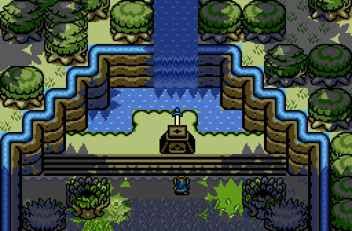
The Blade of Evils Bane grows dull as it has left the hero's hand...
Polaris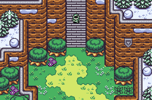
From snowy mountains to grassy plains.
Avataro![]()
There will be some enemies here.
Sheik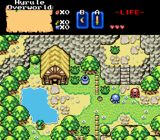
Joelmacool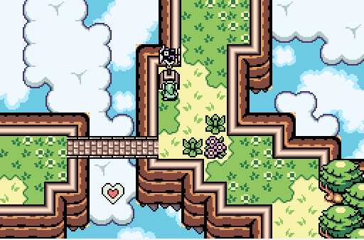
This screenshot is NOT part of Sanctuary Tree. Most tiles on this screen provided my Shane ![]() (Decided to try and make my own screen using his tiles)
(Decided to try and make my own screen using his tiles)
Dimentio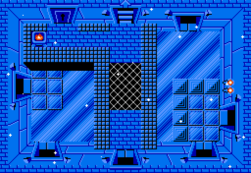
n a snow-bound land...
(Heavily inspired by a quest I am Beta Testing, and uses the same tileset (with a few custom tiles of my own))
Shoelace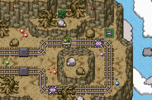
This isn't Link's first rodeo...

Screenshot of the Week 586
Started by
The Satellite
, Nov 21 2016 02:51 PM
Shoelace Zaxarone Polaris Avataro Sheik Joelmacool Dimentio
-
 This topic is locked
13 replies to this topic
#1

The Satellite
-

- Members
-

May the way of the Hero lead to the Triforce.
- Real Name:Michael
- Pronouns:He / Him
Posted 21 November 2016 - 02:51 PM
- MermaidCim, Cukeman and Joelmacool like this
#2
Magi_Hero
-

- Members
-

gubgub
- Real Name:Tim
- Location:NJ
Posted 21 November 2016 - 03:08 PM
Shoelace's shot reminds me of a few roller coasters I've been on. I also like this because the GB games featured mine carts. It needs to be brought back! Great mechanic for dungeon exploration.
#3
Eddy
-

- Moderators
-

ringle
- Real Name:Edward
- Pronouns:He / Him
- Location:London, United Kingdom
Posted 21 November 2016 - 03:10 PM
Really tough contest this week, so many great shots...
Zaxarone - Nice shot, it's good and simple though I do have a few small issues with it. For one, I dunno how to feel about trees being stacked up like that near the top. It just looks really weird and would probably look better if they were stacked diagonally (like in Sheik's shot). Another thing I noticed, is the Master Sword supposed to be going behind the pedestal? Gonna assume that's a tile error or something because I'm pretty sure the sword is supposed to be going into the pedestal ![]() Good effort anyway.
Good effort anyway.
Polaris - This is really nice. I love the animation of the grass and flowers. I also really like how the snow is on the mountains like that, it looks really different and interesting. And that palette is 10/10.
Avataro - Very good and dark shot here. The trees suffer the same problem as Zaxarone's (on the bottom right and bottom left), but I like the overall design and layout of this screen. I also spy a very minor tile error.
Sheik - This looks really beautiful. I love the really bright colours here and this makes the BS Tileset look so much better. The custom tiles you have here is probably my favourite part of this screen.
Joelmacool - Nice job using Shane's tiles here. This looks really good and the cloud tiles are used really well. The only critique I have is the bottom of the mountains have that weird blue colour on the rocks. That looks a little weird and probably would look better with a darker shade of brown or something like that. Good work anyway.
Dimentio - Interesting classic shot. This definitely looks fitting for an ice dungeon, especially with the sparkles everywhere and that really nice looking ice. I haven't really got anything else to say though, but good job lol.
Shoelace - Well this was a surprise ![]() I'm gonna guess this is some kind of minigame or something? Looks great anyway, and I really like the wasteland setting you have here. Reminds me a bit of Lanaryu Desert with the minecarts, though high up in the sky lol.
I'm gonna guess this is some kind of minigame or something? Looks great anyway, and I really like the wasteland setting you have here. Reminds me a bit of Lanaryu Desert with the minecarts, though high up in the sky lol.
Very close contest this week, but I'm gonna go for Sheik with almost everyone else in close second. Good job to all.
- MermaidCim likes this
#4
Sheik
-

- Members
-
Deified
Posted 21 November 2016 - 03:55 PM
Shoelace - Well this was a surpriseI'm gonna guess this is some kind of minigame or something? Looks great anyway, and I really like the wasteland setting you have here. Reminds me a bit of Lanaryu Desert with the minecarts, though high up in the sky lol.
I actually like the idea of moving some of the puzzles into the overworld. So maybe this isn't a minigame but simply the way of traveling in the desert area?
I would have voted for Shoelace, too, had I not been in the poll. I keep thinking, though, that maybe a palette that popped a little more would be nice. The one you have is a good palette, I just (...obviously) have a weak spot for the more comic colors.
Edit: Polaris, have you considered having full-color sprites? Your palettes and your screens in the GB stuff have become so much more complex, detailed and in-depth that the 2 color sprites look kind of out of place by now. Something very subtle might work.
Edited by Sheik, 21 November 2016 - 04:02 PM.
- MermaidCim, Jared and Naru like this
#5
Titanium Justice
-

- Members
-
Justice is served!
- Real Name:Jared
- Location:Ontario
Posted 22 November 2016 - 01:04 AM
Lots of good entries this week. It was a little hard to decide, but I voted for Shoelace.
#6
SpikeReynolds
-

- Members
-

Ironically bald furry
- Real Name:Spens
- Location:Grand Rapids, Michigan
Posted 22 November 2016 - 08:27 AM
Great turnout this week. I voted for Sheik, but Shoelace was a very close 2nd.
#7
Avaro
-

- Members
-

o_o
- Real Name:Robin
- Location:Germany
Posted 23 November 2016 - 08:47 AM
Damn, no votes for me. xD I chose a bad week. There are a lot of awesome shots. I would vote for Shane here, as I think that screen is perfect and something new for GB.
About the trees, I'd say that's just a preference. Thanks for letting me know about the tile error though. I'll need to go through my map and fix all similiar little errors like this.
Avataro - Very good and dark shot here. The trees suffer the same problem as Zaxarone's (on the bottom right and bottom left), but I like the overall design and layout of this screen. I also spy a very minor tile error.
About the trees, I'd say that's just a preference. Thanks for letting me know about the tile error though. I'll need to go through my map and fix all similiar little errors like this.
Edited by Avataro, 23 November 2016 - 08:59 AM.
- MermaidCim likes this
#8
MermaidCim
-

- Members
-

Yes I'm that guy who dreamt Dani was Zelda. LOL Cimfam/zelda
- Real Name:Michael
- Location:Danbury, CT
Posted 23 November 2016 - 07:31 PM
Sheik
Joelmacool
Dimentio
I was going back and forth between these 3, but ultimately I think Dimentio's is the best. The design of this screen is very welcoming. For me this is also a very tough vote deciding on which of these was gonna get my vote but I had it narrowed down to these 3.
Joel I love the idea of putting a heart piece on a cloud path, seems very innovative. Is it for a quest you're working on?
- Joelmacool and Deedee like this
#9
Eddy
-
- Moderators
-
ringle
- Real Name:Edward
- Pronouns:He / Him
- Location:London, United Kingdom
Posted 24 November 2016 - 04:40 AM
Joel I love the idea of putting a heart piece on a cloud path, seems very innovative. Is it for a quest you're working on?
It's just a random test screen he made (as he said in the caption ![]() )
)
- MermaidCim likes this
#10
Cukeman
-

- Banned
-

"Tra la la, look for Sahasrahla. ... ... ..."
- Location:Hyrule/USA
Posted 24 November 2016 - 08:54 AM
Wow!!!! What happened? There's some FANTASTIC work this week!!
Love the drama in Zaxarone's screen, the environmental transition in Polaris', the seamless depth of topgraphy and lush environment in Sheik's (which stole my vote, I haven't seen tiles used this way!), the sweet atmosphere of Joelmacool's, the effor of increased visual depth in Dimentio's, and the imaginative fun in Shoelace's.
- MermaidCim and Sheik like this
#11
Joelmacool
-

- Moderators
-
Addicted to Overwatch
- Real Name:Joel
- Location:Country of Europe
Posted 24 November 2016 - 03:55 PM
Joel I love the idea of putting a heart piece on a cloud path, seems very innovative. Is it for a quest you're working on?
Shane lent me his quest so I could take a look at it and make a few screens of it ![]() I've only made two screens, so it's not a quest I'm working on (the quests I'm working on are shown in my signature).
I've only made two screens, so it's not a quest I'm working on (the quests I'm working on are shown in my signature).
- MermaidCim likes this
#12
BFreq
-

- Members
-

The Unmistakable
- Real Name:Dan
- Pronouns:He / Him
- Location:Canada, Eh!
Posted 27 November 2016 - 12:29 AM
I can never get enough of those mountain tiles, Shoelace! Voted here.
#13
Naru
-

- Members
-

Magus
Posted 27 November 2016 - 08:55 PM
It was a close call between Dimentio, Avataro and Sheik for me. Dimentios is one of the most awesome classic shots I have seen so far and nearly made me forgot that I dislike the classic tileset. Sheiks screendesign feels once more just perfect and its the first tileset with such bright colors I like this much. Everything fits great together. The palette, the atmosphere and the overall screen design in Avataros shot was best for me though.
Joelmacool is a bit boring and I absolutely hate the mountain borders. Shoelace uses a tileset that looks a bit thrown together to me and while the great amount of details make up for it I don't like the general screen design too much. Zaxarone could use a few more details, but I like the general screen design. If it is OK to pull out the the sword from the front you could sprite a big "chest" (combo type) that acts as the podestal with sword in it for the not opened "chest". Polaros is shockingly the clear last place. The screen design itself is good, but the animation, flowers and snowy trees have too much detail for ezgbz in my opinion, the palette is also not very ezgbz like. It misses the simplicity I love about ezgbz and your other screenshots, but it also is far away from the charm firebird has. A bit like a failed fusion stuck in between.
Joelmacool is a bit boring and I absolutely hate the mountain borders. Shoelace uses a tileset that looks a bit thrown together to me and while the great amount of details make up for it I don't like the general screen design too much. Zaxarone could use a few more details, but I like the general screen design. If it is OK to pull out the the sword from the front you could sprite a big "chest" (combo type) that acts as the podestal with sword in it for the not opened "chest". Polaros is shockingly the clear last place. The screen design itself is good, but the animation, flowers and snowy trees have too much detail for ezgbz in my opinion, the palette is also not very ezgbz like. It misses the simplicity I love about ezgbz and your other screenshots, but it also is far away from the charm firebird has. A bit like a failed fusion stuck in between.
#14
The Satellite
-
- Members
-
May the way of the Hero lead to the Triforce.
- Real Name:Michael
- Pronouns:He / Him
Posted 27 November 2016 - 09:42 PM
With 31.37% of the vote, the winner of Screenshot of the Week 586 is Shoelace!
Congratulations!
Voting totals:
- Zaxarone (2 votes [3.92%])
- Polaris (11 votes [21.57%])
- Avataro (2 votes [3.92%])
- Sheik (13 votes [25.49%])
- Joelmacool (5 votes [9.80%])
- Dimentio (2 votes [3.92%])
- Shoelace (16 votes [31.37%])
- Joelmacool likes this
Also tagged with one or more of these keywords: Shoelace, Zaxarone, Polaris, Avataro, Sheik, Joelmacool, Dimentio


1 user(s) are reading this topic
0 members, 1 guests, 0 anonymous users

