QUOTE(Spantac @ Jul 26 2007, 05:27 PM)

I have seen it. But I still disagree. I was wrong about the adult cover though, what on Earth was that thing I found?
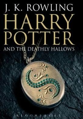
I don't know, but someone somewhere is trying to appeal to adults. To be fair, some people are perfectly fit to read the Potter series but don't want a childish-looking cover on their bookshelf. Still, the one with the picture of the locket was quite superior. Harry Potter doesn't need to look like the victim of an art murder.

QUOTE(Spantac @ Jul 26 2007, 05:27 PM)
Maybe it's because I'm used to the ones I have, but I really prefer the UK covers. I would also disagree and say that the US covers are less detailed - look at them next to eachother! How could you say it was more detailed? I don't like the font either, it's a bit to "wacky", though I don't like the UK font either.
Why, though, is Harry drawn so wierd-looking? On both covers.
I've generally disliked the typical UK fantasy covers I've seen. It's not that UK artists aren't ask skilled, but the generally accepted style seems weird to me. I'd point out that many of the artists seem not to have read the books, but that's true of many American artists, too (this doesn't apply to Harry Potter on either count, though). One example is Discworld: the artwork that makes the cover is typically totally inappropriate to the book. It drives me nuts because Terry Pratchett already has an artist who knows his world inside out: Paul Kidby. But he never does the covers.

Perhaps he's too expensive and his art is too detailed for covers... In cases like that I tend to prefer generic covers with little more than than an icon or two to represent the book's theme.
As for the US covers being "detailed"... I actually didn't say that. On the other hand, being detailed doesn't necessarily make for good art. The US covers put a lot of emphasis on the look of "brushstrokes," which I find effective since a wand is kinda like a magical brush.


