Jump to content

Photo

Screenshot of the Week 800

Anthus Architect Abdiel Colin FireSeraphim HeroOfFire Orithan Phosphor Rambly RedTribeLink Alucard648

  • This topic is locked This topic is locked
18 replies to this topic

Poll: Screenshot of the Week 800 (42 member(s) have cast votes)

Cast your vote!

You cannot see the results of the poll until you have voted. Please login and cast your vote to see the results of this poll.
Vote

#1 Taco Chopper

Taco Chopper

    protector of the darn forum

  • Administrators
  • Pronouns:He / Him
  • Location:South Australia

Posted 30 October 2023 - 01:06 AM

A Screenshot of the Week milestone is upon us! Thanks to all ELEVEN contestants for their screenshots for the 800th Screenshot of the Week - what a milestone to reach!


Anyway, without ado, here are the entries!


Alucard648
Alucard648.png
Sator arepo tenet opera rotas!

Anthus
Anthus.gif
It will cost more than 800 rupees to fix this ship.

Architect Abdiel
ArchitectAbdiel.png
Link reaches the castle. Hopefully the princess is actually IN this one.
 
Colin
Colin.png
Frog
 
FireSeraphim
FireSeraphim.png
Our Hero Link is currently struggling though the acid scarred outposts of The Gel Flow, long abandoned and left to ruin and disrepair

HeroOfFire
HeroOfFire.png
This screen only exists when playing. This level of screen generation in ZC? It's more likely than you think.

Orithan
Orithan.png
Man, it's been AGES since I submitted a screenshot. I'm glad I'm gonna be PRESENT for SotW 800

Phosphor
Phosphor.png
Surely they could have built a bridge here. Now my socks are going to get all wet!

Rambly
Rambly.png

RedTribeLink
RedTribeLink.png
Lost...Home...the search continues...someday soon...

Taco Chopper
TacoChopper.gif
swords


  • Anthus, Jenny, Joaish (RedTribeLink) and 2 others like this

#2 Colin

Colin

    Coblin the Goblin

  • Members

Posted 30 October 2023 - 01:17 AM

Damn, y'all pulling out all the stops.


I'm going to vote even though I'm in the contest because like, half the community submitted here haha. I'll have to think carefully though.


EDIT: Alright, I made my decision, I voted for Orithan this time around, your tileset has come a really long way and has culminated in a very nice shot. Great job!


Edited by Colin, 30 October 2023 - 01:30 AM.

  • Anthus, Taco Chopper and Jenny like this

#3 Anthus

Anthus

    Lord of Liquids

  • Members
  • Location:Ohio

Posted 30 October 2023 - 01:29 AM

Wowie zowie that's a lot of entries!


I really like FireSeraphim's shot. It's very atmospheric. Rambly and Phosphor are close runner ups in my book. I will probably have more thought out stuff to say later, but this is a great turnout.


#4 Shane

Shane

    💙

  • Moderators
  • Pronouns:He / Him
  • Location:South Australia

Posted 30 October 2023 - 01:37 AM

I voted Anthus here. Love the atmosphere and presentation a lot. 


Also more Slipstream, RedTribeLink? That'd be really cool to see! 


  • Anthus, Taco Chopper and Joaish (RedTribeLink) like this

#5 Bagu

Bagu

    Fandomizer

  • Members
  • Real Name:A.I. Bot Bottomheimer
  • Location:Germany

Posted 30 October 2023 - 12:30 PM

Wow, never seen so many entries, in an SotW before.
...and each one's fantastic.

Tis is very hard.
...I often tend to vote for the tileset I prefere. But I think, only screen arrangement should matter,in a screen contest.
But all of them are creative, innovative and well arranged.

I definitly have some favourites, but this week I won't leave a vote, simple because I can't pick an overall favourite.


Edited by Bagu, 30 October 2023 - 12:30 PM.

  • Taco Chopper likes this

#6 Colin

Colin

    Coblin the Goblin

  • Members

Posted 30 October 2023 - 01:36 PM

I think I ought to give some quick remarks to each shot:


Alucard648: I think the backdrop is very nice, but I think a lot of the rest of the graphics clash stylistically, at least between Link and everything else.


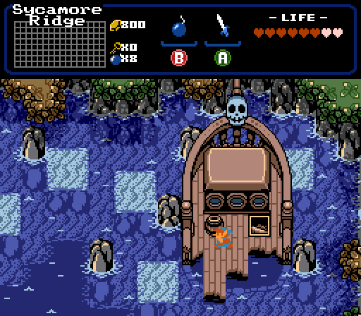
Anthus: this was 2nd place for me. The colors are gorgeous, and the detail of the lower half of the ship under the water is a fantastic addition. My sole issues with this shot are the perfectly square puddles, and the classic Link. As this beautiful tileset has developed, these two elements feel like artifacts and thus stick out detrimentally.


Architect Abdiel: I think this is the best shot I've seen from you; it's really good. I've had a hard time with the palette in the past, but the greys of the castle do something to soften the intensity of the palette and it just makes the screen work for me. I think this wasn't too far behind Anthus' to be honest.


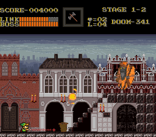
FireSeraphim: I like the sprites quite a bit. I think the texture of the walls could use a fair amount of work though, clashes a bit with the a lot of the other textures. Basically the walls are overly-textured, if they were more similar to the blocks on the floor, I think that could be a fair improvement. Look at Robotrek for some inspiration I think to get an idea of what I mean.


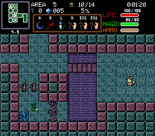
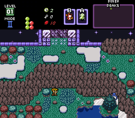
HeroOfFire: Oh, it's procedurally generated? That's fairly cool. I can appreciate the utility of these tiles, simplifying form to allow for more focus on function; though in the end it has an uphill battle for me in SotW. I think the concept is cool though.


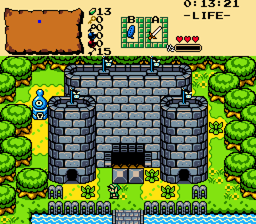
Orithan: already remarked above, but this shot shows excellent progress overall on the tileset and received my vote. My two notes would have to be that I think the bridge and stairs are too shiny and too textured. I would soften the interior outlines on both to suggest a texture, that would make them fit better with the grass and dirt... actually the texture on the house's roof is a good demonstration of what I would like to see on the bridge and stairs.


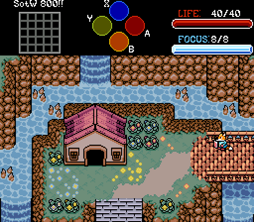
Phosphor: I mean, if this shot doesn't sell people on using PTUS, I don't know what will. This shot's gorgeous, outstanding work.


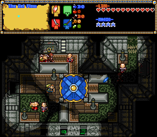
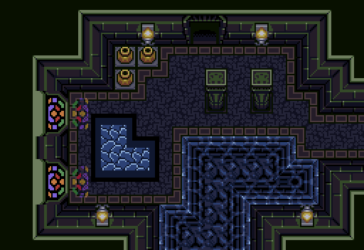
Rambly: I say this fairly frequently to everyone: adding a single sprite to the screen often adds a level of life that always improves it for SotW, in my opinion. That all said, I like the elements on display, such as the stained glass reflections and the floor texture.


RedTribeLink: I like the overall composition of the shot, I like whatever on earth is happening on the north side of the screen, it's quite compelling. I don't like a lot of the tiles though, the bushes and cliffs are too grainy and look mismatched to the other details IMO.


Taco Chopper: fantastic shot, great balance of symmetry and asymmetry. The colors are super pretty, I hope this is in Three Crests and I can't wait to play it.


---


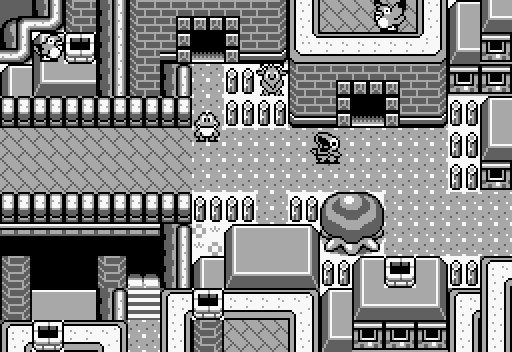
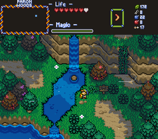
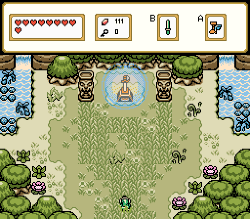
And then some notes on my shot, I made this shot a few months ago when I was exploring the LA tiles. If you'll believe it, this shot is all on a single tile layer and I have edited nothing from base LA here. The only non-LA stuff are the sprites; the goat is a custom sprite by me, the pakkun comes from SD1 and the frog comes from... some frog game that was only released in Japan.


Anyway, it's wonderful to see the turnout overall :)


  • Anthus, Taco Chopper, Phosphor and 2 others like this

#7 notmichaeljfox

notmichaeljfox

    Initiate

  • Members
  • Real Name:Michael

Posted 31 October 2023 - 02:17 AM

I didn't realise the theme was "make everyone else feel inferior about their art".


Edited by notmichaeljfox, 31 October 2023 - 02:17 AM.

  • Taco Chopper and Russ like this

#8 notmichaeljfox

notmichaeljfox

    Initiate

  • Members
  • Real Name:Michael

Posted 31 October 2023 - 02:46 AM

Alucard648 - It looks amazing and reminds me of so many NES games from my childhood.


Anthus - The way you have arranged your water this time elevates it over all your recent screenshots.

Architect Abdiel - the sheer size of that castle is impressive, and I love the addition of grey colours.

Colin - You've done a good job in creating different layers and heights and making it look effortless.

FireSeraphim - It looks amazing and I really want to play this screen.

HeroOfFire - What I love most is how you've arranged your subscreen. There's a lot of information that you've made very easy to read.

Orithan - The contrast between the rocks and the water and the grass is spot on. They belong together.

Phosphor - It's beautiful. The colours and shadows are fantastic.

Rambly - The light from the stained glass windows draws you in.

RedTribeLink - The shadow over the water is a beautiful touch and done very well.

Taco Chopper - The tall grass leading to the sword is a nice touch, and I refuse to believe the sword wasn't already built into Link's Awakening.


  • Anthus, Colin, Taco Chopper and 2 others like this

#9 Architect Abdiel

Architect Abdiel

    Kingdom Builder

  • Members
  • Real Name:Michael
  • Location:Florida

Posted 01 November 2023 - 02:25 AM

Chopper, this is an official request for you to rig the poll in my favor. Then I will become immortal and I can steal a mansion in the woods…. Or something…. Probably.
  • Colin and Taco Chopper like this

#10 Deedee

Deedee

    Bug Frog Dragon Girl

  • Moderators
  • Real Name:Deedee
  • Pronouns:She / Her, They / Them
  • Location:Canada

Posted 01 November 2023 - 11:31 AM

I feel bad for Hero; they have a good shot but they're competing in a contest with absolute bangers with a more subdued screen.


  • Taco Chopper likes this

#11 Phosphor

Phosphor

    Pixelating

  • Members

Posted 01 November 2023 - 06:11 PM

A turnout like this would make one think we went back in time 15 years. I guess the whole community is buzzing because of the looming 2.55 release and the fact that 800 is a nice, round number.

Alucard648 - I am loving the custom graphics in this! My only real criticism really only applies in the event that this becomes a publicly available quest to play: The complexity of the background definitely hurts the readability of the foreground a bit, however darkening the near background or reducing the contrast can completely fix this. Otherwise, solid!

Anthus - Flexing on us with the animated screenshot, I see. Even though I've seen a few other examples of this before, I'm surprised how good "transparent" water looks with the Classic/Cambria style (transparent as in manually drawn rather than relying on ZC's shoddy translucency system). I'm personally not a fan of the style clash the GBC leaves bring, however I wouldn't take any points off of my score since that's purely a matter of taste. At this point, the artstyle could benefit with the LA/Oracle Link tiles. Good work, though!

Architect Abdiel - A solid screen with no real flaws, but definitely an uphill battle this week when not including anything super fancy or eye-catching in the screenshot. I always have to give props whenever a screen includes elements of asymmetric symmetry in terms of tree placement, since it gives things a natural yet structured appearance. A lot of questmakers fall into the trap of perfectly mirroring tree placements in dead-ends like this, but you not completely adhering to the same grid for all trees does a lot of underappreciated work in bringing a screen together.

Colin - Zero criticisms from me on this one. It amazes me how much one can do with the limited tiles GBZ offers, yet you somehow managed to make a realistic-looking urban area that isn't just a collection of houses walls. Excellent work!

FireSeraphim - I like the custom graphics, though I'm wondering how readable things are in motion. The noisiness of the tiles mixed with the dithering style of the light makes me unsure of how things would play, but I'm sure it isn't too big of an issue. Solid dungeon screen.

HeroOfFire - The idea of screen generation in ZC is super novel and I love it! Visually though, as I put with Architect's screenshot, it's definitely an uphill battle.

Orithan - Your custom tileset is coming along super nicely! My only real criticism is that the blacks in the cliff tiles do lead to it appearing very noisy and could benefit with being changed to a darker brown if the palette allows for it. Otherwise, great!

Phosphor - Hello there handsome. I made this as another example screen for PTUS, which is getting an update for the final release of 2.55. I wanted to include some of the new weather graphics the set adds compared to PTUX and the new pine trees this final update is bringing to the set.

Rambly - I love the detail of the stained glass projecting light onto the floor. I actually wonder how things would look if you were to horizontally stretch the light to sorta get the effect of the sunlight pouring in at a lower angle than 45 degrees. No real criticisms from me, though. Good job.

RedTribeLink - I'm curious what tileset this is, because I'm seeing elements from so many all at once. I'm surprised it's remaining coherent to be honest. Definitely a cool setting!

Taco Chopper - Another fancy, solid, animated screenshot! As I noted with Architect's submission, I always appreciate more organic tree placements in an area like this. I'm not sure what else to note, though. Screenshot is overall solid!


  • Anthus, Colin, Taco Chopper and 1 other like this

#12 Anthus

Anthus

    Lord of Liquids

  • Members
  • Location:Ohio

Posted 01 November 2023 - 07:52 PM


Anthus - Flexing on us with the animated screenshot, I see. Even though I've seen a few other examples of this before, I'm surprised how good "transparent" water looks with the Classic/Cambria style (transparent as in manually drawn rather than relying on ZC's shoddy translucency system). I'm personally not a fan of the style clash the GBC leaves bring, however I wouldn't take any points off of my score since that's purely a matter of taste. At this point, the artstyle could benefit with the LA/Oracle Link tiles. Good work, though!


Thanks! That might be a good idea, classic Link doesn't really blend in super well. I could see how it looks, but I'm also unsure if I want to commit to changing all of Link's tiles out. I'm also thinking about enemies too, but there's way more options for that.


  • Colin and Taco Chopper like this

#13 Taco Chopper

Taco Chopper

    protector of the darn forum

  • Administrators
  • Pronouns:He / Him
  • Location:South Australia

Posted 01 November 2023 - 10:25 PM

Chopper, this is an official request for you to rig the poll in my favor. Then I will become immortal and I can steal a mansion in the woods…. Or something…. Probably.


Architect Abdiel,

As you're no longer a mod, you have no access to PureZC moderator bucks - they have all been revoked. Without accepting them as payment, I cannot "rig" the contest for you.

Apologies,

Taco Chopper

on behalf of PureZC staff


  • Anthus, Colin and Russ like this

#14 Architect Abdiel

Architect Abdiel

    Kingdom Builder

  • Members
  • Real Name:Michael
  • Location:Florida

Posted 02 November 2023 - 07:05 PM

I thought we were friends.
  • Anthus, Taco Chopper and Russ like this

#15 Colin

Colin

    Coblin the Goblin

  • Members

Posted 03 November 2023 - 12:23 AM

I thought we were friends.


  • Taco Chopper likes this


Also tagged with one or more of these keywords: Anthus, Architect Abdiel, Colin, FireSeraphim, HeroOfFire, Orithan, Phosphor, Rambly, RedTribeLink, Alucard648

0 user(s) are reading this topic

0 members, 0 guests, 0 anonymous users