)-( Marchland Malady )-(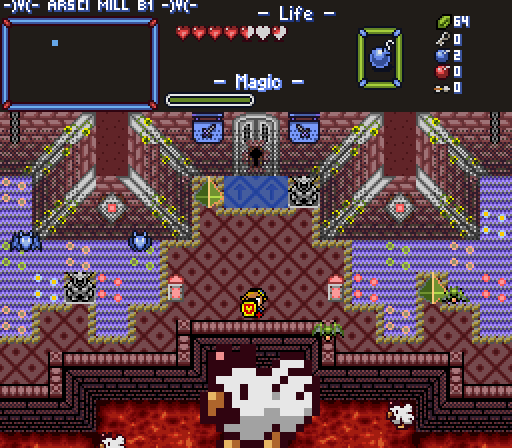
-Y- Link has learned not to question things like this... )Y(
Jambu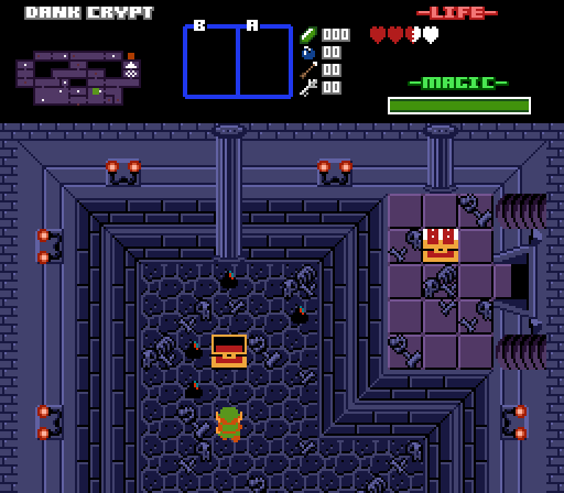
It's pretty dank in here yo.
Joelmacool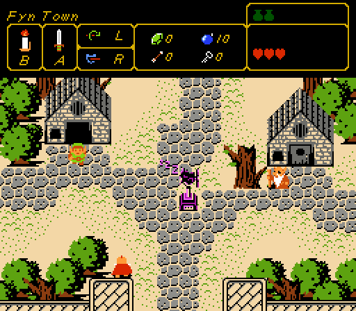
The Weather Vane sleeps, so you better wake it up!
Twilight Knight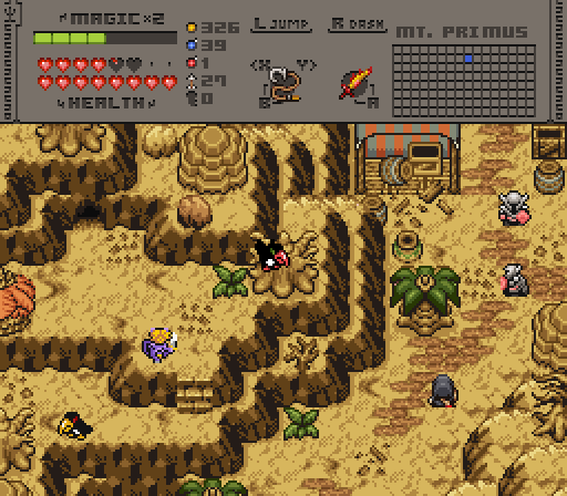
Nefarious

Screenshot of the Week 813
Started by
Taco Chopper
, Apr 29 2024 08:44 PM
Tie )-( Marchland Malady )-( Jambu Joelmacool Twilight Knight
-
 This topic is locked
6 replies to this topic
#1

Taco Chopper
-

- Administrators
-

protector of the darn forum
- Pronouns:He / Him
- Location:South Australia
Posted 29 April 2024 - 08:44 PM
- Twilight Knight and Joelmacool like this
#2
Jambu
-

- Members
-

Junior
- Pronouns:He / Him, They / Them
Posted 29 April 2024 - 08:48 PM
I really like the look of the houses in JoelMacool's Shot
- Twilight Knight, Taco Chopper and Joelmacool like this
#3
Chris
-

- Members
-

The Sun Is in Your Hand!
- Location:Germany
Posted 01 May 2024 - 07:48 AM
)-( Marchland Malady )-( I am still getting used to your tileset, but it is for sure interesting. How about making the top of the walls a brighter color like the grey on the corner pillars?
Jambu: I have no idea what the black things are, I assume enemies that are perfectly fine like that, just wondering. Also, I like the dark screen a lot, but the purple stuff next to your door looks really bad, besides being unlucky with how it "aligns perspective-wise" (sry, not a native speaker, it is not something to really bother about in classic anyway), the shadow makes no sense at all. I would remove the shadow, maybe add a border on the sides and a circle on top like with the pillars.
Joelmacool: I like the screen, it looks reall nice, I agree on the houses looking great. I would try making the castle walls a different color than the ground to look if that might look better and the purple triggers me a bit.
Twilight Knight: I see the wooden floor of the tent as a wooden wall with the barrel floating in front of it, I realize it is the floor but my brain says No. I would try to just go without the wood and use the sand in there as well. I would also try if it looks better if the floor wood is darker or to make the back/insidewall of the tent the darker shade completely instead of just close to the ground.
I do struggle with liking the tileset, but I have to say I like the landscape in this one a lot.
- Twilight Knight and Jambu like this
#4
Twilight Knight
-

- Members
-

Tell all with glee, Argon's on PureZC
- Real Name:Sven
- Location:Rotterdam, NL
Posted 02 May 2024 - 02:21 AM
I see the wooden floor of the tent as a wooden wall with the barrel floating in front of it, I realize it is the floor but my brain says No. I would try to just go without the wood and use the sand in there as well. I would also try if it looks better if the floor wood is darker or to make the back/insidewall of the tent the darker shade completely instead of just close to the ground.
I will look into that, thank you for the feedback. Now you've said it it can't be unseen. I'd like to keep the wooden floors, but perhaps some adjustments, such as getting rid of the hard borders, will help making it look like a floor.
#5
Jambu
-
- Members
-
Junior
- Pronouns:He / Him, They / Them
Posted 02 May 2024 - 07:53 AM
Jambu: I have no idea what the black things are, I assume enemies that are perfectly fine like that, just wondering. Also, I like the dark screen a lot, but the purple stuff next to your door looks really bad, besides being unlucky with how it "aligns perspective-wise" (sry, not a native speaker, it is not something to really bother about in classic anyway), the shadow makes no sense at all. I would remove the shadow, maybe add a border on the sides and a circle on top like with the pillars.
I'll look into fixing up those curtains from zelda2, cause you right. They do Look bad
#6
Joelmacool
-

- Moderators
-

Addicted to Overwatch
- Real Name:Joel
- Location:Country of Europe
Posted 06 May 2024 - 11:55 AM
Joelmacool: I like the screen, it looks reall nice, I agree on the houses looking great. I would try making the castle walls a different color than the ground to look if that might look better and the purple triggers me a bit.
After hearing feedback from you and others about the castle walls blending too much with the ground, I decided to change it up! I also decided to break up the path a bit more, since it looked a little dull before (and too uniform for my liking). The new screen is below, but it still features the purple bird in the centre since I'm trying to go for the ALBW design for the fast travel system.
Here's the how the screen looks now:
- Twilight Knight, Shane, Chris and 1 other like this
#7
Taco Chopper
-
- Administrators
-
protector of the darn forum
- Pronouns:He / Him
- Location:South Australia
Posted 13 May 2024 - 10:13 PM
The first tied Screenshot of the Week for 2024! With 73.91% of the vote each, the winners of Screenshot of the Week 812 are )-( Marchland Malady )-( and Joelmacool!
-Y- Link has learned not to question things like this... )Y(
Joelmacool
The Weather Vane sleeps, so you better wake it up!
Congratulations to you both! As always with tied SotWs, both winners will be eligible for Screenshot of the Month 201.
Voting totals:
- )-( Marchland Malady )-( - 8 (34.78%)
- Joelmacool - 8 (34.78%)
- Twilight Knight - 4 (17.39%)
- Jambu - 3 (13.04%)
Also tagged with one or more of these keywords: Tie, )-( Marchland Malady )-(, Jambu, Joelmacool, Twilight Knight
PureZC Events →
Screenshot of the Week →
Poll Screenshot of the Week 814Started by Taco Chopper , 13 May 2024 |
|

|
||
PureZC Events →
Map of the Month →
Poll Map of the Month 151Started by Shane , 02 May 2024 |
|
|
||
 |
PureZC Events →
Screen Rebirth →
Poll Screen Rebirth 9! The Contest!Started by Taco Chopper , 22 Apr 2024 |
|
|
|
|
|
Jenny
PureZC Events →
Screenshot of the Week →
Poll Screenshot of the Week 812Started by Taco Chopper , 15 Apr 2024 |
|
|
|
|
|
Matthew
PureZC Events →
Screenshot of the Week →
Poll Screenshot of the Week 811Started by Taco Chopper , 01 Apr 2024 |
|
|
2 user(s) are reading this topic
0 members, 2 guests, 0 anonymous users

