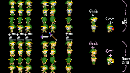
 What do you guys think? This replaces my old QftT Link.

My new Link
Started by
SpikeReynolds
, Feb 08 2007 07:23 PM
9 replies to this topic
#1

Posted 08 February 2007 - 07:23 PM
 What do you guys think? This replaces my old QftT Link.
#2

Posted 08 February 2007 - 07:27 PM
It may be an artistic style of it's own, but given that, it's form is alright. My one complaint is that there is no visible use of shading, making him look kind of flat...
#3

Posted 08 February 2007 - 07:28 PM
Look in ZC, it has shading. It looks flat on high-res. I noticed that too.
#4

Posted 08 February 2007 - 07:35 PM
Looking in ZC, I noticed that there are shades applied to it, my bad... However, you may want to improve shading on him for the people like me who play the quests in Hi-Res. I noticed that it looks so flat because the different shade colors are so similar.
#5

Posted 08 February 2007 - 07:37 PM
You are one fabulous artist, Daiv!  Because you sure know how to draw some completely custom Link Tiles!
Edited by Pokegamer1989, 08 February 2007 - 07:38 PM.
#6

Posted 08 February 2007 - 07:45 PM
Looking in ZC, I noticed that there are shades applied to it, my bad... However, you may want to improve shading on him for the people like me who play the quests in Hi-Res. I noticed that it looks so flat because the different shade colors are so similar.
Maybe. But I want it to look smooth and just the slightest bit moody and depressing.
#7

Posted 08 February 2007 - 07:47 PM
Hmm... Unless you specifically screwed with the palettes in a program to prevent ripping, it seems as if you used 256 color on these Link tiles! Now, because green is the only color that changes on the rings, shouldn't the palette have 16 shades for Link's clothes so every pixel can be a different shade? just a thought... Also, try using either yellow-greens (for an SD3 look) or my personal favorite teal-greens to try to make Link stand out more.
#8

Posted 08 February 2007 - 07:49 PM
The top are but the bottom are 1-palette 16color.
#9

Posted 08 February 2007 - 07:58 PM
Well, the entire palette on the image is messed up, making them unusable without editing the tileset's palette outside of Cset6, but it's alright.
#10

Posted 08 February 2007 - 08:13 PM
I modified your pallete with greater color contrast. This shows that your shading could use some work.

First off, the highlight of the hat should only be near the peak of the fold. You have the highlight spread all over the hat, causing it to look almost paper flat. (Meaning the highlight should be either on one side or the other. If you don't understand me, examine the four-swords link) His face should have shadows on the jawbone too.

First off, the highlight of the hat should only be near the peak of the fold. You have the highlight spread all over the hat, causing it to look almost paper flat. (Meaning the highlight should be either on one side or the other. If you don't understand me, examine the four-swords link) His face should have shadows on the jawbone too.
1 user(s) are reading this topic
0 members, 1 guests, 0 anonymous users


