Can someone explain those perspective issues? I'm lost.

Screenshot of the Week 265
Started by
Neppy
, Jul 19 2009 11:28 PM
-
 This topic is locked
28 replies to this topic
#16

Dawnlight
-

- Members
-

My name is NOT Jason!
- Real Name:Justin
- Location:Chicago, IL
Posted 20 July 2009 - 09:45 PM
#17
Prophecy Face
-

- Members
-

Junior
Posted 20 July 2009 - 09:48 PM
Mainly the trees. You have aLttP, MC, and GB trees in that shot and they all have different perspectives.
#18
Dawnlight
-
- Members
-
My name is NOT Jason!
- Real Name:Justin
- Location:Chicago, IL
Posted 20 July 2009 - 10:24 PM
QUOTE(Prophecy Face @ Jul 20 2009, 09:48 PM) 
Mainly the trees. You have aLttP, MC, and GB trees in that shot and they all have different perspectives.
It's supposed to be in a perspective similar to the trees in Evile's shot.
#19
Colin
-

- Members
-

Coblin the Goblin
Posted 20 July 2009 - 11:00 PM
QUOTE(Dawnlight @ Jul 20 2009, 09:24 PM)
It's supposed to be in a perspective similar to the trees in Evile's shot.
He's basically saying that the tree's graphics are all at different tilts, and the 3 styles look odd together, or something.
I voted for Dawnlight.
Haven't seen many honest to goodness mountain shots recently. Last one I remember was Dawnlight's overlook shot.
Coastline shots too, or plains shots, it seems that forest shots are made most often, and I feel like I see them too often.
Edited by Nuvo, 20 July 2009 - 11:01 PM.
#20
Joe123
-

- Members
-
Retired
Posted 21 July 2009 - 05:17 AM
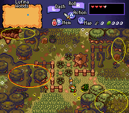
The issues with perspective is where you're using the GB-style small trees next to the aLttP-style large trees. And that little stumpy thing.
Now, arguably the large aLttP trees next to the orginal GB trees looks ok-ish, probably mostly because I've been looking at screens with those two sorts of trees together for years, and because the aLttP tree is so much larger than the GB trees, so while we're looking down on the aLttP tree we could be looking across at the GB trees.
It's still wrong however, and you shouldn't really use them together on a screen.
Those errors are in yellow circles.
The stumpy thing from aLttP in the red cicle looks really bad. It's just a small as the GB trees, and has a top-down perspective while the GB trees have a 'looking straight at' perspective.
Admittedly the actual tree stump itself looks a little off next to the GB trees too; if you look at the stump from OoS it's in a different perspective to the stump from aLttP.
An easy fix would be to rip in the DoR perspective-edited GB trees, and just use those instead of the original ones.
#21
Zemious
-
- Members
-

Magicite: Bahamut
Posted 21 July 2009 - 08:28 PM
I wanted to vote for Pabru but since he decided jpeg was the way to go, I went with Dawn Light.
Jpeg = Fail
Jpeg = Fail
#22
Twilight Knight
-

- Members
-
Tell all with glee, Argon's on PureZC
- Real Name:Sven
- Location:Rotterdam, NL
Posted 22 July 2009 - 05:01 PM
Even though it = fail, it doesn't say anything over the screen itself, neither it is disallowed by the rules, so I guess you just sound REALLY unfair atm.
#23
Zemious
-
- Members
-
Magicite: Bahamut
Posted 25 July 2009 - 08:14 AM
QUOTE(Twilight_Knight @ Jul 22 2009, 06:01 PM)
Even though it = fail, it doesn't say anything over the screen itself, neither it is disallowed by the rules, so I guess you just sound REALLY unfair atm.
I wouldn't say so. :/
#24
ShadowTiger
-

- Members
-
The Doctor Is In
Posted 25 July 2009 - 10:04 AM
It's like saying a world class competitor chef's entry into a competition is awful because of the way the light shines on their food.
If the image is distorted a bit, look for some other way to determine the screenshot's worth. Here you're just banging your head into the same wall over and over again.
If the image is distorted a bit, look for some other way to determine the screenshot's worth. Here you're just banging your head into the same wall over and over again.
#25
Nathaniel
-

- Members
-
Deified
Posted 25 July 2009 - 12:05 PM
skateboarder11 - 7/10
Yes, you are still alive. It is not bad for a classic style screen. As subtle are they are, the ground details are just right.
Pabru - 8/10
It seems to give all the right elements of a forest clearing. The lighting is well done, and this shows that a screen can mostly be shades of one color and still look great. The trees are well positioned. No file format can judge that sort of detail. Sorry Zemious, but I strongly disagree with you on your point.
jimmyb - 7/10
Also good for classic standards. The ground details, like skateboarder's screen, help bring life to graphics originally from two decades ago.
Dawnlight - 7/10
Great placement of fences, trees, grass, and other vegetation. Looks great, and I am sure the screens surrounding it do too. The only thing weird for me is the difference of tree types together in the same screen. Mainly their perspective with each other.
Evile - 7/10
I'm not a fan of the sharp cornered grass, but everything else seems to work well for the screen. The trees were placed in a very pleasing way, and the road details look like what I would expect from such a scene.
Lots of great shots this week. I voted for Pabru for working together well the common details with a more unique one.
#26
Moonbread
-

- Members
-
Playing With Psychos
- Pronouns:They / Them
Posted 25 July 2009 - 03:28 PM
Well, Mr. ShadowTiger, I do not like your metaphor/analogy mainly because food is meant to be eaten, not looked at (unless it's like an art class or something). I am with Zemious- well, somewhat. I think that the only good reason to use a jpeg screenshot is if you don't want people ripping custom tiles from the shot. This is a contest of how well a screenshot is designed and how 'pretty' it looks, so if that's the case, distortion isn't going to help much. :/ The only exception I've seen in the past is the subscreen for Lost Isle that Peteo submitted many SotW's ago.
#27
Bayta
-

- Members
-

Follower of Destiny
- Real Name:Robin Evans
- Location:Suffolk County, NY
Posted 25 July 2009 - 03:33 PM
I voted for Dawnlight. It just seems the most appealing to me.  Not to say the other ones weren't awesome too. In fact, there are quite a few really awesome screens this week.
#28
Prophecy Face
-
- Members
-
Junior
Posted 25 July 2009 - 04:59 PM
QUOTE(ShadowTiger @ Jul 25 2009, 11:04 AM)
It's like saying a world class competitor chef's entry into a competition is awful because of the way the light shines on their food.
If the image is distorted a bit, look for some other way to determine the screenshot's worth. Here you're just banging your head into the same wall over and over again.
That's a bad analogy. If a chef saved his food as a jpeg, I would not eat it. ...Or something like that. You know what I'm saying. A more correct analogy is that saving an image as jpeg is like a chef making a meal then scrambling everything on the plate so it looks like a brown mound of garbage.
#29
Neppy
-

- Members
-
Grand Overlord Empress
- Real Name:It's dangerous to go alone. Take Nep!
- Location:Minnesota
Posted 27 July 2009 - 03:49 AM
skateboarder11 - 3 votes = [7.32%]
Pabru - 15 votes = [36.59%]
jimmyb - 1 vote = [2.44%]
Dawnlight - 16 votes = [39.02%]
Evile - 6 votes = [14.63%]
Total Votes: 41
Dawnlight

Stay away from my fried chicken Deku Scrubs!
Good work once again, Dawnlight! Congrats!!
Pabru - 15 votes = [36.59%]
jimmyb - 1 vote = [2.44%]
Dawnlight - 16 votes = [39.02%]
Evile - 6 votes = [14.63%]
Total Votes: 41
Dawnlight
Stay away from my fried chicken Deku Scrubs!
Good work once again, Dawnlight! Congrats!!
0 user(s) are reading this topic
0 members, 0 guests, 0 anonymous users

