My vote went to Joelmacool. I like how his use of simple edits to the classic tileset create a ton of atmosphere. Creative use of limited resources is something that should be commended.
As for the others
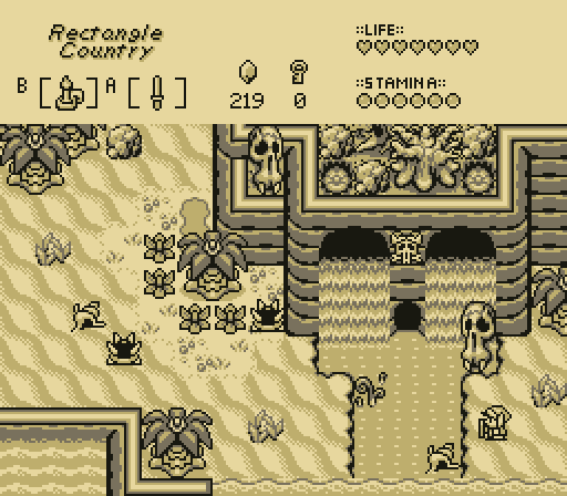
I love Aslion's palette choice. I don't think its nostalgia: the 3 color palettes really make the gameboy sets shine. My biggest problem is the symmetrical waterfall/cliiff/cave thing; The hard 90 degree angles of the GBC cliffs make it really easy to fall into a habit of making symmetrical natural features.
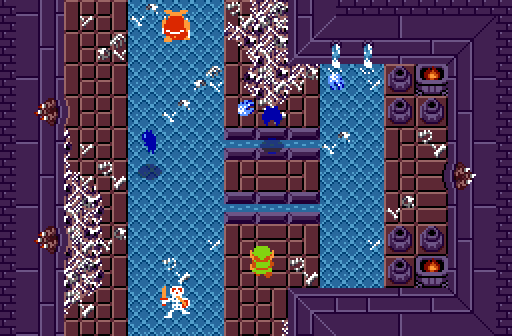
Haritiro's custom tiles and screen composition are excellent; while the screen transitions are aligned in a simple cross (a design choice I would generally try to avoid) the detailing on the cliffs, and sense of depth they provide distract from the actual simplicity of the screen layout; the Pokemon cliffs seem to be really useful for designing more natural cliff shapes, and are better at signaling elevation change without being too rigidly defined like the default Zelda GB cliffs. I love the color gradient for elevation change, but the world seems a little... pink? This would be my choice if the palette were refined just a little more. (I know this is a weird thing to latch on to, but I really like that staircase tile)
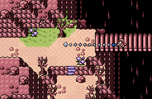
Valerie's shot is vibrant, colorful, and her trees really fit the BS aesthetic; I especially like her crooked logs and fallen trees. On the other hand, the composition seems a little basic: The N/S/E exits are aligned in a simple cross shape; and everything seems a little too basic Zelda 1 for my taste (okay, no wonder. the screen is just an exact replica of screen 59 of Zelda 1 but with some basic BS flavor)
Edited by TheManHimself, 16 April 2021 - 10:18 AM.

 This topic is locked