Bagu
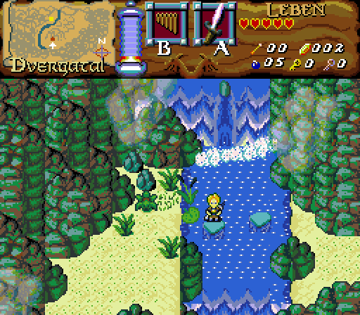
Jumping about the rocks in the creek
Fynn says:
"...tomorrow I'm gonna learn, how to swim.
YES... tomorrow sounds good!"
Jared
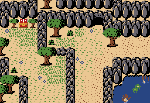
In the Plains
TheManHimself
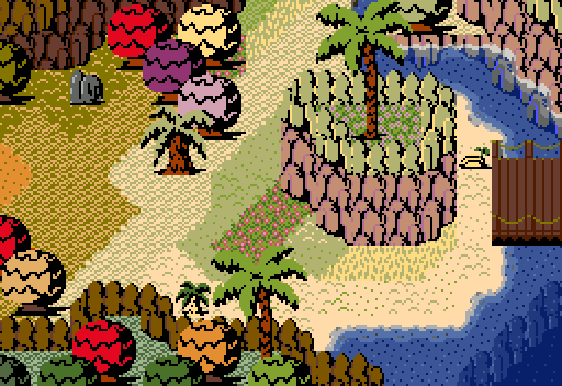
Equinox Transitions
Twilight Knight
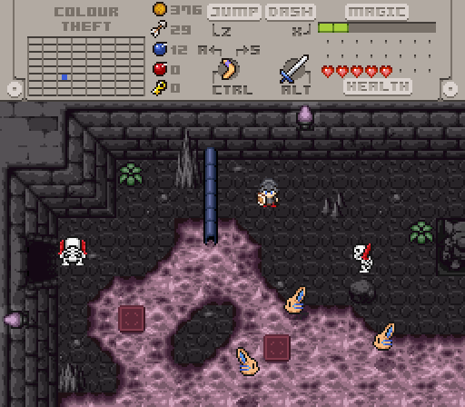
Heat-resistant bunnies!

Posted 29 August 2021 - 11:04 PM
Bagu

Jumping about the rocks in the creek
Fynn says:
"...tomorrow I'm gonna learn, how to swim.
YES... tomorrow sounds good!"
Jared

In the Plains
TheManHimself

Equinox Transitions
Twilight Knight

Heat-resistant bunnies!
Posted 29 August 2021 - 11:32 PM
I like my own work
...but Twily got me again!!!
Posted 29 August 2021 - 11:43 PM
Edited by Ether, 30 August 2021 - 06:04 AM.
Posted 30 August 2021 - 05:47 AM
Really good turn-out. I ended up voting for TMH but could would have voted for either of the others in other weeks with more ordinary entries.
Posted 30 August 2021 - 08:44 AM
I really agree with Ethers critique and advisement.
...so this is the edited version.
I took out a little color shade of my mountain palette.
...I keep the green/brown note.I also have a pure grey CSet of these custom mountain tiles.
But in this area I wanted to create a kind of "cross-fade" between pale grey-brown and grey-blue notes.
...and I don't want them paler than they are now.
But the colors were much too intensive.
(I still like intense colors, but they always need soft smooth overhangs).
The buggy, cut-off rock also looks a bit betternow, I guess.
Well, yes...
...the fog is transparent clouds, which are floating above the valley of "Dvergatal".
to the outstanding grid.
I still work on more diversified varation in my mountain tiles.
...but I think the basic concept is perfect, to disguise the screen grid.
...at least it was supposed to do that ![]()
Edited by Bagu, 30 August 2021 - 09:34 AM.
Posted 30 August 2021 - 11:03 AM
tough one between bagu and shane🇺🇸 for me. both gorgeous and super stylistically unique screens
in the end i went with TheManHimself, but just barely
Posted 30 August 2021 - 11:19 AM
tough one between bagu and shane for me. both gorgeous and super stylistically unique screens
in the end i went with TheManHimself, but just barely
Thank you very much.
...nice to hear that you like my graphic set
Posted 30 August 2021 - 09:29 PM
Bagu's tileset is interesting, but there is something off about the cliffs: I really don't think the brown accent color works at all with green cliffs; and this clash of color makes some of the corner cliff tiles that you use as texturing detail pop out from the main cliff face in a really distracting way. I would highly recommend cleaning up those cliffs my man: once you do that you're onto something here. getting early 90s crpg graphics vibe from your shots, and that's a cool place to be. Also that fog is absolutely choice. good color blend there!
Jared - I like the idea of your shot, and most of what I have to say is more about the tileset than your actual work. But to talk about your shot I'm going to have to talk about Cambria, which means I'm going to have to talk about cliffs again. I love how Cambria is coming along, but the pillar-cliffs are a gaping weak point in my opinion, and the rigid boxform shapes are way too GB-like in function to replace the utility of the classic cliff tiles, which with their asymmetrical slants and edges lend themselves to naturalistic freeform shapes. Also, because the cliff faces resemble columns of rock, the elevation effect in the bottom right corner of the screen near the pond looks a little too pillar-ish to convey a sense of depth, making it look like there is just a wall of rock separating the two ground areas instead of the intended terracing effect you were going for.
Mine - Completely refurbishing some of my earlier screens with a new layered ground style to allow for more seamless transitions between ground types, transparent water. restructured palettes, and a semi-optimized tileset to go with the palette restructure. This is a truly global Shane-gang effort: ShaneAU sent me the shore tiles, the short palms, and touched up my amateurish tall palms for me so they fit stylistically with the rest of classic. I've integrated a selection of tiles from Cambria to fill in classic's spartan detailing tiles, but I think that the only ones that made it into this shot are the palm nuts and the bridge tiles. TL;DR Them Bones is no longer classic, but SlantyClassic. Also purple trees until the day I die, bb.
TK - This is one dark, dank (in every meaning of the word) dungeon. Is the titular colour theft from Quake? because between the pipes and the browns and the slime I'm getting some industrial vibes here. I can hear scraping guitars and Trent Reznor's howls looking at this bad boy right here.
Edited by TheManHimself, 30 August 2021 - 09:49 PM.
Posted 31 August 2021 - 04:37 AM
Bagu
I absolutely love these aesthetics, so mystical and... primal? The atmosphere and graphics are spot-on. The choke-point on the right looks a little tight to walk through, but I'm sure it'll be fine. I agree with Ether that the half-rock doesn't look so good, I'm glad you edited it and the mountains look better as well. I personally like the way the clouds are in the original screen better though.
Jared
Are those savannah trees in Classic? Wonderful graphics and I like what you did with the ground detailing. I think it would look a lot better if the mountain tiles could stack properly, or give more of a sense of perspective with shadowing (on the ground f.e.), because especially the part right of the chest looks a bit awkward. But a pretty nice screen overall.
TMH
Wow! The colours are so vibrant, yet fit together well. The water looks superb also. But I do feel it's a bit too much variation and too chaotic to process quickly. At least in your quest players won't blaze through the screens quickly and need a moment to analyse each screen, so this could be viewed as something positive too.
It was a difficult choice between Bagu & TMH, but I voted for Bagu based on the original screen submitted. (not that I wouldn't vote for the newer version as well)
TK - This is one dark, dank (in every meaning of the word) dungeon. Is the titular colour theft from Quake? because between the pipes and the browns and the slime I'm getting some industrial vibes here. I can hear scraping guitars and Trent Reznor's howls looking at this bad boy right here.
The dungeon name is made up by CastChaos (this is a remake of a quest by the both of us), but perhaps he took it from Quake? I did play Quake multiplayer long long ago though, fun game!
I haven't listened much Nine Inch Nails, but their music sure would be fitting for this dungeon!
I dispute this, Pol's voice are just fakers they are not real bunnies, just giant eldritch maw creatures disguised as big floppers from a distance! Don't let them fool you!
Conspiracy! They are but innocent bunnies ![]()
Twilight Knight's screen puzzles me a bit, because I'm not parsing what that liquid coming out of the pipe is actually supposed to be. It's different from your generic orange lava, and I want to respect screens that make weird decisions like that! But I'm not sure I like the look of the mauve on gray, on top of not being totally sure what it is. I like that little island in the liquid, but the cool border around it makes me more conscious of the lack of any similar border for those two smaller floor tiles. (The walls and floors look pretty cool, in general, though. I tend to have a pretty strong GBC bias, but little top-of-the-wall details like the hints of a brick pattern in the top left corner are one thing I adore about fancier tilesets.)
Colour Theft is an odd name for a map. Is there a story there?
Even I don't know what the pink/purple/mauve (I didn't know the latter existed) liquid is exactly, but the hot liquid and industrial elements are related to the dungeon name, Colour Theft. There is indeed a story there, in a nutshell a wizard stealing colours from the world via machinery, though that realistically isn't possible at all. The full story will be revealed in the completed quest! :-)
And I like your suggestion with the floor tiles in the lava, I probably should put some border around them.
Posted 31 August 2021 - 08:45 AM
Conspiracy! They are but innocent bunnies

Posted 12 September 2021 - 05:56 PM
I like the colorful trees
Posted 12 September 2021 - 10:44 PM
With 51.35% of the vote, the winner of Screenshot of the Week 762 is TheManHimself!
My dearest Alma... as I stare out to the vast ocean, once again I feel nostalgia for what used to be myself... my life has never been the same without you. What used to be smiles and laughter, has become tears and sorrow. I miss you so much... and I only wish you were here with me... I love you so so much... and most importantly... I miss you. (Palette is up for grabs, I named it "sunset nostalgia").
Congrats!
Voting totals:
- Bagu - 14 votes [37.84%]
- Jared - 3 votes [8.11%]
- TheManHimself - 19 votes [51.35%]
- Twilight Knight - 1 votes [2.70%]
0 members, 1 guests, 0 anonymous users