3) The pallet placement seems REALLY weird to me, probably I'm misunderstanding something. Why are the 'normal' pallets located where enemy pallets are usually placed? If you imported the graphics and pallets into your quest you would be stuck with a really weird pallet. If you don't get what I'm saying, ask, I'm not being very clear. What I'm saying is why are the pallets not aligned between classic and Koten?
5) There's a problem with the extra overworld tiles. When people add extra tiles to their quests they usually add them in the space occupied the extra tiles. If they imported the graphic set this would mess up their quest. The solution is pretty simple though. Just move the extra tiles down a whole lot where people don't make new tiles. Then make a link in the favorite tiles to use box that gets you there when you right click.
6) Nitpick but the second and third dirt tiles should be switched.
Hey, Strike! I know you've probably been following this project since it's start so thanks for your patience and the nice compliments. 
As far as tweaking tiles go, I'm fine with moving the ground tiles but I'd really rather not move the new overworld tiles. No matter where I shove them, there will always be conflicts. Can't predict 'em all. 
And the palettes? Hmm...There's a lot I'd like to say but, to be blunt, I have no idea how ZC palettes work. I've read up on everything the wiki has and that I know of, there shouldn't be any sprite/overworld palette conflicts other than Link's tunic changes. And I've already fixed those! But yeah, sadly I had to completely reinvent Classic's palette system. An explanation, if you will...

There are several "styles" of NES graphics out there. Some of the earlier NES games go for high-usability, where each of a sprite's 3 colors belongs to a different shade. A good example of this is SMB3. The pirahna plant there doesn't have any shading or very much detail, but you can also swap out any of it's colors and no matter what combination you use, it will still make artistic sense. On the other hand, we have late NES games like Sunsoft's Batman. They chose to make their sprites have a 3-color monochrome palette and as a result, they were able to shade with a lot of detail. But the tradeoff is that you can't use any combination of colors. One color must be brighter and the other must be darker. And generally speaking, they both have to be near each other on the color wheel.
The original Legend of Zelda went for the high-usability route while Koten took the high-detail route. And unless you layer sprites to add more detail (Like Mega Man did) these graphics are incompatible with each other. And that's why Koten uses an entirely different palette system.
This looks pretty great. I love the style and the colors are really nice. I definitely want to play around/make something with this. A couple things though:
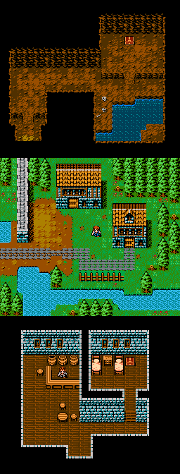
1. I would realllllly like some house tiles. Having all these other details added to the Classic set but no houses? We're not cavemen, we have technology. 
2. Is there any chance you wouldn't mind making a female hero set? Pretty please?
Yes, and yes! Both of those are something I've planned from the start for Koten Advanced. I'm not going to be adding any more tiles to Koten Basic (to stay import-friendly) but for Advanced I'll be completely reinventing the Zelda aesthetic. I'll be keeping all of the sprite/item/gui graphics, but for terrain I'll be going nuts but keeping it simple to save on screen space. Here's an example of the kind of tiling I'm going for, courtesy bologht: