By the way, is there anything you would change or get rid of?
Post your maps.
Started by
Anthus
, Jan 02 2012 02:28 PM
1375 replies to this topic
#91
Posted 20 May 2012 - 11:17 PM
Ah, already fixed that. 
By the way, is there anything you would change or get rid of?
#93
Posted 21 May 2012 - 10:41 AM
I really like your map Dragonite, but did you try directly going from the mountain to the water? That could be used in some places.
The grass-water borders could use some more contrast/depth to match your other tiles, if other games has nothing to use you might want to get/create some custom ones.
#95
Posted 21 May 2012 - 11:52 PM
Looks good, Dragonite. The design is detailed and functional. You can't ask for much more.
#97
Posted 24 May 2012 - 04:42 PM
Amazing job. Great design, great colors, great tiles. Wonderful work, Dragonite!
#98
Posted 24 May 2012 - 05:11 PM
Really good! Did you try those grass to water borders instead of the BS borders you used near the mountains?
#99
Posted 25 May 2012 - 01:59 PM
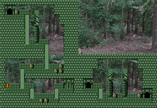
This is the starting area of a dungeon I am working on.
Nymph Shrine Beta
Are you afraid of this dungeon? No? You will be.
You will be.
Nymph Shrine Beta
Are you afraid of this dungeon? No? You will be.
#100
Posted 25 May 2012 - 03:18 PM
It looks really...interesting.
Infact, it actually looks pretty good! I like the originality I am seeing here.
#101
Posted 25 May 2012 - 03:24 PM
Thank you, Dragonite.
There will be more to this dungeon.
#102
Posted 25 May 2012 - 08:41 PM
This is the starting area of a dungeon I am working on.
Nymph Shrine Beta
Are you afraid of this dungeon? No? You will be.
Eh, there are many perspective clashes I'm seeing in this map. But nice concept and background.
#103
Posted 27 May 2012 - 04:08 AM

Timbersin Village strikes again!
(Just so you know the image size is 512px × 176px which does not break 600px image rule.)
Also what's subject to change:
- The path tiles, while yes, they look awesome, they don't really fit in with the other graphics.
- The pink square of course, which later, will be replaced with a chest!
EDIT: And yes, forgot to mention, there are more houses/screens to come.
Edited by Shane, 27 May 2012 - 05:08 AM.
#104
Posted 27 May 2012 - 12:34 PM
I like it, but the left side still bugs me. However, from what I saw on your stream last night, it looked like you fixed that, so no complaints here!
#105
Posted 29 May 2012 - 09:13 PM
Thanks Evan! Actually, I'm adding in the suggestions people said right now. But here is the latest version:
Timbersin Village!
Overall, it's playable (besides the warps and NPCs) design wise. Suggestion and gameplay elements are up next!
Timbersin Village!
Overall, it's playable (besides the warps and NPCs) design wise. Suggestion and gameplay elements are up next!
1 user(s) are reading this topic
0 members, 1 guests, 0 anonymous users