Jump to content

Photo

PureZC Art Gallery


  • Please log in to reply
1324 replies to this topic

#946 Sheik

Sheik

    Deified

  • Members

Posted 25 March 2011 - 01:02 PM

Thanks for the feedback on my previous piece, everybody.
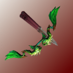
As you may know, I'm a Skyward Sword fanboy beyond reason. Also, recently I'm developing a love for everything Zelda 1 related (I never was that much into it, it just recently hit me). And, moreover, I'm a huge supporter of Zelda redesigns. Now add that I wanted to give digital art a second chance (got a gt, gotta use it, right?). So here is my second digital artwork: Skyward NES (or something).
Yeah, obviously heavily referenced a certain SS screenshot. I've noticed that I'm much better without outlines in digital art. Well, I had a pencil scribble, of course, but I decided against black OLs (and they'd look awkward with the SS style anyways). The "technique" I used is a terrible mess (as in I have no technique) and I abused the smearing-tool heavily, but I kinda like the result anyways. The sword is designed after the NES Wooden Sword and TP's Wooden Sword (the bottom part of the tilt), if anybody cares.
Anyways, comments? icon_smile.gif
Edit: Isn't it frightening that it took Link 25 years to get some normal trouses? I think it is.
Edit2: Oh, and it took me about 5 hours. Now I'm hungry. :O

Edited by Sheik91, 25 March 2011 - 01:13 PM.


#947 Yapollo

Yapollo

    To Discover

  • Members
  • Location:Somewhere in the U.S.

Posted 25 March 2011 - 05:09 PM

I like it, it is a realtic/cartoony blend that reminds me of anime and Skyward Sword.

This is much better than my artwork
<==

I would like to see your rendition of Zelda in a similiar style

#948 Sheik

Sheik

    Deified

  • Members

Posted 25 March 2011 - 05:14 PM

Thank you! icon_smile.gif It's ment to remind of Skyward Sword, good thing it does.
Yeah, I'm already planning to render Zelda in such a style. I'm growing quite font of the strong colours of the NES. I'm usually not that bold with bright colours, but it actually has a certain charme. Though I have to redesign her a little and switch the anatomy to the one I decided to use on Link (a little less FSA and a little more SS).
I was thinking about drawing that Link in actions (fighting some Octoroks or Moblins probably), but I'm not sure wether I want the stay honest to the NES and make the blade of the (L1) sword wooden or make it a metal blade (which would make more sense). What do you guys think?

Are you talking about your avatar? Well, what I like there is the colours, the text(-font) and the washed-out-ness. It has a certain vintage-vibe, actually. Vintage's always good icon_biggrin.gif

Edited by Sheik91, 25 March 2011 - 05:15 PM.


#949 Sheik

Sheik

    Deified

  • Members

Posted 26 March 2011 - 03:33 PM

WIP of NES_Ganon. The NES palettes are actually quite great as they are so limited that everything's cut down to the important stuff only. Not so much distraction.
Another WIP, actually, but that one's final. I don't feel like finishing it, but it was good practice. I'm fairly used to the grafic tablet now, so I should start actually considering shading and anatomy and physics... and well, the hard stuff :/ But I'll definately stick with the strong colours. Hm, I should also learn how to make custom brushes. I also need to get much faster. Again spend hours on it and the resluts don't justiy the time invested.
The white patterns on the armor are slightly inspired by TP Ganondorf. The main inspiration for this piece was some artwork by a guy called Arne in the net.

Edited by Sheik91, 26 March 2011 - 06:04 PM.


#950 Moon

Moon

    goopy

  • Members
  • Pronouns:She / Her
  • Location:Viridi Town

Posted 03 April 2011 - 08:45 PM

Kirby and my fan character Kibble.

#951 Moon

Moon

    goopy

  • Members
  • Pronouns:She / Her
  • Location:Viridi Town

Posted 04 April 2011 - 04:24 PM

Oh, did you draw those sheik? because they look really good

#952 Tree

Tree

    Everything must go away

  • Members
  • Real Name:Mundy Fumple McStroodlestein
  • Location:The Milky Way Galaxy

Posted 04 April 2011 - 08:19 PM

Sheik: That link drawing is awesome! I almost thought it was a model for the game! Only complaint is that his head is huge.

#953 Geoffrey

Geoffrey

    Chosen One

  • Members

Posted 19 April 2011 - 11:24 AM

Hey Buddy!

Copy Pasta:
This is my socials project. It's supposed to attract British settlers of the 1800s to come to Canada, don't know if I accomplished that.

This is made 100% out of construction paper and glue. All I can say is that I have newfound respect for Stone and Parker for creating The Spirit of Christmas without a computer.

This uses South Park character and style, which I do not claim as my own.

#954 SpacemanDan

SpacemanDan

  • Members
  • Location:Ontario, Canada

Posted 22 April 2011 - 09:38 PM

If it weren't for the fact that I already live in Canada, I would be there to see Terrance and Phillip. icon_razz.gif

But seriously, nice stuff. Simple, but I find Terrance and Phillip amusing for whatever reason. I can't say why. XD

#955 SpikeReynolds

SpikeReynolds

    Industrial Sorcerer

  • Members
  • Real Name:Spens
  • Pronouns:He / Him
  • Location:Grand Rapids, Michigan

Posted 04 June 2011 - 07:16 AM

Devil's Hog

Yea. Tired of "Biker-Dykes," so I drew a non-bikerdyke on a bike. Yay.

#956 Jared

Jared

    Deified

  • Members
  • Real Name:Jared
  • Pronouns:He / Him
  • Location:Massachusetts

Posted 04 June 2011 - 07:34 PM

That's very nice, Spens!
I like the motorcycle >:D

IPB Image
This will become part of my game banner.
What do you guys think?

#957 ZebraStallion

ZebraStallion

    Follower of Destiny

  • Members

Posted 05 June 2011 - 01:54 PM

QUOTE(Lynker @ Jun 4 2011, 07:34 PM) View Post

That's very nice, Spens!
I like the motorcycle >:D

IPB Image
This will become part of my game banner.
What do you guys think?

The blade needs more shading and I think the handle should be darker.

#958 SpikeReynolds

SpikeReynolds

    Industrial Sorcerer

  • Members
  • Real Name:Spens
  • Pronouns:He / Him
  • Location:Grand Rapids, Michigan

Posted 05 June 2011 - 03:08 PM

QUOTE(Lynker @ Jun 4 2011, 08:34 PM) View Post

That's very nice, Spens!
I like the motorcycle >:D

IPB Image
This will become part of my game banner.
What do you guys think?


Thanks for the kind words, Lynker.

Anywaqy, the only thing that I can really see is the lack of any shading. Metal is shiny, and as such, you'll want some highlights both on the blade and cross-guard.

#959 Jared

Jared

    Deified

  • Members
  • Real Name:Jared
  • Pronouns:He / Him
  • Location:Massachusetts

Posted 05 June 2011 - 03:32 PM

Here is the updated version!
And no, thank YOU for your kinds and helpful words! icon_biggrin.gif

IPB Image

#960 SpikeReynolds

SpikeReynolds

    Industrial Sorcerer

  • Members
  • Real Name:Spens
  • Pronouns:He / Him
  • Location:Grand Rapids, Michigan

Posted 05 June 2011 - 07:30 PM

QUOTE(Lynker @ Jun 5 2011, 04:32 PM) View Post

Here is the updated version!
And no, thank YOU for your kinds and helpful words! icon_biggrin.gif

IPB Image


You've got it looking a bit better. One thing I can say is that the highlights would probably be a bit more drastic and a bit less consistent.

Here's for reference.

IPB Image

You ARE coming along though.


1 user(s) are reading this topic

0 members, 1 guests, 0 anonymous users