QUOTE(Mr. Pimpy @ Dec 8 2010, 01:41 PM)

Usually when critique is given in this thread it goes ignored.
If nothing else though, it provides the artist with a confirmation that their work didn't get skipped over and was seen by someone

. I doubt any serious critique will cause any immediate changes, but if just one small thing can be improved through constant pandering it's a job well done.
For what it's worth to, I now check my comics to make sure I haven't left any "a" open, or otherwise looking like a "u".

QUOTE
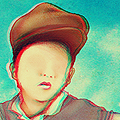
Funny thing though, you said "you'll be doing indie cd covers in no time kid." and an indie artist noted me on dA the next day asking me to do some album art for him. You psychic, you.
Psychic nothing. You're style of drawing is realistic with whimsical touches, and you've got a very good eye for color. Hipster indie musicians will eat that up. Your wardrobe will slowly convert to plaid and your fridge slowly accumulate PBR's in no time.
QUOTE
Reminds me of a larger version of that avatar you used to have. Like it, though I think even more consideration for where to put the rainbow splashes could make it a lot better.
Re: the tree one: Don't care for the moon, sun, dark green circle to the right of the center tree. Yay swirls.
Spent three hours yesterday drawing six musicians (among other small graphics) for a top 20 albums of 2010 for newspaper. I'll post the other ones when I can, but here's one of em.