Looking pretty good Limebeer, I like the set up you got going there.
Crescent Island in the past. Any thoughts?

I actually just beat this area last night! And thus, yours is very faithful to the original. Looks perfect.

Deified

Posted 07 April 2015 - 12:00 PM
Looking pretty good Limebeer, I like the set up you got going there.
Crescent Island in the past. Any thoughts?
Formerly Lineas

Posted 07 April 2015 - 12:00 PM
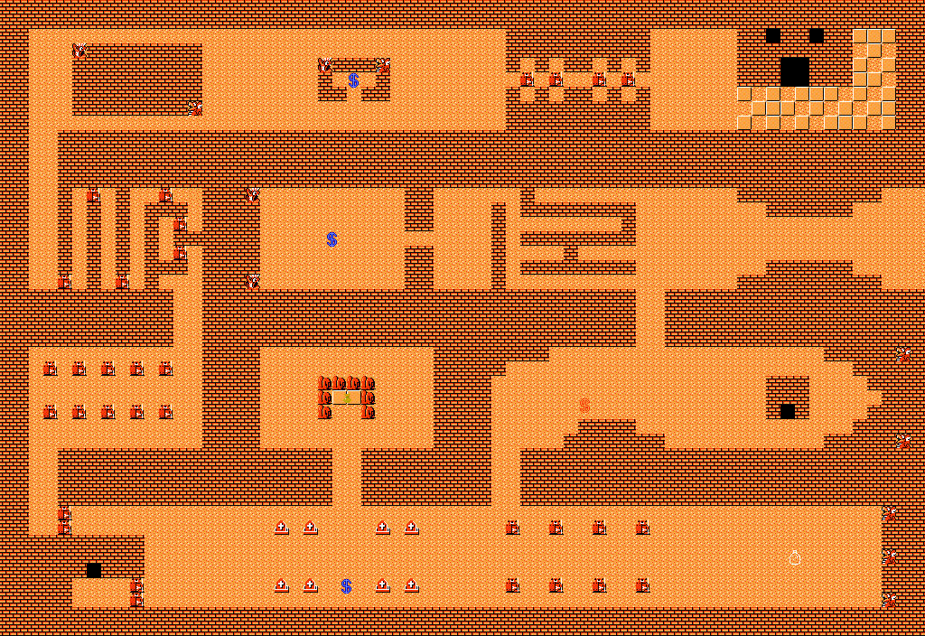
Looks like it's coming along wellforest area
As it stands. here is my (mostly complete, still need trees in screens) forest area until I finish level 4 and release the next demo before revamping the mountain sections where I can add in the last few screens as well as the swamp section. The screen where the house is at the top is where you'll receive some hints about the swamp, as well as the dungeon. I don't know if I'll have it be a pay for info hut, or if it will just be subtle hints via dialogue. As you see, level 4 is at the bottom there, and to get to it you need to find the hidden pathway that will allow you to explore the forest fully. There will be only the one entrance to the forest/swamp area (the one from the first town close to where the fisherman is hanging around), though I'll probably set up a warp station in the second town that leads to certain areas. If you can't find it, pay attention to the leaves on the ground, sometimes they can point certain things out for you..
Edited by Binx, 07 April 2015 - 12:01 PM.
You can do anything with the abuse of the Animal Husbandry skill

Posted 07 April 2015 - 12:09 PM
Looks like it's coming along well
Thank you! I am quite enjoying doing the forests, even though the canopy parts are annoying at times... But all in all I am very happy with how it's coming along ![]()
Deified
Posted 07 April 2015 - 02:02 PM
You can do anything with the abuse of the Animal Husbandry skill
Posted 07 April 2015 - 04:49 PM
I'm going to be honest, Limebeer. I don't like it very much. You need to edit your trees to stand on top of the forest brush, instead of using the grass ground it comes with I like the forest design though.
You're also not using the DoR/SD3 grass correctly. You're supposed to use all the tiles on a pattern, and not flat like in your maps. I might be able to show you how I do it soon.
On the positive side, I absolutely adore the shape of the land and the water. It feels very fresh and natural. Well done!
I'll be honest, I was a bit lazy with the grass in this area mainly because I wanted to get the layout done more quickly. And yeah, I do see what you mean with editing the trees. I'll be sure to go back and do so when I go to edit some of the canopy as I found that I had to adjust the tree positioning too much from where I wanted them to be at times because the canopies could not align properly, even with the merging ones found in this tileset. (I'm also going to have to get some imported ones as well to get some diversity)
But yeah, back to the grass I do try (in previous screens) to use them all in a random pattern placed by hand. Unfortunately that means that each screen can take quite a while to finish just for the grass alone. But yes I would love to see how you do it, especially if it will help me and help build them alot better as I know I am not using the tiles nearly to their fullest potential!
And thank you! natural was what I was going for in the water and land shape ![]()
But yes, any help and advice is always welcome!
ringle

Posted 08 April 2015 - 04:58 AM
I actually just beat this area last night! And thus, yours is very faithful to the original. Looks perfect.
Thanks a lot man, I appreciate it ![]()
Go glitches
Posted 11 April 2015 - 09:43 AM
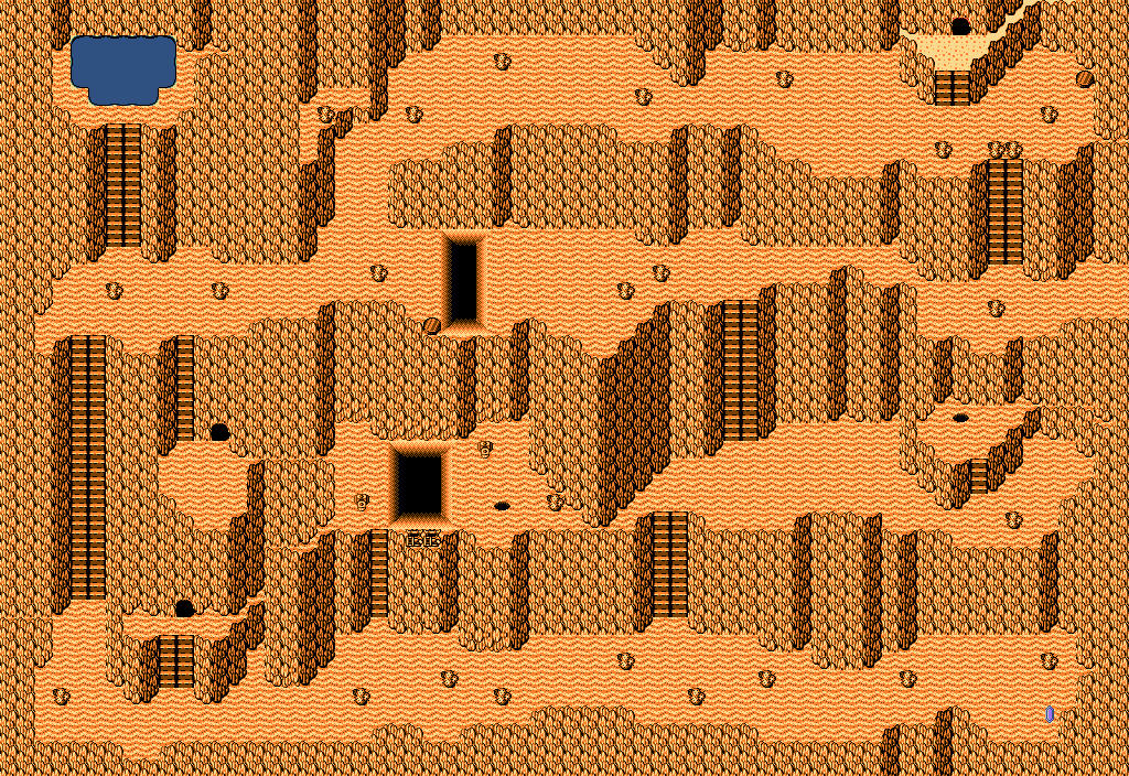
One of the area's of level 10. This thing is a lot more confusing to look at then it is to play.
Edited by bmc10011, 11 April 2015 - 09:45 AM.
ringle
Posted 12 April 2015 - 05:57 AM
Looks really nice. Like I said over in the accomplishment thread, an actual palette would make the world look much prettier rather than using CSets 4-9 (or whatever the numbers are).
🤍

Posted 12 April 2015 - 06:09 AM
Looks really nice. Like I said over in the accomplishment thread, an actual palette would make the world look much prettier rather than using CSets 4-9 (or whatever the numbers are).
Csets 5-11 actually.
But I agree with Eddy. Even if this were a legit palette, it still looks bland and uninspiring. There are palettes within the tileset made by PureZC members that look much better IMHO. Speaking of which, perhaps we need more custom palettes within the tileset...
Warrior

Posted 12 April 2015 - 08:51 AM
It uses cset 0 as a matter of fact! But I am actually using a different palette, but I didn't bother changing the screen palette.
*DERP*
Even if I do use other palettes, the map has been built in cset 0 already. I don't really mind though, I like how it looks.
Edited by FlameCursed, 12 April 2015 - 08:59 AM.
King of Pridenia, Safehaven of the LGBTQ

Posted 21 April 2015 - 08:23 PM
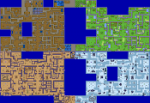
The level 3 area of Adam's Quest Redux. Although in retrospect I see an oddity or two, I think the new is a hundred times better than the boring, bland as hell original. Care to compare?
The Old:
The New:
What's up my playas

Posted 21 April 2015 - 08:27 PM
The level 3 area of Adam's Quest Redux. Although in retrospect I see an oddity or two, I think the new is a hundred times better than the boring, bland as hell original. Care to compare?
The Old:
The New:
1 word: AMAZING
Edited by ZeldaPlayer, 21 April 2015 - 08:28 PM.
ringle
Posted 22 April 2015 - 11:53 AM
That's a really neat remake of the old ruins area. I guess if I had to give a suggestion, I would probably say it's a bit too monochrome, as in, it's just orange and black and there isn't really any other colours used besides that one pool. Besides that though, it looks pretty awesome.
King of Pridenia, Safehaven of the LGBTQ
Posted 22 April 2015 - 06:07 PM
That's a really neat remake of the old ruins area. I guess if I had to give a suggestion, I would probably say it's a bit too monochrome, as in, it's just orange and black and there isn't really any other colours used besides that one pool. Besides that though, it looks pretty awesome.
I'm thinking about making the cacti in 8-bit color so they can be green to stand out from the orange/brown. After all, I think a cactus looks better green than orange/brown. I also noticed a few other minor mistakes, such as one of the screens missing cacti and I was thinking about replacing the Armos on the one screen with them as well.
0 members, 0 guests, 0 anonymous users


