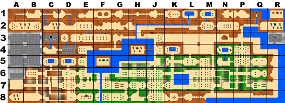
Hmmm....I don't know...This is really good screen detailing as far as Classic maps go, but when you look at it from a distance there just isn't much going for it, you know? There aren't any landmarks that stand out, a lot of screens look very same-y and overall there isn't a very unified color scheme. Heck, even the original LoZ overworld had some unity to it. Notice how there are some large patches of green, large patches of red, big bodies of water, etc. Really, what I'm getting at is that you should probably focus more on your maps as a whole, and less on the screen-to-screen designing. Having a plan in place (even a terrible MS Paint sketch) works wonders for giving maps some unity. 
You don't automatically get access to certain areas anyways, till you get more scales in the game.*
A Scale is an item you have to obtain for each dungeon before the mermaid is able to dive yet in some areas from the start and then come up too the surface within other areas of the world maps.*
Example: The top right enclosed looking area with the pillars and blocks is as much as you get till you get along further to other dungeons on the overworld map.
(Some areas you cannot access until you have a higher level- hammer or a Silver/green stone
smashing Zyphar Hammer.
All my maps concentrate heavily on secrets mainly.* When you're such a tiny person on the overworld you won't really notice much of a 'confusing difference' underwater anyways.
Junk always falls too the bottom of the lakes, but always prevents conscious Persona's from passing by through except for some strange bizarre demon fish.'
Edited by SkyLizardGirl, 18 February 2015 - 11:21 PM.


