Jump to content

Photo

The Official Quest Screenshot Critique Thread


  • Please log in to reply
7962 replies to this topic

#7006 Geoffrey

Geoffrey

    Chosen One

  • Members

Posted 30 April 2016 - 06:28 PM

OK...how does this look?

beach_dunes_demonstration_2_by_dragondep

The rule of thumb here is that if something has a black outline, it's unwalkable.

I actually really liked and preferred the original. The new grass feels too busy and detracts from the otherwise simple beauty of the shot. Either way, stellar work.


Edited by Geoffrey, 30 April 2016 - 06:28 PM.

  • Astromeow and Matthew like this

#7007 grayswandir

grayswandir

    semi-genius

  • Members

Posted 30 April 2016 - 06:32 PM

That looks decent. I was going to suggest the other grass with a dark yellow outline (with 1 pixel of normal sand inbetween) to suggest it rising into a hill.


#7008 ywkls

ywkls

    Master

  • Members

Posted 30 April 2016 - 07:46 PM

Work has begun on adding actual scripted bosses to the first quest in my ongoing series, Balance of Nature. Please note that the boss shown here doesn't actually do anything yet, I was just testing to make sure it looked correct.


fOOLZM6.png


And yes, he is only supposed to have one arm.


Edited by ywkls, 30 April 2016 - 07:54 PM.

  • Joelmacool, Demonlink and DragonDePlatino like this

#7009 Demonlink

Demonlink

    Lurking in the shadows...

  • Members
  • Real Name:Miguel
  • Location:Wouldn't you like to know?

Posted 30 April 2016 - 08:03 PM

Work has begun on adding actual scripted bosses to the first quest in my ongoing series, Balance of Nature. Please note that the boss shown here doesn't actually do anything yet, I was just testing to make sure it looked correct.


fOOLZM6.png


And yes, he is only supposed to have one arm.

Is this supposed to be a zombified version of Onox's Dark Dragon form?


#7010 ywkls

ywkls

    Master

  • Members

Posted 30 April 2016 - 08:06 PM

Is this supposed to be a zombified version of Onox's Dark Dragon form?


Not particularly. I just found some tiles that I liked and were easy to rip into ZC.


The color on the enemy is subject to change.


As for the missing arm, I have Onox himself minus an arm, so I'm being consistent.


Edit: Here's an alternate color choice. I'll show the two side by side. Which looks better?


Old                                                           New

fOOLZM6.pngeU1lfCw.png


I actually kind of like the first better, myself.


Edited by ywkls, 30 April 2016 - 08:22 PM.


#7011 trudatman

trudatman

    one point nine hero

  • Members
  • Real Name:that guy
  • Location:State Of Love And Trust, The United State Of Amorica.

Posted 01 May 2016 - 12:33 AM

....if something has a black outline, it's unwalkable.

so... just the trees, now? or maybe you are using the term "outline" to mean something drastically different from what I think. in fact, the trees aren't even fully outlined, but at least they are close. I think you said the grass was unwalkable, but only some of it is even partially outlined in black. well, whatever, it's still a neat set. I prefer the second attempt, especially if more than the trees are not walkable.

#7012 Naru

Naru

    Magus

  • Members

Posted 01 May 2016 - 06:51 AM

Ywkls, the blue one is more interesting but the grey could be a bit darker. The green one looks a bit boring but would fit perfectly in a dungeon with jungle palette. Will you use the other zelda sprites if that guy also, they are all pretty big?

#7013 ywkls

ywkls

    Master

  • Members

Posted 01 May 2016 - 08:02 AM

The green one looks a bit boring but would fit perfectly in a dungeon with jungle palette. 


Since this place has the palette shown in the screenshot, I doubt I'll use the green version. The only way I see to make it more lively is to change all the tiles to 8-bit. But the amount of work that would then be involved is frightening.


Will you use the other zelda sprites if that guy also, they are all pretty big?


Not sure what you mean there. Could you maybe provide or link to an example screenshot?


#7014 Naru

Naru

    Magus

  • Members

Posted 01 May 2016 - 08:54 AM

The spriter should be named something with p, should be on the left down corner. Spriters Resource - Edited/Costum - Legend of Zelda

#7015 ywkls

ywkls

    Master

  • Members

Posted 01 May 2016 - 01:45 PM

The spriter should be named something with p, should be on the left down corner. Spriters Resource - Edited/Costum - Legend of Zelda


Oh, you meant the spriter from that site! Well, I'm already using a bunch of sprites by that person and while I'm not averse to using more, you'd have to be more specific about which sprites of his that you're talking about since I've looked at a lot of them and have already downloaded a bunch. Additionally, Onox (Dark Dragon) is about done.


#7016 Naru

Naru

    Magus

  • Members

Posted 01 May 2016 - 02:02 PM

I only know this site :) This also meant you using finally enemysprites that fit each other and kind of to the tileset. Nothing else about it.

#7017 Feenicks

Feenicks

    still the harpy guy

  • Members
  • Real Name:Robert
  • Location:dn ǝpᴉs ʇɥƃᴉɹ

Posted 02 May 2016 - 01:31 AM

zelda129.png


Think I'm about 50% done with the overworld now.


  • Shane, Eddy, Joelmacool and 2 others like this

#7018 Matthew

Matthew

    Warrior

  • Members
  • Pronouns:He / Him
  • Location:Ohio

Posted 02 May 2016 - 01:16 PM

I'm finally getting over my prejudice of DoR and have started making some screens...


TDwHTgF.png

"Yawn... What a beautiful afternoon... wait! I slept too late!"


  • Shane, Eddy, Jared and 4 others like this

#7019 Lüt

Lüt

    Germanize

  • Members
  • Real Name:Steve
  • Location:Chicago

Posted 04 May 2016 - 11:17 AM

While y'all are on colors, could I get an opinion on these?

5o8Hp4V.png?1

I feel like the ground might be a bit too saturated. I can't really tell, though.
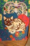
A week late, but...


I'm seeing a bit of a clash between the walls and the floors.


Tan/brown is one of the most annoying colors to get right in this game. The original palette has an extreme red cast to its colors - the overworld's tan ground and brown rocks specifically. That's why I went through some 20-30 variations of my own desert palette to get it right (as in, the best match between a stand-alone palette, and one that matches the pre-existing palettes).


I see your tans/browns are leaning in that direction - a notable red cast that becomes stronger as the lighter colors transition to darker colors, and a blue cast that all but disappears by that point. That's totally fine, and perfectly in line with the original game.


By contrast, your floor tiles have a green cast - the upper ones, barely noticeably, but on the lower ones, it's just as strong as the red is on the tans/browns. For reference, your lightest tan has a red : green ratio of 1.1 : 1.0, while the brown by the upper floor has a 1.5 : 1.0 ratio, and the dark brown by the lower floor has a 1.66 : 1.0 ratio. However, the "gray" on the lower floor has a 1.0 : 1.4 red : green cast.


In other words, your lower floor leans as strongly toward green as your mid-walls lean toward red. Which, to me, gives the screen a subtle Christmas vibe. Probably not what you were going for :P


So, I think the walls are upper floor are fine, but I'd tweak up that lower floor to ditch the green cast (along with the similarly strong blue), or just aim for another neutral gray like the upper floor.


#7020 MarinaraSauce

MarinaraSauce

    Magus

  • Members
  • Real Name:Grant
  • Location:New York

Posted 05 May 2016 - 05:53 PM

kCtC8cV.png

Immediately west of my last screenshot.  At first, I wasn't entirely sure how to design this area, but I think now I know what direction I want to take with it.


  • Eddy, Jared, Joelmacool and 4 others like this


0 user(s) are reading this topic

0 members, 0 guests, 0 anonymous users