Vulpix? Lol that's just a fox.
PureZC Art Gallery
Started by
Lemon
, Nov 26 2005 05:30 PM
1324 replies to this topic
#662

Eddard McHorn Van-Schnuder
-

- Members
-

smash the bye button
- Real Name:Ronny Wiltersen


#663
Fabbrizio
-

- Members
-

Legend
- Real Name:Mark
#665
Lemon
-

- Members
-
Legend
Posted 18 July 2010 - 12:01 PM
Ah. Mr.Pimpy you're artwork makes me all happy inside.
Are those actually done on paper, or completely colored in photoshop? The fox looks like colored pencil, but the Pokemans could go eitherway.
Are those actually done on paper, or completely colored in photoshop? The fox looks like colored pencil, but the Pokemans could go eitherway.
#666
SpikeReynolds
-

- Members
-

Industrial Sorcerer
- Real Name:Spens
- Pronouns:He / Him
- Location:Grand Rapids, Michigan
Posted 18 July 2010 - 01:10 PM
That fox is excellent, Pimpy.
#667
Fabbrizio
-
- Members
-
Legend
- Real Name:Mark
Posted 26 July 2010 - 10:48 AM
http://powerbracelet...t.com/#/d2tm1wv
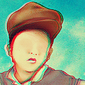
Character profile for Kyle, the shy kid in my upcoming webcomic comedy, Anime Club.
Character profile for Kyle, the shy kid in my upcoming webcomic comedy, Anime Club.
Edited by PowerGauntlets, 26 July 2010 - 10:48 AM.
#668
Lemon
-
- Members
-
Legend
Posted 30 July 2010 - 08:06 PM
He just looks bewildered. Not really shy.
Instead of looking at animes/manga you should look at real peoples faces and see how the mouth, ears, eyes, and face in general is twisted when certain emotions are being displayed. This varies person to person, but I guarantee you'll convey the message far better across if you use a real source.
Shy
Maybe gasping. I can see gasping to.
#669
SpikeReynolds
-
- Members
-
Industrial Sorcerer
- Real Name:Spens
- Pronouns:He / Him
- Location:Grand Rapids, Michigan
Posted 31 July 2010 - 01:16 AM
A lot of times shy people have their faces toward you but their eyes averted. Just saying.
#670
Lemon
-
- Members
-
Legend
Posted 01 August 2010 - 12:14 AM
His eyes don't look averted though. It just looks like he's in awe/gasping at something that we can't see/happening over to the left.
#671
SpikeReynolds
-
- Members
-
Industrial Sorcerer
- Real Name:Spens
- Pronouns:He / Him
- Location:Grand Rapids, Michigan
#672
Fabbrizio
-
- Members
-
Legend
- Real Name:Mark
Posted 02 August 2010 - 07:57 AM
By shy I mean timid. You know, not talking much, not being talked to. This particular picture is cut from a scene where this girl from his school's anime club starts a conversation with him (as you can tell, he really doesn't know what to say).
Also:
My best drawing ever, hands down.
Also:
My best drawing ever, hands down.
Edited by PowerGauntlets, 02 August 2010 - 07:58 AM.
#673
SpikeReynolds
-
- Members
-
Industrial Sorcerer
- Real Name:Spens
- Pronouns:He / Him
- Location:Grand Rapids, Michigan
Posted 02 August 2010 - 02:22 PM
Yea. Timid people don't often make eye contact.
#674
Fabbrizio
-
- Members
-
Legend
- Real Name:Mark
Posted 02 August 2010 - 03:12 PM
Duly noted. However, there is a new picture posted.
#675
Lemon
-
- Members
-
Legend
Posted 03 August 2010 - 12:32 AM
You don't need to defend yourself so much. Just take my advice as is and take from it what you will.
PowerBracelet: Lot's of stuff to critique. It may be the best thing you've ever made, but it's still not really that good. It has potential though, you've just stopped to soon. Go over your pencil lines with pen. Color it in with pencil/charcal/paint/whatever you can. Even just pen will make anything look far more "complete".
For next time, keep the following in mind as well; Action poses. While standing cool looking down with a sword is cool in that silly anime style, a character in some dynamic positioning will always be more interesting. Here, I think one leg being up a little bit, or him leaning on something would be very beneficial. If you want examples of "action poses" look at the Sistine Chapel.
1 user(s) are reading this topic
0 members, 1 guests, 0 anonymous users

