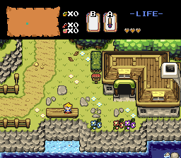
I liked that first shot so much better. "wrong" is a metter of opinion there. what you had looked natural and pretty and now it's just another bland river scene. using tiles creatively can be great and I think your earlier try was much better. I have looked at it repeatedly and can't figure out what is so "wrong" about it. I suspect people well versed in using that set of edging tiles are used to seeing them for their intended purpose and can't see how pretty you had it because they only see the "right" way they try so hard to hold to.
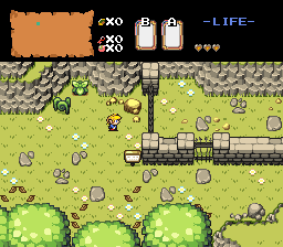
Your comment had me fiddle around with it and give it one more shot to go with the different elevations idea. After some more effort I came up with this. I'm guessing it's pretty much the best that can be done with the original plan:
If this doesn't work I'm just going to stick with the other one I said I ironed out.
EDIT: Thanks for all your help guys.
Edited by FalsePower, 14 August 2015 - 12:34 AM.