
Agreed. "Black Point on Blue Triangle" is by no means art. Some modern art is nice to look at, but only because it's nice shapes or whatever. But most of that isn't art for me.
I think that art is something beautiftul (including the aesthetics of the ugly of course) that an artist created, using her or his own creative powers to get some message across and express a certain emotion and or impression.
It's sort of hard to explain. It has to have aesthetic value, obvious effort put into/ good craftmanship, message, emotion, impression and expression. In my eyes at least. That might be a lot I'm asking for, but that's what makes the difference for me between "randon picture" or "random text" and art for me.
... ...
I'm totally against that "beeing shocking" is a feature of art; I rather think "beeing shocking" is sort of dumb. If something is shocking just for the sake of beeing shocking, than I see no point in it whatsoever. Thus I exclude it from my definition of art. If something is pretty and has some message, evokes a certain emotion and is shocking, than it might be art. What I want to say, is, that the "shocking-factor" is totally irrelevant for the discoussion wether something is art or not. For me of course.
I'm talking 'bout the whole "beeing shocking"-deal, because lots of modern art claims to be art because it's shocking. Which is dumb nonsense to me.
PureZC Art Gallery
Started by
Lemon
, Nov 26 2005 05:30 PM
1324 replies to this topic
#632

Mr. Pimpy
-
- Members
-

...
Posted 17 April 2010 - 07:02 PM
QUOTE(Lemon @ Apr 17 2010, 12:08 PM) 
Mr.Pimpy; I can see Asian, but Caucasian was my initial reaction... regardless I don't get racial ambiguity out of it.
That's what ambiguity is though. It's left up to personal interpretation because he has no definitive ethnicity..
Eck, if it seems like I'm acting pissy over critique that's really not the case. I agree with your other points.
QUOTE
As for Lemon's piece, I don't get the Asian feeling at all. The red hair and blue eyes says Caucasian all over it for me.
Haha, I know. I was talking about my drawing.
Edited by Mr. Pimpy, 17 April 2010 - 07:03 PM.
#633
Nathaniel
-

- Members
-

Unburdened By What Has Been
Posted 17 April 2010 - 07:04 PM
Oops, my bad. Something must have thrown me off.
#634
Daemon
-

- Members
-

Apprentice
- Real Name:Sabbastian
- Location:United States
Posted 05 May 2010 - 03:50 AM
I made a couple Zelda pictures today, with my new tablet (that I just got today.  )
)
First, Young Link. Missed a few details, but no major ones.

Second, Link fighting Barba from Zelda II. I've had Zelda II on my mind from a bunch of playing... So I decided to draw this. Not my best work, and the background's pretty sloppy, but I think it's alright.
 (You can view the full size on my deviantArt page.)
The rest of my art I feel like sharing, is on my deviantArt page. http://sajihanma.deviantart.com/
First, Young Link. Missed a few details, but no major ones.
Second, Link fighting Barba from Zelda II. I've had Zelda II on my mind from a bunch of playing... So I decided to draw this. Not my best work, and the background's pretty sloppy, but I think it's alright.
(You can view the full size on my deviantArt page.)The rest of my art I feel like sharing, is on my deviantArt page. http://sajihanma.deviantart.com/
#635
Lemon
-

- Members
-

Legend
Posted 10 May 2010 - 11:37 PM
QUOTE(Daemon @ May 5 2010, 03:50 AM)
I made a couple Zelda pictures today, with my new tablet (that I just got today.
First, Young Link. Missed a few details, but no major ones.
By god his hands begin at his elbow! I have no idea how old you are, so it's hard to critique this seriously beyond just keep working at it. If you're somewhere before high school, more power to you, keep it up.

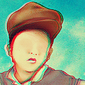
It really bugs me that my scanner completely misses yellow tones (the skin is far more orange), and as a result the red in this has been greatly exaggerated... but ah, the main picture remains. Also the eyes are tinier in the base shot, which makes the perspective make a lot more sense (the mouth is dead on accurate, I suppose for an example). I can't wait to be good at this.
Still putting off doing the next acrylic attempt. Want to, but man, to scared.
Edited by Lemon, 10 May 2010 - 11:38 PM.
#636
Daemon
-
- Members
-
Apprentice
- Real Name:Sabbastian
- Location:United States
Posted 11 May 2010 - 02:05 AM
QUOTE(Lemon @ May 10 2010, 11:37 PM)
By god his hands begin at his elbow! I have no idea how old you are, so it's hard to critique this seriously beyond just keep working at
Well, I'm pretty much beginning with art. I've been drawing for as long as I can remember, but only recently I've been trying to work on my skills, and draw better art.
As for my age, I'm 13, and coming to the end of 7th grade. I'm fine with any critique you have to offer, how else am I suppose to get better? As for the hands, proportions are something I have to work on, I don't expect them to be perfect. Perhaps I'll study a diagram, or something, next time.
Edited by Daemon, 11 May 2010 - 02:05 AM.
#637
Siguy
-

- Members
-

�
- Location:The inactive user list.
Posted 13 May 2010 - 02:24 PM
Try anatomical studies with realistic proportions, before you move on to stylization; if you start off with cartoon proportions, you'll have trouble reproducing them and it will always end up looking odd. This is a fairly common mistake; just look at deviantART.
#638
Eddard McHorn Van-Schnuder
-

- Members
-
smash the bye button
- Real Name:Ronny Wiltersen
Posted 14 May 2010 - 01:33 PM
I was bored and I drew this: http://users.sephiro...rmuda/house.jpg
Wouldn't it be cool as an area in a book, or maybe a game? Picture it being the map of a metriod-style 2D game... XD
Wouldn't it be cool as an area in a book, or maybe a game? Picture it being the map of a metriod-style 2D game... XD
#639
Siguy
-
- Members
-
�
- Location:The inactive user list.
Posted 16 May 2010 - 12:28 PM
Yeah, a game designed by M.C. Escher.
#640
Adem
-

- Members
-
-
- Real Name:Anything except rap and country.
- Location:New England
Posted 18 May 2010 - 07:15 PM
Tribute to my Fiddler on the Roof cast members. Tevye and Golde. (Link removed.)
I think it turned out fairly well, even if I forgot to finish shading Golde (the one on the right) and messed up on a few other things. Drew and colored it in an 58 minutes; I told somebody I'd have it done in an hour, and they nagged me for being two minutes early.
I think it turned out fairly well, even if I forgot to finish shading Golde (the one on the right) and messed up on a few other things. Drew and colored it in an 58 minutes; I told somebody I'd have it done in an hour, and they nagged me for being two minutes early.
Edited by Rem, 01 June 2010 - 06:11 AM.
#641
Bourkification
-

- Members
-

Magus
Posted 22 May 2010 - 07:43 AM
Well this isn't so much art as it is graphics. Its visual design nonetheless!
It is a car badge/logo, for a brand I have made up. This is for my folio for Visual Communication and Design class in my last year of high school. It's a work in progress but is nearly finished so I thought I'd show it off to get some pointers on what I could do to make it look better. The font isn't final, and I'm thinking of changing it but I dont know what style of font. The animal is a pather BTW. Anyway here it is:

EDIT: I forgot to say that I did this in GIMP for Mac. And sorry about the JPEG, but if I save it as a GIF its too pixilated and lacks antialiasing.
It is a car badge/logo, for a brand I have made up. This is for my folio for Visual Communication and Design class in my last year of high school. It's a work in progress but is nearly finished so I thought I'd show it off to get some pointers on what I could do to make it look better. The font isn't final, and I'm thinking of changing it but I dont know what style of font. The animal is a pather BTW. Anyway here it is:
EDIT: I forgot to say that I did this in GIMP for Mac. And sorry about the JPEG, but if I save it as a GIF its too pixilated and lacks antialiasing.
Edited by Jimmyb, 22 May 2010 - 07:46 AM.
#642
SpikeReynolds
-

- Members
-

Industrial Sorcerer
- Real Name:Spens
- Pronouns:He / Him
- Location:Grand Rapids, Michigan
Posted 26 May 2010 - 10:56 PM
Not a fan of Festivities... This one got killed by my scanner, but yea, feel free to look.
#643
SpikeReynolds
-
- Members
-
Industrial Sorcerer
- Real Name:Spens
- Pronouns:He / Him
- Location:Grand Rapids, Michigan
Posted 31 May 2010 - 10:26 PM
#644
Fabbrizio
-

- Members
-
Legend
- Real Name:Mark
Posted 01 June 2010 - 06:04 PM
http://powerbracelet...llery/#/d2qw8v0
A final character design for the antagonist from my superhero manga.
A final character design for the antagonist from my superhero manga.
#645
SpikeReynolds
-
- Members
-
Industrial Sorcerer
- Real Name:Spens
- Pronouns:He / Him
- Location:Grand Rapids, Michigan
Posted 01 June 2010 - 10:53 PM
The actual drawing is a bit basic. Maybe an action pose? I don't know a whole lot of people who stand completely straight like that.
1 user(s) are reading this topic
0 members, 1 guests, 0 anonymous users

